Designing a website isn’t about making something “look good”—it’s about creating a strategic, user-focused experience that supports your goals. In this article, we unpack what really makes a website work. You’ll learn why usability beats flashy visuals, how to craft navigation that feels second nature, and why typography and whitespace are more than just aesthetic choices. We’ll look at psychological principles like Hick’s Law and Fitts’ Law, explore the role of visual hierarchy and branding, and offer a practical take on how to turn web design into a tool for conversion. If you’re building a site or refreshing an old one, this guide will help you avoid common pitfalls and focus on what matters most.
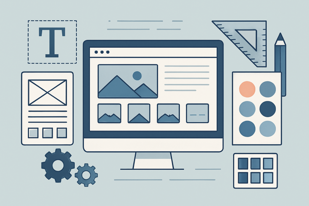
Why Design Still Matters (Even More Than You Think)
Let’s start with a truth bomb: users don’t read websites—they scan them. They bounce when things take too long to load. They lose trust the second something feels off. So while beautiful visuals may grab attention, functionality, speed, and clarity are what hold it.
What’s at stake? Everything. Your brand, your conversions, your credibility.
“A website is no longer a digital brochure. It’s your first impression, your sales pitch, and your customer service desk—all rolled into one.”
Web design must serve the user. That means reducing cognitive load, anticipating user behavior, and keeping interfaces intuitive. Every element—button, heading, image—should earn its place.
Building Blocks: What Really Makes a Website ‘Effective’
1. User-Centric Design Begins with Empathy
If there’s one unbreakable rule, it’s this: design for the user, not yourself.
User-centric design puts the visitor at the center. What do they need? What do they expect? Where will they get stuck? When you prioritize usability over aesthetics, you start winning. This means:
- Thinking mobile-first
- Avoiding decision fatigue (see: Hick’s Law)
- Respecting users’ mental models
- Ensuring accessibility across devices and for all abilities
Sites with strong homepage clarity tend to guide users effortlessly—because they’re designed around how people behave online.
2. Intuitive Navigation: Let Them Move Without Thinking
Navigation isn’t a feature—it’s the glue. Without it, even the best content dies in the void.
Good navigation is:
- Predictable (users shouldn’t have to guess)
- Consistent (menus, buttons, and headers should behave the same way everywhere)
- Visible (don’t bury links or hide actions behind obscure icons)
Think of your navigation like a shop floor plan. If someone walks into our PPC services from a landing page, they should easily be able to find their way back to the homepage or onward to more specific services without friction.
3. Visual Hierarchy: Design With Purpose
Design isn’t just decoration—it’s communication.
Visual hierarchy tells users what to look at first. Use:
- Typography that scales in importance (headings > subheadings > body)
- Color palette to highlight actions or sections
- Whitespace to group and separate content
- Imagery that supports (not distracts from) your message
Even things like balance & alignment play a subconscious role in how users interpret credibility. When everything feels “off,” trust goes out the window.
4. Scannable, Strategic Content
People don’t read; they skim. So your content needs to be:
- Broken into digestible chunks
- Structured using content hierarchy
- Filled with concise copy that gets to the point
- Supported by CTAs that are direct and clear
For example, the content on our SEO services page is structured to walk users through problems, solutions, and results—with action steps built right in.
A good CTA doesn’t just say “Click Here.” It tells you what you’ll get when you do.
5. Speed, Interaction, and Responsiveness
Design isn’t just visual—it’s experiential. And nothing ruins an experience faster than:
- Slow page load speed
- Heavy animation
- Unresponsive layouts
Modern websites must be mobile-optimized, yes—but also fast and intuitive. Use animations sparingly. Compress images without compromising quality. Make sure buttons are tappable (see: Fitts’ Law), and avoid elements that jump around on scroll.
Interactive Elements Should Enhance, Not Distract
Think hover states, modals, product configurators—interactive design elements can increase engagement, but only if they’re tied to user intent.
6. Brand Identity: More Than a Logo
Consistency breeds trust.
Your website should feel like a seamless extension of your brand. That goes beyond just the logo in the corner—it’s about:
- Typography that aligns with your brand voice
- A color palette that’s recognisable and deliberate
- Imagery that matches your tone and values
- A consistent layout style across pages
When a visitor lands on your site, they should immediately understand who you are and what you stand for. Whether they’re reading your blog, browsing your services, or considering your offer, the brand identity must feel unified and confident.
Authenticity online comes from visual consistency, clear messaging, and delivering on what you promise.
7. The Psychology Behind Design Decisions
Smart design is rooted in how people think. And there are a few timeless psychological principles that every web designer should understand.
Hick’s Law
The more choices you give a user, the longer it takes for them to make a decision.
Application: Keep menus and forms simple. Reduce the number of CTA buttons. Streamline your service offerings when possible.
Fitts’ Law
The size and distance of a clickable object affects how easily a user can interact with it.
Application: Make buttons large enough to tap, especially on mobile. Keep primary actions in accessible places.
Gestalt Principles
Users tend to perceive objects that are close together or similar in appearance as part of a group.
Application: Use white space, proximity, and alignment to guide user focus and understanding.
Mental Models
Users bring expectations with them. Break those expectations, and they break away from your site.
Application: Stick to common design patterns where appropriate—especially with things like navigation structure or product layout.
8. Build for Mobile—First
You’ve heard of responsive design—but mobile-first is a step beyond. It’s about starting with the smallest screen and building up from there.
Why?
- Over 60% of traffic comes from mobile
- Mobile users are more goal-focused
- Load times and UX expectations are much stricter on small screens
A truly mobile-first website prioritizes speed, simplicity, and touch-friendly design. For example, content blocks should stack naturally, buttons must be easily tappable, and page structure must maintain visual hierarchy without cramming the screen.
9. Trust Is Built in the Details
Visitors don’t just decide to trust you—they feel it based on cues.
Here’s what helps build that trust on your site:
- Professional design and polish
- Real, relevant testimonials
- Transparent contact info
- No broken links or outdated content
- HTTPS and secure browsing
- Easy-to-find legal pages (Privacy, Terms, etc.)
- A clear value proposition above the fold
Even the smallest visual inconsistency can create doubt. At Red Frog Media, we’ve seen how visual cues of trust lead directly to higher conversions, especially on service-based landing pages.
10. Performance: Every Second Counts
We can’t talk about design without addressing page load speed and performance. According to Google, a 1–3 second delay can increase bounce rates by 32%. You can have the best layout in the world—but if it doesn’t load quickly, no one will ever see it.
To keep things lightning fast:
- Use modern image formats like WebP
- Minimize or defer non-critical scripts
- Eliminate render-blocking resources
- Host videos externally (or lazy load them)
- Audit your Core Web Vitals regularly
And don’t underestimate minimal animation. A site overloaded with movement can be visually noisy and cognitively draining. Animation should guide—not distract.
11. Internal Linking: The Unsung Hero of UX and SEO
A well-planned internal linking structure does more than just help Google crawl your site—it helps users find relevant content naturally.
Example:
If a user lands on your PPC services page, they should be able to explore how those campaigns connect to your SEO offering or how your website design service ensures optimal landing pages for ad traffic.
When internal links are placed contextually and sparingly, they enhance the user experience, reduce bounce rates, and increase time-on-site—all of which matter for conversions and rankings.
12. Testing, Feedback, and Continuous Improvement
Your website is never finished. The best-performing websites are those that are always evolving—based on user data, behavioral patterns, and direct feedback.
A/B Testing: The Art of Small Tweaks
Whether you’re deciding between two headline styles or testing button colors, A/B testing is essential for optimization. Choose one variable at a time:
- CTA wording: “Get Started” vs “Book a Free Audit”
- Hero image: Static photo vs. animated banner
- Page layout: 2-column vs. single-column
The data will speak. Just remember to test long enough to draw meaningful conclusions and avoid changes based on assumptions.
Usability Testing: Real People, Real Feedback
Don’t rely solely on analytics. Ask real users to complete real tasks on your site:
- “Find a specific product.”
- “Submit a contact form.”
- “Compare two services.”
Watch where they click. See what confuses them. What you learn from just 5 users can often reshape your entire design direction.
Usability testing isn’t expensive—it’s just often overlooked. And that’s costly.
Feedback Loops: Build, Listen, Iterate
- Include feedback forms or quick emoji polls on key pages.
- Use heatmaps to visualize attention and scroll behavior.
- Monitor exit rates and time-on-page with analytics tools.
From there, build a roadmap of iterative design changes—improving based on real-world use, not theory.
13. Designing for Conversion (Not Just Aesthetics)
Here’s the thing: most websites don’t have a design problem—they have a conversion problem.
That’s where Conversion Rate Optimization (CRO) comes in. A beautifully designed site that doesn’t convert isn’t just a missed opportunity—it’s a revenue leak.
CRO Tactics That Actually Work
- Use heatmaps to see where users don’t click
- Simplify the path to conversion (Hick’s Law again!)
- Use social proof near CTAs (testimonials, reviews, numbers)
- Reduce form fields where possible
- Clearly communicate value propositions above the fold
- Keep your most important CTAs in high-attention zones
And yes, make sure your mobile experience converts just as well—if not better—than your desktop experience.
14. Going Global: Multilingual & International Considerations
If your brand serves (or will serve) an international audience, then multilingual design is not a “nice-to-have”—it’s strategic.
Things to keep in mind:
- Navigation must adapt for language length (German or Finnish text is often longer than English)
- Avoid using flags to represent languages—they represent countries, not languages
- Make sure all translated versions maintain visual hierarchy and design consistency
- Plan your SEO around international targeting (using
hreflangtags, local TLDs, etc.)
A solid global site respects cultural differences while maintaining the same brand integrity and user experience throughout.
15. Design Systems & Scalable Frameworks
As websites grow, design decisions multiply. If those decisions aren’t governed by a system, things get messy—fast.
What is a Design System?
A design system is a documented collection of:
- UI components (buttons, cards, forms, etc.)
- Brand guidelines (typography, color use, spacing)
- Interaction rules (hover states, animations, breakpoints)
It helps ensure:
- Consistency across pages and teams
- Faster development cycles
- Scalable, repeatable design patterns
If you’re constantly recreating page elements or patching mismatched styles, you need a design system.
Atomic Design Principles
Use atomic design as a framework—start with the smallest elements (buttons, inputs), then combine them into modules (forms, navigation bars), then templates and full pages. This allows flexibility without chaos.
16. SEO-Focused Design: Build It to Be Found
Even the most user-friendly website is useless if no one finds it.
That’s why SEO-focused design must be baked into the development process—not tacked on after the fact.
Key Considerations:
- Use semantic HTML (correct use of
h1,h2, etc.) - Avoid infinite scroll or dynamic content without crawlable alternatives
- Make every page load fast and clean
- Structure your internal links intelligently (we covered that here)
- Design with rich snippets, FAQ schema, and metadata in mind
Good SEO isn’t just technical—it’s visual and architectural too. For example, using scannable content and effective writing improves both readability and ranking.
The Fundamentals in Action: A Final Checklist
Here’s a practical audit list you can use right now:
Visual & Structural
- Is the layout consistent across all pages?
- Are your typography and color choices enhancing readability?
- Does your visual hierarchy clearly prioritize content?
UX & Navigation
- Can users easily find what they’re looking for in 3 clicks or less?
- Is the mobile experience equally functional and intuitive?
- Are all buttons and links appropriately sized and placed?
Performance & Accessibility
- Does your site load in under 3 seconds on mobile?
- Are all images optimized?
- Are you WCAG 2.1 compliant?
Trust & Conversion
- Do you have social proof in key decision areas?
- Is your value proposition obvious above the fold?
- Do your CTAs stand out and make sense?
Iteration & Optimization
- Are you actively A/B testing?
- Are user feedback tools in place?
- Is your design scalable with a documented system?
Final Thoughts
Website design is both art and science. It’s where psychology meets layout, and where user behavior meets brand expression. Whether you’re a startup crafting your first homepage or an established brand revisiting your digital footprint, the fundamentals never change—but the expectations keep rising.
You can have a gorgeous site. But unless it’s fast, accessible, intuitive, trustworthy, and conversion-focused, it won’t deliver the results you’re after.
Design with intention. Test with discipline. Iterate with humility.
Need help putting all of this into action? That’s what we do best at Red Frog Media.
Frequently Asked Questions: Website Design Fundamentals
1. How much does professional website design typically cost?
Costs can vary widely depending on complexity, features, and whether you’re working with freelancers, agencies, or building in-house. A basic business site might range from £1,500 to £5,000, while complex eCommerce or custom platforms can exceed £10,000. Always factor in long-term costs like hosting, updates, and SEO.
2. How long does it take to design and launch a website?
A standard site can take 4–8 weeks from planning to launch. This timeline includes wireframing, copywriting, design, development, testing, and final revisions. Larger projects with custom functionality or integrations may take 3–6 months or more.
3. Should I use a website builder like Wix or Squarespace, or invest in custom design?
Website builders are great for quick, low-cost builds—but they often lack scalability, SEO flexibility, and customisation. Custom design offers full control, performance optimisation, and brand alignment. If your site is a core part of your business (e.g. lead gen, eCommerce, client services), invest in custom.
4. What’s the difference between UX and UI design?
- UX (User Experience) is about how a user feels when interacting with your website—ease of use, flow, satisfaction.
- UI (User Interface) focuses on the visual and interactive elements—buttons, menus, typography, colours.
Both are essential to effective website design, and they must work together.
5. How often should I redesign or refresh my website?
Every 2 to 3 years is a common recommendation, depending on:
- Changes in your brand or business goals
- Shifts in user expectations or technology (e.g. mobile-first)
- Declining performance in metrics like conversion or engagement
Micro-refreshes (updating visuals, copy, or layouts) should be done more regularly—quarterly or biannually.
6. What’s the ideal number of pages for a business website?
There’s no magic number, but most small businesses benefit from:
- Homepage
- About Us
- Services/Product pages
- Blog or resources
- Contact page
Focus more on purposeful content than quantity. Avoid bloated navigation.
7. How do I know if my current website design is effective?
Measure it. Look at:
- Bounce rate
- Time on site
- Conversion rate
- Page speed
- Mobile responsiveness
Run usability tests or heatmaps to identify problem areas. And gather user feedback directly when possible.
8. Is blogging still important for website design?
Absolutely. A blog:
- Supports your SEO strategy
- Builds authority in your niche
- Adds fresh, crawlable content
- Keeps users engaged longer
However, blog layout and content hierarchy should be designed for readability and UX—not just aesthetics.
9. Do I need to hire a designer and a developer separately?
Not always. Many professionals and agencies offer full-stack services—design + development. However, for larger projects or advanced functionality, hiring specialists may yield better results. Just ensure clear collaboration between both roles to preserve design intent.
10. How do I balance creativity with usability in design?
Start with function, then layer creativity. Design is not just self-expression—it’s a tool for communication. Follow established UX principles and only “break the rules” when it serves the user. Use creativity to enhance clarity and engagement, not just to decorate.