If you’re looking to dramatically improve your form conversion rates and avoid the common design traps that drive users away, this guide is for you. Here’s what you’ll learn:
- How small layout choices like single-column design and visual grouping increase completion rates
- The difference between good input field design and user drop-off
- Common mistakes like using reset buttons or ambiguous spacing
- How to handle validation, errors, and real-time feedback gracefully
- Why accessibility, progress indicators, and emotional design matter
- Where trust, security, and user transparency intersect to build confidence
- The hidden power of form testing, microcopy, and first-person CTAs
And yes—we’ll cover why placeholder text is not a label.
The Silent Conversion Killer Hiding in Plain Sight
Forms often sit at the end of the customer journey—but they shouldn’t be an afterthought. If you’ve invested time in building a sleek product page or running an efficient PPC campaign, then your form is the final handshake between your business and a user. A poorly designed form can destroy trust, derail intent, and turn an otherwise seamless user experience (UX) into a source of friction.
Let’s change that.
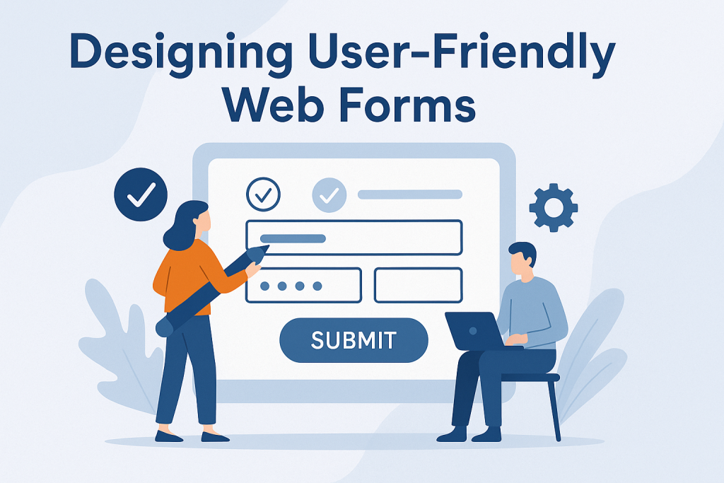
The UX Foundations Behind Great Forms
Forms are more than data capture tools—they’re tiny, interactive narratives. And like any good story, they need to be clear, structured, and compelling. At the heart of great forms lie core UX/UI design principles, including:
- Usability: Can the user complete the form easily, on any device?
- Accessibility: Can users with disabilities use your form independently?
- User Flow: Does the form guide them logically from start to submit?
- Information Architecture: Is data grouped and ordered in a way that makes sense?
Every tap, scroll, or field entry is part of a mental conversation the user is having with your brand. If your form asks too much, too soon—or in the wrong way—it adds cognitive load. And that’s when form abandonment spikes.
Structure First: The Blueprint for Better Forms
Before writing your first field label, map out your form structure. Consider:
- Logical sequencing: Ask easy questions first; delay complex or sensitive ones.
- Visual grouping: Cluster related fields with whitespace and section headers.
- Single-column layout: Maintain vertical eye movement—especially on mobile.
- Multi-step form: For longer forms, break things into manageable chunks.
- Progress indicators: Show users where they are and what’s left.
Whether you’re redesigning a website form or starting from scratch, remember that every extra field introduces risk. Only collect what’s essential. If a field isn’t crucial for your goals, cut it.
“Everything should be made as simple as possible, but not simpler.” – Albert Einstein
Input Field Design: The Micro Decisions That Make or Break a Form
Let’s get specific. Badly sized inputs, unclear labels, or poorly placed buttons often go unnoticed—until users start to drop off.
Here’s how to avoid that:
- Use clear labels placed above the input, not inside it (avoid placeholder-only labels).
- Match field size to expected input length—don’t make users scroll in a tiny box.
- Use dropdowns or radio buttons for short, defined choices.
- Employ autofill and predictive text where applicable to save time.
- Be precise with input constraints (e.g. “MM/DD/YYYY” for date pickers).
- Group related fields together for clarity (think: contact info vs billing).
Need an example? If you’re designing a newsletter signup for a digital product, two fields—name and email—are usually enough. Adding “Company Size” or “How Did You Hear About Us?” might serve marketing goals, but it could cost you conversions.
Pitfalls That Are Still Shockingly Common
Despite being widely discussed, these form-killers still show up too often:
- Reset buttons: Almost no user needs a “clear all” option in 2025. Eliminate it.
- Overuse of optional fields: If it’s optional, question if it’s needed at all.
- Ambiguous spacing: Avoid placing labels too far from fields—they may confuse users.
- Placeholders instead of labels: Once the user starts typing, guidance vanishes.
- CAPTCHAs: If not absolutely necessary, skip them—they harm completion rates.
Form friction isn’t just about usability—it’s about perception. Users won’t always tell you what annoyed them, but they will quietly click away.
Real-Time Feedback: The Validation Layer
Validation isn’t just a technical function—it’s part of the conversation.
Here’s how to keep the dialogue flowing:
- Inline validation: Show errors as the user moves through fields, not just at submission.
- Real-time error feedback: “Password too short” is more helpful than “Invalid input.”
- Preserve user input: Never clear fields after an error. It’s infuriating.
- Disable submit buttons until required fields are complete—but do it subtly.
- Offer suggestions when possible (e.g. “Did you mean…?”).
This approach reduces error-induced frustration and improves completion rates.
🔒 Building Trust, One Field at a Time
A form doesn’t exist in isolation—it’s a trust test. By the time users land on it, they’ve likely navigated multiple pages or found your brand through search. When they’re asked to submit personal information, even something as simple as an email address, a form becomes a gatekeeper.
Here’s how to build confidence:
- Always include a visible privacy policy link. Place it near the submit button.
- Use trust signals like SSL badges or short statements such as “We’ll never share your data.”
- Avoid requesting sensitive data unnecessarily—it raises red flags.
- Offer confirmation messages immediately upon submission.
- Be transparent: if you’re collecting data for marketing, tell them why and how.
Security isn’t just about encryption (though SSL encryption is non-negotiable). It’s about user data transparency—clarifying what happens after submission. If users don’t feel in control of their data, they won’t give it to you.
📢 Crafting Call-to-Actions That Actually Work
If the submit button is your closer, then the CTA (call-to-action) is your pitch.
Boring CTAs like “Submit” or “Send” fail to connect. A better CTA does more:
- Describes the action clearly (“Book My Free Audit”)
- Reflects the user’s voice (“Yes, I Want This!”)
- Creates emotional resonance (“Get My Results”)
Studies have shown that first-person CTAs tend to convert better than generic commands. Why? They feel more personal and affirm the user’s agency.
You can also enhance CTAs with subtle visual feedback, like hover states or micro-animations, to guide the user toward clicking. A slight color shift or ripple effect goes a long way.
Finally, don’t forget form submission feedback—a success state should reassure the user that their input was received. A redirect, a friendly message, or even a small animation can complete the interaction on a positive note.
✨ Visual Design: Subtle Tweaks, Big Impact
You don’t need an avant-garde UI to design a beautiful form. You need clarity. Often, this means:
- Sticking to a minimalist design where form elements aren’t buried under visual clutter.
- Applying consistent branding so users feel like they haven’t been redirected to a third-party tool.
- Using color contrast wisely to highlight actions and guide attention.
- Avoiding all-uppercase text—it’s harder to read, especially for users with dyslexia.
- Choosing a high x-height sans-serif typeface for maximum legibility.
You’d be surprised how much readability influences form fatigue. A clean, visually intuitive form can keep users moving through, while a cluttered or unstructured one breaks flow. Consider the impact of dark mode compatibility as well—it’s increasingly expected by users on mobile devices.
Also: smart use of icons (like a calendar icon for date fields or a lock icon for password fields) reinforces familiarity and reduces confusion without needing more words.
📊 Testing Isn’t Optional—It’s a Form’s Final Draft
Even the best-designed forms can fail if they haven’t been tested. Your users aren’t guessing—they’re reacting. And those reactions are measurable.
Consider these testing strategies:
- A/B testing different CTA texts or field orders.
- Form analytics tools to see where users drop off.
- Cross-browser testing to ensure compatibility across Chrome, Firefox, Safari, and mobile.
- Mobile usability testing, especially for small screen behaviors.
- Performance testing—how fast does the form load? How fast is the response?
Don’t rely solely on internal feedback. Watching real users struggle (or breeze) through your form during usability testing can reveal issues no designer noticed. Even the best information architecture can break under real-world conditions.
Want an edge? Try adding gamification elements like progress meters or milestone rewards in multi-step forms. These subtle nudges create a sense of accomplishment—and improve completion rates.
💡 Going Beyond: Accessibility and Inclusivity
Designing forms for the average user excludes millions. To truly optimize, you must embrace form accessibility by default—not as a bonus.
Here’s how:
- Ensure your form meets WCAG standards.
- Use ARIA labels so screen readers can interpret inputs correctly.
- Make everything accessible via keyboard navigation.
- Avoid relying on color alone to communicate errors or status.
- Test for focus management—does the cursor move where expected?
You’re not just complying with guidelines; you’re improving experience for all users. Inaccessible forms are not just unusable—they’re invisible to a large part of your audience.
🎯 Advanced Techniques to Drive Form Performance
Once your form is clean, usable, and tested, it’s time to level up. The final layer of form design mastery involves anticipating user needs, emotional design, and leveraging modern interface tools that enhance interaction.
These additions don’t just reduce form abandonment—they foster a sense of control, ease, and sometimes, even delight.
🧠 Emotional Design: Small Feelings, Big Results
Most forms feel like chores. But what if they didn’t?
Emotional design is about crafting micro-moments that connect. That might include:
- A success message that congratulates the user (“You’re all set—we’ve got you!”)
- A warm tooltip that reassures (“Don’t worry, we’ll never spam you”)
- A playful touch of microcopy that sparks a smile
These seemingly tiny moments influence how users feel about your brand. And that matters. Whether you’re collecting leads for a campaign or converting a client through a form on your website design service page, remember: people convert when they feel understood.
Even color choices and animation can express empathy, urgency, or calmness.
🗣 Voice Input & Modern Interactions
Let’s talk future-forward. With mobile devices now dominating form submissions, modern form interfaces are increasingly embracing:
- Voice input for faster data entry, especially useful in mobile-first forms
- Predictive text that auto-suggests input based on past entries or popular responses
- Progressive disclosure—revealing fields only when relevant (e.g., showing a “Billing Address” only if different from “Shipping Address”)
- Smart defaults—like pre-filled country or date values
These enhancements don’t just save time—they eliminate unnecessary friction. In a world of instant everything, efficiency is UX currency.
🧩 Personalisation and Dynamic Forms
Not all users are the same—and neither should their form experience be.
Dynamic forms adapt based on user input. For example:
- Selecting “Business” from a dropdown might trigger a different set of questions than selecting “Individual”
- A returning visitor may see pre-populated fields
- A multi-step form remembers user choices from step to step
This level of responsiveness requires more than good UI. It calls for smart information architecture and well-planned data models—but the payoff is higher conversion rates and lower form fatigue.
🔍 Measuring What Matters
All the design improvements in the world mean little without tracking performance. So what should you measure?
- Completion rate – How many users finish the form once they start?
- Field time – Which fields take the longest? Are they necessary?
- Abandonment point – Where do users leave the form?
- Error frequency – Are there any fields generating repeated validation issues?
Use form analytics tools like Hotjar, Microsoft Clarity, or Formisimo. Then act on the insights.
And remember, improvements are iterative. A/B testing is your friend—try variations in button text, field order, or number of steps. Small changes can lead to significant lifts in performance.
✅ The Final Checklist for User-First Forms
Before you publish your form, run it through this human-first checklist:
- Is the form logically sequenced with grouped, relevant sections?
- Are only necessary fields included?
- Does the form function flawlessly on mobile and desktop?
- Are field labels clear and visible at all times?
- Are inline validations in place with helpful error messages?
- Is sensitive information handled securely and transparently?
- Do you provide a clear confirmation and next steps post-submission?
- Have you tested it with real users and across browsers?
If you’ve ticked these off, you’re well on your way to building a form that doesn’t just work—but converts.
Wrapping Up: Forms That Work for People
Designing a form isn’t about asking questions. It’s about answering them—before they’re even spoken. It’s about shaping an experience that respects time, reduces confusion, and meets users where they are.
When done right, web forms aren’t barriers. They’re invitations.
And whether you’re applying these principles to an onboarding flow, a contact page, or a conversion-focused campaign, remember: clarity, empathy, and simplicity always win.
At Red Frog Media, our approach to design is never just visual. It’s strategic, human-centered, and built to perform—because every field matters.
📚 Frequently Asked Questions (FAQ)
1. How many fields are too many in a web form?
There’s no magic number, but a general rule is: ask only what you need. Short forms (3–5 fields) typically convert better, especially for newsletters or lead captures. For longer forms (like applications), break them into multi-step formats with progress indicators to maintain momentum.
2. What’s the best way to design a form for mobile users?
Mobile-first forms should prioritize:
- Touch-friendly inputs (larger buttons and tap areas)
- Single-column layout
- Minimized typing (use toggles, pickers, autofill)
- Sticky “Next” or “Submit” buttons on longer forms
Design with one hand in mind—test usability using your thumb only.
3. Is it okay to use dropdown menus for everything?
Not always. Dropdowns should be used sparingly:
- Great for >5 options
- Bad for binary or tri-state choices (use radio buttons or toggles)
They require more interaction (tap, scroll, select) and can slow users down.
4. Can I pre-check consent boxes (like email marketing opt-ins)?
No, not if you want to stay legally compliant in regions like the UK or EU (GDPR). Consent must be:
- Freely given
- Informed
- Unambiguous
Use unchecked boxes with clear explanations.
5. What role does microcopy play in form UX?
Microcopy—those tiny bits of helper text, hints, and messages—have huge influence. Good microcopy:
- Sets expectations (“We’ll get back to you within 24 hours”)
- Reduces anxiety (“We won’t spam you”)
- Clarifies input formats (“Enter phone number without spaces”)
It builds trust and humanizes the form.
6. How do I handle form submissions that require file uploads?
File upload fields should:
- Specify file types and size limits
- Offer drag-and-drop interfaces
- Provide upload feedback (progress bar, success message)
- Allow file previews where relevant (e.g., profile images)
Ensure these are accessible and mobile-friendly.
7. Should I offer social login options in my forms?
Yes—with caution. Social logins (Google, Apple, Facebook) reduce friction for users who don’t want to fill out fields. They’re great for:
- Registrations
- Event signups
- App onboarding
But: always offer an email/password alternative for privacy-conscious users.
8. How do I make sure my form is accessible to users with disabilities?
Use these form accessibility best practices:
- Label elements properly with
<label>or ARIA labels - Ensure keyboard navigation works for all elements
- Provide visible focus states
- Avoid using color as the only indicator for errors
- Validate against WCAG 2.1 guidelines
9. Can animations or transitions improve form UX?
Yes—if used thoughtfully. Subtle animations can:
- Indicate success (e.g., checkbox ticks)
- Smooth transitions between form steps
- Confirm interactions (e.g., button hover effects)
Avoid overuse or fast motion, as it can be disorienting or harm accessibility.
10. What should happen after a form is submitted?
Always:
- Show a clear confirmation message (“Thanks! We’ve received your message.”)
- Outline next steps (“You’ll receive a reply within 24 hours.”)
- Offer a way back to the site (link to homepage, product page, etc.)
- Optionally, send a confirmation email
This closure builds trust and reinforces that the user’s time was valued.