
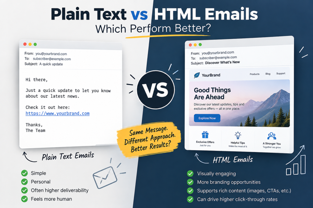
When you’re planning an email campaign, there is a surprisingly important decision hiding behind the subject line and send button: should the email be plain text or HTML?
The answer isn’t as simple as saying one format always wins.
Plain text emails are lightweight, direct and can feel remarkably personal. HTML emails give you far greater control over branding, layout, images, calls-to-action and the overall recipient experience. Yet adding more design doesn’t automatically produce better email performance. Sometimes, stripping an email back can actually increase engagement.
The quick answer: If you’re wondering Plain Text vs HTML Emails Which Perform Better, neither format is universally superior. A simple, personal-looking email can be excellent for conversations, outreach and campaigns where the copy is the star. HTML is generally more suitable when branding, visual hierarchy, product imagery, multiple CTAs or richer analytics matter. For many businesses, the strongest approach isn’t choosing one and abandoning the other: it’s using clean HTML with a plain-text alternative, then using A/B testing to discover what their own subscribers respond to.
At a glance: Plain text prioritises simplicity and a human feel. HTML prioritises presentation, branding and flexibility. Performance depends on the audience, message, email type and execution—not merely the format.
What Is a Plain Text Email?
A plain text email contains exactly what the name suggests: text.
There are no elaborate layouts, styled CTA buttons, custom fonts, background colours, animations or carefully positioned images. Links may still appear as URLs, but the message itself is fundamentally straightforward.
Think of the kind of email one person might send directly to another:
Hi James,
I wanted to send over the details we discussed yesterday.
You can find everything here: [example link]
Any questions, just reply to this email.
Thanks,
Sarah
It isn’t flashy. That’s precisely the point.
A plain-text message can resemble one-to-one communication rather than a carefully constructed commercial email. For personalized outreach, follow-up emails, internal communications and certain marketing emails, that sense of authenticity can be valuable.
Plain text is also technically lightweight. There is less complexity for an email client to interpret and fewer opportunities for an ambitious layout to behave unexpectedly.
That doesn’t mean plain text is automatically better for email deliverability, however.
Deliverability depends on a much broader collection of signals, including sender reputation, domain reputation, email authentication, recipient engagement, spam complaints and the quality of the mailing list. SPF, DKIM and DMARC matter. Sending useful emails people actually want matters.
Changing an HTML email into plain text isn’t a magic ticket to the main inbox.
Where plain text is particularly useful
A plain-text format can make sense for:
- personalized outreach and sales conversations;
- follow-up emails where a personal response is the objective;
- simple announcements and updates;
- system notifications where clarity is more important than presentation;
- audiences or situations where broad email client compatibility matters;
- messages where speed, simplicity and readability are priorities.
There is another advantage that is easy to underestimate: focus.
With no banners, columns, GIFs, product cards or competing CTA buttons, the reader has very little distracting them from the email copy. If the message itself is persuasive, simplicity can work in its favour.
This follows a principle we frequently encounter elsewhere in digital marketing: adding more elements doesn’t necessarily add more value. Effective website design also relies on hierarchy, usability and giving people a clear route towards the action you want them to take.
Email is no different.
What Is an HTML Email?
An HTML email uses HTML code to control how the message looks and behaves.
At its simplest, that might mean little more than formatted text and a hyperlink. At the opposite extreme, an HTML-rich email might contain:
- branded headers and footers;
- columns and structured content sections;
- images and GIFs;
- fonts and colours;
- prominent CTA buttons;
- clickable links;
- dynamic content;
- personalised sections;
- responsive layouts for mobile email;
- tracking and other measurable interactive elements.
HTML therefore gives marketers significantly more creative freedom.
If you’re announcing a product, publishing a visual newsletter, presenting several offers or creating a promotional email where brand consistency matters, HTML email design has obvious attractions. Instead of merely telling the recipient something, you can construct a visual journey through the message.
But there is an important distinction here:
HTML email does not have to mean heavily designed email.
A simple HTML email can look remarkably similar to a plain-text message while retaining useful functionality such as formatted hyperlinks, email analytics and controlled presentation.
That middle ground is important because the real comparison isn’t always:
Plain text vs enormous glossy newsletter.
Sometimes it’s:
Plain text vs simple HTML vs heavily designed HTML.
And those can produce very different results.
Why HTML Emails Are So Popular
HTML became central to email marketing for a fairly obvious reason: businesses want emails to look like their businesses.
A well-constructed HTML email can carry the same visual identity a customer encounters on your website. Logo, typography, imagery, buttons and content hierarchy can work together to create a recognisable branded experience.
This is particularly useful for ecommerce, visual products, event promotions, content newsletters and campaigns containing several distinct messages.
HTML also gives marketers considerably more control over calls-to-action (CTAs).
Compare:
with:
Book Your Consultation
Both can ultimately lead to exactly the same destination, but a carefully positioned CTA button can make the desired next step considerably more obvious.
That visual hierarchy can help recipients scan an email quickly—especially on mobile devices.
There is a parallel here with PPC campaign management: getting someone’s attention is only part of the job. What happens after that attention has been earned can determine whether it turns into a click, enquiry or conversion.
The HTML advantage
When implemented well, HTML gives marketers more control over:
- Email branding — logos, fonts, colours and visual identity.
- Content hierarchy — headings, sections, spacing and visual cues can guide the eye.
- Calls-to-action — buttons can make important actions more prominent.
- Email personalization — content can be tailored to particular recipients or segments.
- Dynamic content — different subscribers can potentially receive different content within the same campaign.
- Email analytics — HTML supports common approaches to measuring opens and interactions.
- Mobile responsiveness — responsive email design can adapt content for different screen sizes.
- Visual storytelling — images in email can communicate things that paragraphs of copy cannot.
For the right campaign, those aren’t small advantages.
But every extra layer introduces another variable.
The Hidden Cost of HTML: Complexity
Open a professionally designed marketing email and it may appear effortless.
Behind the scenes, it often isn’t.
Email development has historically been more restrictive than building an ordinary web page because an email needs to render across numerous email clients, devices and environments.
Gmail, Outlook and Apple Mail don’t necessarily interpret every piece of HTML/CSS identically. Something that looks perfect in one inbox may render differently in another.
That creates the possibility of email rendering issues such as:
- unexpected spacing;
- altered fonts;
- broken layouts;
- oversized or missing images;
- buttons displaying incorrectly;
- mobile layouts that don’t behave as expected;
- dark mode email changing the appearance of colours or graphics.
Image-heavy emails create additional considerations. Remote images may be blocked or delayed. Large assets can increase load time. Poorly implemented layouts can become awkward on a phone. Accessibility can also suffer if an email relies too heavily on visual information without appropriate text, structure and alt text.
So HTML’s greatest strength—its flexibility—is also a source of complexity.
More design gives you more control, but it also gives you more things that can go wrong.
This is why clean HTML, responsive email design, accessibility and cross-client testing matter.
So, Does Plain Text Get Better Email Deliverability?
This is where the debate becomes more interesting.
You’ll often encounter the claim that plain-text emails have inherently better deliverability because they look less promotional and contain less code.
There’s a grain of logic behind the idea, but it’s too simplistic as a general rule.
Spam filters and mailbox providers don’t make inbox-placement decisions based solely on whether a message contains HTML. Modern spam filtering involves numerous signals surrounding the sender, domain, content and recipient behaviour.
That means an HTML email isn’t automatically destined for a promotions tab or spam folder, just as a plain-text email isn’t automatically guaranteed a place in the main inbox.
Factors that can influence email deliverability include:
- sender and domain reputation;
- SPF, DKIM and DMARC authentication;
- list quality;
- bounce rate;
- spam complaint rate;
- recipient engagement;
- sending behaviour;
- content quality and relevance;
- technical implementation.
Format is part of the picture. It isn’t the whole picture.
There’s also an important difference between delivery and inbox placement.
An email can technically be delivered but land somewhere the sender didn’t particularly want it to appear. Conversely, a message reaching the inbox is of limited value if nobody opens, reads or acts on it.
Which brings us to the metric that really matters: performance.
What Does “Perform Better” Actually Mean?
Before comparing plain text vs HTML email, you need to decide what better means.
Is success:
- a higher open rate?
- a better click-through rate (CTR)?
- more replies?
- a higher click rate?
- stronger subscriber engagement?
- a better conversion rate?
- fewer unsubscribes?
- more revenue?
- improved email ROI?
Those objectives aren’t interchangeable.
A beautifully designed newsletter could generate lots of clicks while a plain-text-style sales email might produce fewer clicks but more valuable replies. A transactional email might succeed simply by communicating critical information clearly. An onboarding email may need to move the recipient towards one very specific action.
This is why email performance should be measured against the purpose of the message.
A click is useful.
A conversion is better.
And if the objective was to generate a reply rather than a website visit, obsessing over click-through rate may tell you very little.
That same principle applies across organic acquisition. Good SEO isn’t simply about generating the largest possible number of visits; the value comes from attracting the right audience and turning visibility into meaningful commercial outcomes.
Email marketing needs the same discipline.
The metrics worth watching
When testing email format, look beyond one headline number.
Open rate can provide directional information, although modern privacy features and tracking limitations mean opens shouldn’t be treated as a perfect measurement of human attention.
Click-through rate tells you whether recipients are progressing from the email to a linked destination.
Conversion rate goes further and asks whether those recipients ultimately completed the desired action.
Reply rate can be particularly revealing for plain-text-style outreach.
Unsubscribe and spam complaint rates can indicate whether the audience considers your campaigns useful and welcome.
Together, these engagement metrics provide a much richer view than declaring one format the winner because it achieved more opens in a single campaign.
And this is where the apparent battle between plain text and HTML starts to unravel.
Because there is a third option sitting quietly between them—and for many businesses, it may be the most practical approach of all.
The Third Option: Simple HTML and Hybrid Emails
That third option is simple HTML.
And it deserves far more attention than it usually gets.
The debate is often presented as though marketers have two doors to choose from. Behind one sits a completely unformatted plain text email. Behind the other is an elaborate HTML email packed with imagery, columns, buttons, banners and branded graphics.
In reality, there is an enormous amount of space between those extremes.
A simple HTML email can look and feel almost like personal communication while retaining some of HTML’s most useful capabilities. You might have straightforward copy, a restrained layout, a handful of hyperlinks and minimal styling—without turning the message into a miniature web page.
This creates an interesting compromise:
- the visual simplicity and authenticity associated with plain text;
- clickable links rather than unwieldy URLs;
- greater control over email formatting;
- support for common email tracking methods;
- improved control over content hierarchy;
- enough flexibility to maintain subtle brand consistency.
For many email campaigns, this middle ground makes considerably more sense than treating the decision as strictly HTML vs plain text email.
There is also a second kind of hybrid approach happening underneath the visible email.
That’s where things get slightly more technical.
Plain Text and HTML Can Exist in the Same Email
Here’s something that can make the entire plain text vs HTML argument seem rather less binary:
An email can contain both.
A properly constructed multipart email can include an HTML version alongside a plain-text alternative.
This is commonly handled through MIME—Multipurpose Internet Mail Extensions—using a structure known as multipart/alternative.
Conceptually, the message can contain:
Content-Type: multipart/alternative

Content-Type: text/plain
[Plain-text version of the message]

Content-Type: text/html
[HTML version of the message]
The recipient’s email client can then use the appropriate representation.
So when marketers talk about choosing HTML, that doesn’t necessarily mean abandoning plain text altogether.
An HTML marketing email can—and often should—have a sensible plain-text fallback.
This is useful for email client compatibility and creates an alternative representation of the message for environments where HTML isn’t being used or displayed as intended.
It also forces marketers to answer a surprisingly useful question:
If all the design disappeared, would the message still make sense?
If the answer is no, the email may be relying too heavily on presentation and not enough on communication.
Plain-Text Alternative vs Plain-Text-Style Email
There is an important distinction here.
A plain-text alternative is the actual text/plain component of a multipart message.
A plain-text-style email, meanwhile, may still technically be HTML.
It simply looks like a personal text-based email.
For example:
Hi Alex,
I saw your message earlier and thought this might help.
We’ve put together a quick explanation of the issue here.
Have a read when you get a chance, and if you have any questions just reply.
Sarah
To the recipient, that can feel like an ordinary one-to-one message.
Underneath, however, HTML could still be providing formatted hyperlinks, controlled spacing and other functionality.
That distinction matters when interpreting email performance studies.
If a supposedly “plain text” email wins an A/B test, ask what was actually tested. Was it a genuine text/plain email? Or was it a stripped-back HTML email designed to resemble personal correspondence?
Those aren’t necessarily the same thing.
Why Simpler Emails Can Perform So Well
People don’t open their inboxes because they’re desperate to admire another marketing template.
They open emails because they want information.
That sounds obvious, but it changes how we should think about HTML email design.
A beautifully designed email can absolutely improve the recipient experience when its visuals serve a purpose. Product photography can demonstrate a product. A strong content hierarchy can make a newsletter easier to scan. A prominent CTA can make the next action obvious.
But design becomes counterproductive when it starts competing with the message.
Imagine receiving two emails.
The first opens with a large banner, followed by a logo, navigation links, a hero image, introductory copy, several content blocks, social icons and multiple buttons.
The second says:
I thought you’d find this useful. Here’s what changed, why it matters and what you need to do next.
Which feels more like somebody is actually speaking to you?
That human quality helps explain why minimalist email design and plain-text-style campaigns can be surprisingly effective.
Simplicity removes friction
Stripping an email back can:
- make the main message immediately obvious;
- reduce competing calls-to-action;
- put greater emphasis on the email copy;
- make the message feel more conversational;
- create fast-loading emails;
- reduce certain email rendering complications;
- make the desired next step easier to identify.
None of those advantages require marketers to abandon HTML completely.
The lesson is more subtle:
Use as much design as the message needs—and no more.
What the Evidence Tells Us About Plain Text vs HTML
This is where claims about one format “winning” need some restraint.
Different audiences, campaigns and objectives can produce different results.
Testing published by HubSpot has historically found that increasingly elaborate HTML emails could produce lower engagement than simpler versions, with plain-text-style emails performing particularly well in some tests.
That’s significant because it challenges a very intuitive assumption:
More polished doesn’t automatically mean more persuasive.
But it would be a mistake to turn those results into a universal rule that plain text always beats HTML.
Email on Acid takes a more audience-dependent view: test the formats and determine what your recipients prefer. Zoho similarly frames the choice around the purpose of the email rather than declaring a single format appropriate for every situation.
Those positions actually fit together rather well.
The useful conclusion isn’t:
“Plain text wins.”
Nor is it:
“HTML wins.”
It’s:
The right amount of HTML depends on what you’re sending, who you’re sending it to and what you want them to do next.
When Plain Text Emails Can Perform Better
There are situations where stripping away most or all visual design makes considerable sense.
1. Personalised outreach
If the objective is starting a conversation, a glossy promotional template can create unnecessary distance between sender and recipient.
A simple email can feel closer to genuine one-to-one communication.
This can be especially valuable for sales outreach, partnership enquiries and other messages where the desired CTA is essentially:
Reply to me.
A large colourful button doesn’t necessarily help with that.
2. Follow-up emails
Imagine you’ve already spoken to somebody.
Would your follow-up naturally arrive looking like a newsletter?
Probably not.
A simple message preserves the feeling that the conversation is continuing between two people.
3. Founder or personal-brand messages
Emails written in the voice of a founder, consultant, account manager or other recognisable person can benefit from restraint.
Heavy branding may undermine the very authenticity the sender is trying to create.
4. Important announcements
Sometimes the information is the product.
Changes to services, important notices, operational updates and concise announcements may benefit from removing everything that distracts from the central message.
5. Audiences that respond to copy
Some subscriber lists simply respond well to strong written communication.
If your readers are opening because they value your expertise, analysis, stories or commentary, you may not need extensive visual decoration to hold their attention.
But that doesn’t mean every plain text email is engaging.
A boring email remains boring even after you remove the pictures.
When HTML Emails Can Perform Better
Now turn the situation around.
Imagine you’re launching a new clothing collection, showcasing a property, promoting a restaurant menu or presenting several products.
Would removing every image improve the message?
Probably not.
HTML is particularly powerful when visual communication is part of the value proposition.
1. Products that need to be seen
For ecommerce businesses, images in email can do genuine selling work.
Product photographs, collections, demonstrations and visual comparisons can communicate far more efficiently than lengthy descriptions.
2. Newsletters containing several stories
A structured HTML email layout makes it easier to separate content into sections.
Headlines, thumbnails, summaries and CTA buttons allow subscribers to scan the email and choose what interests them.
3. Strongly visual brands
If visual identity is an important part of the customer experience, a carefully designed HTML email can extend that identity into the inbox.
Colours, typography, imagery and layout can all contribute to email branding.
4. Promotional campaigns
A promotional email may need to communicate several things rapidly:
What’s the offer?
What’s included?
What does it look like?
When does it end?
Where do I click?
HTML provides the visual hierarchy to answer those questions efficiently.
5. Onboarding emails
Well-designed onboarding emails can use sections, buttons, explanatory graphics and clearly defined next steps to guide a new customer through a process.
6. Transactional emails
Transactional emails are sometimes treated as though they should always be plain text, but structured HTML can be extremely useful.
Order confirmations, booking details, receipts and account notifications often contain information that benefits from hierarchy.
The objective isn’t decoration.
It’s comprehension.
HTML Gives You Better Visual Control—Not Automatically Better Results
This distinction is crucial.
HTML gives you capability.
It doesn’t guarantee performance.
You can add six CTA buttons.
You can include an animated GIF.
You can use multiple columns, several product images, different fonts and elaborate visual sections.
The important question is whether you should.
Every element should earn its place.
If a button makes the next action clearer, good.
If an image communicates something important, use it.
If visual hierarchy makes a complex newsletter easier to navigate, that’s useful design.
If an animation exists purely because somebody discovered how to insert a GIF into an email template, it may simply be noise.
This is where email user experience matters.
Good email design isn’t about putting as much HTML as possible into the available space. It’s about helping the recipient understand the message and take the appropriate next action with minimal friction.
What About Open Rates?
Open rate has traditionally been one of the headline metrics used to judge an email campaign.
But it deserves careful interpretation.
HTML emails commonly use tracking pixels—tiny remotely loaded images that can signal to an email service provider that an email has been opened.
That sounds straightforward.
In practice, privacy protections, image-loading behaviour and email client features mean an “open” doesn’t always map neatly to a person consciously opening and reading an email.
This makes open rate useful as an engagement metric, but not an infallible one.
Suppose Campaign A has a 48% reported open rate and Campaign B has 42%.
Can you confidently say Campaign A was more successful?
Not without knowing what happened next.
Perhaps Campaign B produced:
- more clicks;
- more replies;
- more purchases;
- more enquiries;
- fewer unsubscribes;
- greater revenue.
That’s why judging email performance on open rate alone can produce misleading conclusions.
Click-Through Rate Tells Us More—But Still Not Everything
Click-through rate (CTR) moves us one step closer to meaningful behaviour.
Someone clicking a link has generally demonstrated more intent than somebody registering an open.
For a campaign designed to drive website traffic, CTR can therefore be an extremely useful metric.
But again, context matters.
An email with five CTA buttons naturally creates more opportunities for clicks than a personal email asking the recipient to reply.
That doesn’t automatically make the HTML email more successful.
If your objective is a sale, measure sales.
If your objective is a booking, measure bookings.
If your objective is a reply, measure replies.
If your objective is content consumption, clicks and subsequent engagement become more meaningful.
Measure the behaviour your email was designed to create, not simply the metric that’s easiest to find in your email analytics dashboard.
Conversion Rate Is Where the Argument Gets Commercial
Clicks are encouraging.
Conversions pay the bills.
If an HTML email generates 1,000 clicks and 20 conversions while a simpler email generates 700 clicks and 35 conversions, which performed better?
The second campaign produced fewer clicks but substantially more of the action that mattered.
This is why conversion rate needs to be part of the plain text vs HTML discussion.
Email isn’t an isolated marketing activity. It’s usually one stage of a broader journey:
Inbox → open → read → click → landing page → action.
Improving one stage while damaging another isn’t necessarily progress.
A beautifully designed email might generate curiosity-driven clicks but set expectations the landing page fails to meet.
A simpler email might attract fewer visitors but pre-qualify them more effectively.
Understanding that difference requires looking beyond email analytics and connecting campaign behaviour with actual business outcomes.
Does HTML Send Emails to the Promotions Tab?
This is another persistent question.
Particularly for Gmail users.
It’s tempting to believe that sending a plain-text-style email is a shortcut from the promotions tab into the main inbox.
The reality is considerably more complicated.
Mailbox providers can use numerous signals to classify incoming email. Message content and structure can contribute, but so can sender identity, recipient behaviour, sending patterns and the nature of the communication.
A commercial message doesn’t stop being commercial merely because you’ve removed the logo.
And trying to disguise promotional email as personal correspondence isn’t a sustainable email strategy.
Instead, concentrate on signals that have much broader value:
- send emails people genuinely requested;
- maintain healthy lists;
- authenticate your sending domain;
- build a positive sender reputation;
- avoid misleading subject lines;
- make unsubscribing straightforward;
- segment subscribers intelligently;
- send relevant content;
- monitor spam complaints and engagement.
Inbox placement is an outcome of the wider relationship between sender, message, mailbox provider and recipient.
Email format is only one variable.
Email Authentication Matters More Than Fancy Formatting Tricks
If email deliverability matters—and it should—technical foundations deserve attention.
Three acronyms appear repeatedly in modern email discussions:
SPF. DKIM. DMARC.
SPF helps specify which servers are authorised to send mail for a domain.
DKIM uses cryptographic signatures to help verify that a message is associated with the claimed sending domain and hasn’t been improperly altered in transit.
DMARC builds on SPF and DKIM to provide domain owners with additional policy and reporting mechanisms.
These technologies don’t answer whether your email should contain a hero image.
They address something more fundamental:
Can receiving systems establish trust around the identity of the sender?
That makes email authentication part of the deliverability conversation regardless of whether you’re sending an elaborate HTML newsletter or the simplest text-based campaign imaginable.
If the foundations are weak, switching the font off isn’t going to fix them.
Don’t Forget Email Accessibility
Performance isn’t only about what generates the highest CTR.
An email has to be usable by the person receiving it.
That brings email accessibility into the comparison.
Plain text has inherent simplicity, but that doesn’t mean HTML is inaccessible by definition. Properly structured HTML can work effectively with screen readers and assistive technologies.
Problems emerge when visual design is treated as the only means of communicating information.
For example, an HTML email shouldn’t rely on an image alone to convey an essential message. Images should have meaningful alt text where appropriate. Link text should make sense. Content should follow a logical structure.
Colour contrast matters.
Font size matters.
Reading order matters.
Mobile responsiveness matters.
And a CTA shouldn’t become incomprehensible simply because an image hasn’t loaded.
Accessibility is therefore another reason to favour purposeful HTML over HTML for HTML’s sake.
Email Rendering Can Change the Experience Completely
Designing an HTML email on one screen doesn’t tell you how every recipient will see it.
Your subscribers might open the campaign in:
- Gmail;
- Outlook;
- Apple Mail;
- webmail;
- desktop software;
- an Android device;
- an iPhone;
- dark mode;
- environments with remote images disabled.
That’s why email preview testing and cross-client testing are so valuable for HTML-rich campaigns.
A desktop-perfect email that becomes a cramped mess on mobile isn’t well designed.
Neither is a CTA that disappears in dark mode or a crucial piece of information embedded exclusively inside an image that doesn’t load.
This represents another advantage for simpler campaigns: there are fewer moving parts.
The more complicated your email becomes, the more thoroughly you should test it.
But rendering, accessibility and deliverability still don’t answer the biggest question.
If you have two viable formats sitting in front of you, how do you actually determine which one your audience prefers?
That’s where A/B testing becomes considerably more useful than somebody else’s benchmark.
A/B Testing: Let Your Audience Decide
This is ultimately where theory needs to meet evidence.
You can read benchmarks. You can study other companies’ email campaigns. You can debate whether subscribers prefer polished visuals or personal-looking messages.
But none of those people are your subscribers.
The most reliable way to determine which email format performs better for your business is through controlled A/B testing.
That doesn’t mean sending two completely different emails and declaring whichever one generates more clicks the winner.
A useful test isolates the variable you’re trying to understand.
If you’re testing email format, try to keep the following consistent:
- subject line;
- sender name;
- sending time;
- offer;
- core email copy;
- audience segment;
- primary CTA;
- landing page.
Then change the presentation.
For example:
Version A: A simple HTML email with predominantly text, minimal styling and one prominent link.
Version B: A richer HTML email containing branded graphics, imagery and a designed CTA button.
You could subsequently test the winner against another variation.
The important part is resisting the temptation to change five things simultaneously.
If Version B has a different subject line, different copy, three additional images, a different offer and a different CTA, you haven’t really tested plain text vs HTML email.
You’ve tested two entirely different campaigns.
Which Email Metrics Should You Measure?
The answer depends on the campaign objective.
If the email is designed to generate website visits, click-through rate is obviously relevant.
If you’re trying to generate sales, conversions and revenue deserve greater weight.
If you’re starting conversations, replies may be more important than clicks.
A useful email testing framework might therefore examine:
| Metric | What it can tell you |
|---|---|
| Open rate | Directional indication of opens, subject-line performance and sender recognition, with tracking limitations |
| Click rate / CTR | Whether recipients interacted with links in the message |
| CTOR | Click-to-open behaviour among recorded opens |
| Reply rate | Particularly useful for personal outreach and conversational emails |
| Conversion rate | Whether recipients completed the intended business action |
| Bounce rate | Potential list-quality or delivery issues |
| Unsubscribe rate | Whether campaigns may be losing relevance for recipients |
| Spam complaint rate | A critical signal of unwanted email |
| Revenue | Commercial return generated by a campaign |
| Email ROI | Whether email activity creates worthwhile return relative to its cost |
The key is to decide what matters before looking at the results.
Otherwise, it’s remarkably easy to find whichever metric supports the conclusion you already wanted.
Don’t declare a winner too quickly
Suppose a simple email produces:
- fewer opens;
- more clicks;
- more replies;
- more conversions.
And the elaborate HTML version produces:
- more recorded opens;
- fewer clicks;
- fewer conversions.
Which won?
For most commercial campaigns, the first.
That’s why the phrase “better email performance” needs a defined outcome attached to it.
Better at what?
Segment Your Results Before Making a Universal Decision
There is another complication.
Your subscribers aren’t one person.
A business might have customers, prospects, long-term subscribers, new subscribers and inactive contacts sitting on the same broader email list.
Their preferences can differ.
Someone who has just discovered your brand may respond well to a polished onboarding sequence that establishes identity and explains what you offer.
A long-standing customer may prefer concise messages that get straight to the point.
A prospect who has already spoken to your sales team might find a glossy marketing template strangely impersonal.
This is where email segmentation and list segmentation become important.
Rather than asking:
Which email format does our audience prefer?
Ask:
Which email format does this segment prefer for this type of message?
That’s a much better question.
Match the Email Format to the Job
Instead of adopting a company-wide rule that every email must be plain text or every email must use the same HTML email template, match the format to its purpose.
A practical starting point looks something like this:
| Email type | Format worth testing first | Why |
|---|---|---|
| Personalised sales outreach | Plain text / plain-text-style HTML | Feels closer to one-to-one communication |
| Personal follow-up | Plain text / simple HTML | Keeps the conversation natural |
| Founder email | Simple HTML / plain-text style | Keeps attention on personality and copy |
| Newsletter | Simple or structured HTML | Makes multiple stories easier to scan |
| Product launch | HTML | Imagery and visual hierarchy can support the message |
| Promotional campaign | HTML / simple HTML | Offers and CTAs can be made prominent |
| Transactional email | Simple structured HTML + text alternative | Prioritises clarity while retaining structure |
| Onboarding email | HTML | Supports steps, links and clear calls-to-action |
| System notification | Plain text / simple HTML | Information usually matters more than decoration |
| Content promotion | Simple HTML | Keeps the message focused while allowing trackable links |
These aren’t rules.
They’re hypotheses to test.
An ecommerce business selling highly visual products could discover that image-rich HTML consistently produces its highest conversion rate.
A consultancy could discover the opposite: straightforward letter-style emails generate more enquiries because subscribers respond to expertise and personality rather than design.
Both results can be correct.
Don’t Confuse “Plain Text” With Bad Formatting
There’s another trap worth avoiding.
Choosing plain text doesn’t mean dumping an enormous wall of words into someone’s inbox.
Readable plain text still needs structure.
Short paragraphs help.
White space helps.
Clear language helps.
A logical progression helps.
And links should appear where they’re relevant rather than being scattered indiscriminately throughout the message.
For example:
Hi Sarah,

We've just published the results from our latest research.

The biggest finding surprised us: simpler emails generated more responses.

You can read the full analysis here:
https://example.com/research

If you have any questions, reply and let me know.

Thanks,
James
That’s significantly easier to digest than:
Hi Sarah, we've just published the results from our latest research and the biggest finding surprised us because simpler emails generated more responses and you can read the full analysis here...Plain text removes visual decoration.
It doesn’t remove the need for good writing.
And Don’t Confuse HTML With “More Design”
The same misunderstanding happens in reverse.
Using HTML doesn’t oblige you to create a digital brochure.
Some of the most effective HTML emails barely look designed at all.
You can use clean HTML to create:
- readable paragraphs;
- sensible spacing;
- descriptive hyperlinks;
- a restrained CTA;
- responsive typography;
- accessible structure;
- subtle branding.
That’s still an HTML email.
The distinction matters because businesses sometimes ask whether they should “switch to plain text” when the better experiment would be to simplify their existing HTML.
Remove the giant hero image.
Reduce the number of buttons.
Cut unnecessary navigation.
Simplify the email layout.
Make the copy more conversational.
Give the primary CTA room to breathe.
Then test it.
You might discover that HTML itself was never the problem.
The problem was clutter.
How Images Can Affect Email Performance
Images deserve particular attention because they’re one of the biggest differences between simple text-led messages and HTML-rich email.
Used well, email images can:
- demonstrate a product;
- create desire;
- establish brand identity;
- explain a concept visually;
- break up longer content;
- make products easier to compare.
Used badly, they can dominate the message.
An image-heavy email can also create a poor recipient experience when remote images don’t load, mobile data is limited or essential information has been baked into graphics instead of included as readable text.
There is no universally “correct” text-to-image ratio that magically guarantees inbox placement.
A better rule is functional:
If an image disappeared, would the recipient still understand the important parts of the email?
If not, reconsider the structure.
Use descriptive alt text where appropriate and avoid relying on graphics to communicate essential information.
Images should enhance the message rather than hold it hostage.
Mobile Responsiveness Is No Longer Optional
An HTML email that looks excellent on a large desktop display can be dreadful on a narrow phone.
That makes mobile responsiveness a core component of modern email user experience.
Responsive HTML email should account for:
- readable font sizes;
- appropriately sized CTA buttons;
- sensible image scaling;
- spacing that works on smaller displays;
- columns that adapt gracefully;
- links that are easy to tap;
- content hierarchy that remains understandable.
There’s a simple practical test:
Can somebody understand and act on your email comfortably with one hand on a phone?
If not, the desktop design isn’t saving you.
Plain-text and very simple HTML messages naturally avoid some of these problems because their layouts contain fewer complex components.
Again, simplicity reduces the number of things capable of breaking.
Tracking Pixels: Useful, but Don’t Worship the Data
One attraction of HTML is email tracking.
Tracking pixels and instrumented hyperlinks can provide useful email analytics, allowing marketers to examine campaign behaviour and compare engagement over time.
But measurement should never become more important than the customer experience.
Privacy protections and client behaviour can make open tracking imperfect. Automated systems can interact with links. Different email clients can handle remote content differently.
Treat the resulting data as evidence—not divine truth.
Look for patterns across multiple campaigns.
Combine email analytics with website behaviour, conversions, sales and replies.
The more evidence sources agree, the more confidence you can have in the conclusion.
Common Plain Text vs HTML Email Mistakes
Regardless of which format you choose, several mistakes can undermine performance.
1. Assuming plain text automatically avoids spam filters
It doesn’t.
Sender reputation, email authentication, list quality and recipient behaviour remain critical.
2. Assuming attractive emails automatically convert better
Visual appeal and conversion aren’t synonymous.
An attractive email that distracts people from the CTA can perform worse than a simpler alternative.
3. Designing before writing
A template shouldn’t dictate the message.
Work out what needs to be communicated first. Then determine the amount of design required to communicate it effectively.
4. Ignoring the plain-text version
If you’re sending multipart HTML email, review the plain-text alternative instead of assuming your email service provider has generated something sensible.
5. Using too many CTAs
When everything is important, nothing feels important.
Prioritise the action that matters most.
6. Ignoring accessibility
Decorative design should never prevent visually impaired users or people using assistive technologies from understanding the message.
7. Testing too many variables at once
If you change the email format, subject line, offer and copy simultaneously, you won’t know which change caused the result.
8. Optimising exclusively for open rate
An open isn’t a sale.
Connect email engagement with downstream business outcomes.
9. Copying somebody else’s winning format
Their subscribers aren’t your subscribers.
Use competitor research to generate hypotheses, not conclusions.
10. Overengineering the email
Sometimes the most effective message really is:
Here’s something useful. Here’s why it matters. Here’s what to do next.
A Practical Email Format Testing Framework
If you’re currently unsure which format to use, don’t redesign your entire email marketing operation overnight.
Run a structured experiment.
Step 1: Choose one important campaign
Select a campaign with enough recipients to provide useful comparative data.
Step 2: Define the objective
Choose the primary outcome before sending.
That could be:
- clicks;
- replies;
- enquiries;
- registrations;
- purchases;
- revenue.
Step 3: Create two format variations
Keep the underlying message and offer as similar as reasonably possible.
For example:
A: Minimal, letter-style HTML.
B: Designed HTML with imagery and CTA buttons.
Step 4: Keep other major variables controlled
Avoid changing your subject line, sender identity, audience and offer at the same time.
Step 5: Test rendering
Check major email clients and mobile devices.
Pay particular attention to Outlook, Gmail and Apple Mail where relevant to your audience.
Step 6: Check accessibility
Review reading order, link descriptions, alt text, font sizing, contrast and whether the message remains understandable without images.
Step 7: Send the test
Use appropriately comparable audience groups.
Step 8: Measure the metric that matters
Don’t crown a winner solely because one version achieved the highest open rate if your objective was conversions.
Step 9: Repeat
One experiment is evidence.
Repeated results create confidence.
Step 10: Test the winner again
Perhaps minimal HTML beats the elaborate design.
Excellent.
Now test minimal HTML against an even simpler version.
Email optimization is iterative.
What About MIME and multipart/alternative?
For marketers who don’t need the technical details, the practical takeaway is straightforward:
You don’t necessarily have to choose between sending HTML and providing plain text.
A MIME multipart message can contain both.
With multipart/alternative, an email can provide different representations of substantially the same content, including:
Content-Type: text/plainContent-Type: text/html
That means your normal HTML campaign can include a plain-text fallback.
Your email service provider may handle this automatically, but it’s worth understanding what is happening—and checking the resulting text version.
Automated HTML-to-text conversion isn’t always elegant.
A carefully constructed HTML email can turn into an ugly collection of repeated links, navigation labels and poorly spaced text if the fallback isn’t handled properly.
So preview both.
What About HTML-to-Text Ratio?
You’ll occasionally encounter claims that there is a perfect HTML-to-text ratio or text-to-image ratio that marketers need to hit to guarantee email deliverability.
Treat universal formulas cautiously.
Spam filtering and inbox placement aren’t governed by one simplistic ratio.
Instead of trying to reverse-engineer an imaginary magic percentage, concentrate on fundamentals:
- send wanted email;
- maintain good list hygiene;
- authenticate your domain;
- protect sender reputation;
- use clean HTML;
- avoid deceptive practices;
- provide useful content;
- make emails accessible;
- monitor recipient engagement.
Those practices have value regardless of whether your campaign is 95% copy or visually rich.
Plain Text vs HTML Emails: Side-by-Side Comparison
Here’s the practical comparison.
| Factor | Plain Text | HTML |
|---|---|---|
| Visual design | Very limited | Extensive control |
| Branding | Limited | Strong |
| Images | No embedded visual layout | Supported |
| CTA buttons | No styled buttons | Supported |
| Clickable text links | Limited compared with HTML | Supported |
| Dynamic content | Limited | Supported |
| Personal feel | Often strong | Depends heavily on design |
| Load time | Very lightweight | Depends on content |
| Email rendering complexity | Low | Can be significant |
| Mobile simplicity | Strong | Depends on responsive design |
| Accessibility | Naturally simple but still requires good writing | Can be highly accessible when implemented correctly |
| Tracking capability | More limited | Greater analytics capabilities |
| Visual product marketing | Weak | Strong |
| Personal outreach | Strong | Strong when kept simple |
| Newsletter structure | Limited | Strong |
| Brand consistency | Limited | Strong |
| Potential for distraction | Low | Higher if overdesigned |
| Plain-text fallback | Already text | Can be included through multipart email |
| Best use | Conversations and text-led communication | Visual, structured and branded campaigns |
Notice how neither column says “better.”
That’s intentional.
So, Which Performs Better: Plain Text or HTML?
The evidence doesn’t justify a universal winner.
And that’s probably the most useful conclusion.
Plain text can perform exceptionally well when simplicity, authenticity and direct communication are important.
HTML can perform exceptionally well when imagery, branding, structure, personalization and visual calls-to-action genuinely improve the message.
Simple HTML sits between those two extremes and deserves serious consideration.
For many businesses, a strong default approach is:
- use clean, restrained HTML;
- provide a sensible plain-text alternative;
- keep the message focused;
- make the design responsive and accessible;
- authenticate your sending domain;
- measure meaningful engagement metrics;
- A/B test different levels of design;
- segment results where appropriate;
- optimise for conversions rather than vanity metrics;
- let your own audience determine the winner.
That’s less exciting than declaring that one format destroys the other.
It’s also considerably more useful.
Frequently Asked Questions
Are plain text emails better than HTML emails?
Not universally.
Plain text emails can work particularly well for personal communication, outreach and text-led campaigns. HTML emails are more suitable when the message benefits from imagery, branding, structured layouts, CTA buttons or dynamic content.
The best format depends on the audience, objective and type of email.
Do plain text emails have better deliverability?
A plain text email isn’t automatically more deliverable than an HTML email.
Email deliverability depends on numerous factors, including sender reputation, domain reputation, authentication, list quality, recipient engagement and sending practices.
Poorly constructed HTML can create problems, but HTML itself isn’t synonymous with spam.
Do HTML emails go to spam?
Not simply because they’re HTML.
Legitimate businesses send enormous volumes of HTML email every day. Spam filters and mailbox providers assess a broader range of signals than message format alone.
Does plain text avoid Gmail’s promotions tab?
There is no reliable guarantee that switching to plain text will place a commercial message in Gmail’s main inbox.
Mailbox classification involves numerous signals, and the recipient’s relationship with the sender can also matter.
What is a plain-text-style email?
A plain-text-style email looks like a straightforward personal message but may actually be built using HTML.
This allows marketers to retain useful HTML functionality while creating a restrained, conversational appearance.
What is a plain-text fallback?
A plain-text fallback is a text representation supplied alongside an HTML email.
Using MIME and multipart/alternative, a message can contain both text/plain and text/html versions.
Is simple HTML better than heavily designed HTML?
It can be.
Simpler HTML reduces visual clutter and may make the message feel more personal while retaining useful functionality such as formatted hyperlinks and tracking.
But the only reliable way to determine whether it performs better for your audience is through testing.
Should marketing emails contain images?
When images genuinely help communicate or sell the message, yes.
Product photography, demonstrations and visual storytelling can be extremely valuable. But essential information shouldn’t depend entirely on an image loading successfully.
Are HTML emails accessible?
They can be.
Accessible HTML email design should consider structure, reading order, contrast, alt text, descriptive links, font sizes and screen readers.
HTML itself isn’t inherently inaccessible; poor implementation is the problem.
Should transactional emails be plain text or HTML?
Either can work.
Simple HTML is often particularly useful for transactional emails because information such as order details, booking confirmations and account information benefits from clear structure.
Providing a plain-text alternative can complement the HTML version.
What should I measure when testing email format?
Choose metrics according to the objective.
Useful measurements can include click rate, CTR, reply rate, conversion rate, unsubscribe rate, spam complaints, revenue and email ROI.
Open rate can still provide useful information, but it shouldn’t automatically be treated as the definitive measure of success.
Final Verdict
So, Plain Text vs HTML Emails Which Perform Better?
The answer is frustratingly simple:
The email that best matches the message, audience and objective.
Plain text has simplicity on its side. It can feel personal, immediate and refreshingly free of marketing theatre.
HTML has flexibility. It can create visual hierarchy, reinforce branding, display products, introduce dynamic content and make calls-to-action unmistakable.
And simple HTML offers a compelling middle ground: enough technology to provide useful functionality without allowing the design to overpower the conversation.
Don’t choose a format because somebody else’s A/B test declared it the winner.
Don’t add design simply because your email platform gives you a drag-and-drop editor.
And don’t strip everything down to text because somebody told you HTML automatically goes to spam.
Start with the person opening the email.
What do they need to know?
What do you want them to do next?
What is the simplest format that communicates that message effectively?
Answer those three questions, test the result against a meaningful alternative and follow the conversion data.
Because the best-performing email isn’t necessarily the prettiest.
It isn’t necessarily the simplest either.
It’s the one that gets the right person to take the right action.