
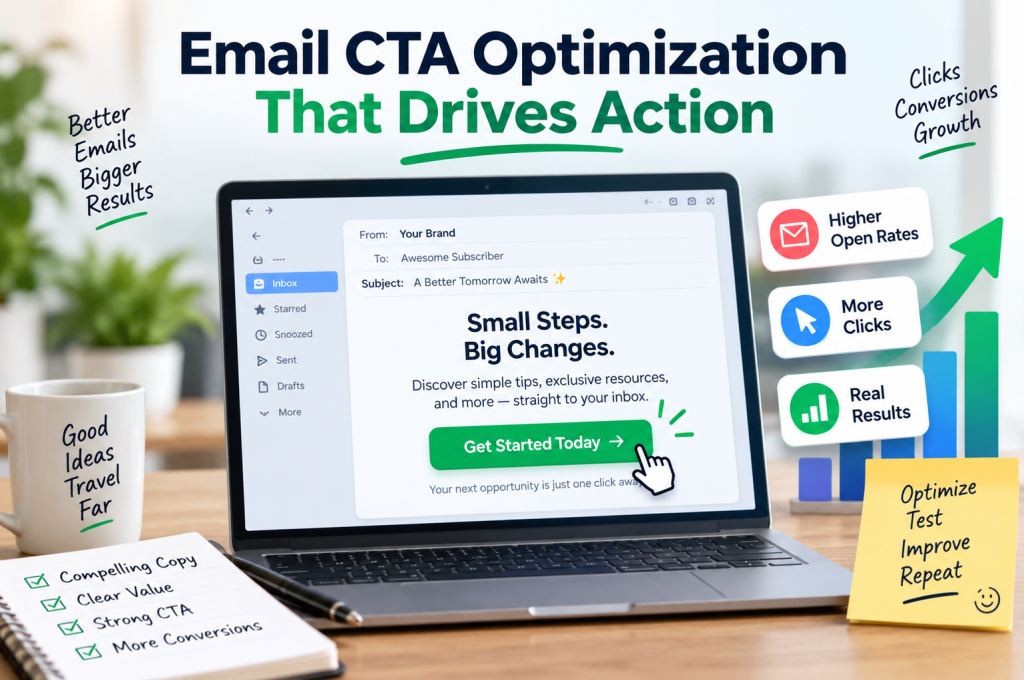
The quick answer: A high-performing email CTA makes the next step obvious, valuable and easy. Strong calls to action combine specific, action-oriented copy with a clear customer benefit, prominent button design, intelligent placement and a destination that fulfils the promise made in the email. Rather than cramming several competing actions into one campaign, give the reader a clear primary CTA, reduce cognitive friction and make the button effortless to use on mobile. Then test what actually moves your audience: wording, placement, design and offer. The objective isn’t simply more clicks. It’s more useful clicks that progress subscribers towards conversion.
A subscriber opens your email.
Good start.
They scan the headline. Read a sentence or two. Perhaps they look at the image. Then comes the moment that decides whether all the work that went into the campaign actually leads anywhere:
What do they do next?
That’s the job of your call to action.
Email CTA optimization isn’t about making a button brighter and hoping for the best. It’s about creating a natural bridge between attention and action. The copy, visual hierarchy, customer benefit, placement and post-click experience all have to point in the same direction.
Get that combination right and the CTA feels almost inevitable.
Get it wrong and even a beautifully designed email can end with a shrug.
What Is an Email CTA?
An email CTA (call to action) is the prompt that asks a subscriber to take a specific next step after engaging with an email.
That might mean asking somebody to:
- Shop now and view a featured range.
- Book a demo after reading about a service.
- Download a guide to continue learning about a subject.
- Start a free trial after discovering a product.
- Reserve a seat for an event.
- Request a quote when they’re ready to talk.
- Get started with a service.
- View an offer before it expires.
The CTA is often presented as a button, although a text link can also act as a call to action.
What’s important is not the format alone. It’s the decision the CTA asks the reader to make.
An effective email CTA answers three questions extremely quickly:
- What can I do?
- What will I get if I do it?
- Why should I do it now?
If the subscriber has to stop and decode the button, the CTA has already introduced friction.
A CTA is a transition, not a decoration
It’s tempting to think of CTA design as the final cosmetic step in building an email.
Headline? Done.
Copy? Done.
Image? Done.
Now add a colourful button.
That approach misses the strategic role of the CTA. The call to action connects the campaign objective with the desired action of the subscriber. It’s the point at which your email marketing strategy becomes measurable behaviour.
The button isn’t there because emails are supposed to have buttons.
It’s there to move somebody forward.
A useful CTA doesn’t merely tell the reader where to click. It gives them a compelling reason to take the next step.
That distinction matters when you’re measuring email campaign performance. A high click-through rate can be encouraging, but clicks that lead to the wrong page, attract the wrong intent or create a disappointing post-click experience aren’t necessarily valuable.
The real objective is progression through the customer journey.
Why Email CTA Optimization Matters More Than It Looks
Imagine receiving two promotional emails for exactly the same offer.
The first ends with:
Learn More
The second says:
See My Website Options
The destination could be identical, yet the second CTA gives the reader substantially more information before the click.
That’s the power of specific CTA copy.
Words such as learn more aren’t automatically wrong. Sometimes a low-commitment prompt is appropriate. The problem is that generic CTA wording often makes the subscriber do additional mental work.
Learn more about what?
What happens after I click?
Is this a product page, an article, a form or a sales pitch?
Specificity removes uncertainty.
If an email is introducing a service and the natural next stage is seeing how that service could translate into a stronger online presence, directing the reader towards relevant website design services gives the CTA a coherent destination rather than treating the click as the end goal.
This is where CTA clarity and landing page alignment meet.
The email makes a promise.
The button describes the next step.
The landing page delivers it.
Every extra decision creates friction
There is another reason CTA strategy matters: human attention is limited.
Consider an email containing these actions:
- Read our latest article
- View our services
- Follow us on social media
- Download our guide
- Book a consultation
- Browse recent projects
- Subscribe to another list
Technically, you’ve given the subscriber plenty of choice.
Strategically, you may have given them no obvious choice at all.
This is where decision fatigue, choice overload and cognitive load enter CTA psychology. When multiple CTAs compete with equal prominence, the subscriber has to decide not only whether to act but which action deserves attention.
A single primary CTA creates hierarchy.
It says: this is the most important next step.
Secondary CTAs can still have a role, particularly in longer emails or campaigns serving subscribers at different stages of the sales funnel. But they should look and behave like secondary actions.
The visual hierarchy should reflect the strategic hierarchy.
Start With One Question: What Should the Reader Do?
Before writing CTA button text, choosing a button colour or debating whether the CTA belongs above the fold, define the campaign objective.
Not vaguely.
Precisely.
“Generate engagement” isn’t precise enough.
“Drive qualified visitors to our service page” is better.
“Encourage subscribers considering organic growth to explore our SEO services” is better still.
Once the desired action is clear, dozens of smaller CTA decisions become easier.
You can ask:
- Does the CTA copy describe that action?
- Does the surrounding copy build sufficient motivation?
- Is the CTA placement appropriate for the commitment being requested?
- Is there one obvious primary CTA?
- Does the destination match subscriber intent?
- Can a mobile user identify and tap it effortlessly?
- Can we measure whether the click leads to the intended conversion?
This turns CTA optimization into a process rather than a collection of tricks.
Match the CTA to intent
Not every subscriber is ready for the same action.
Someone reading an introductory educational email may happily download a guide but resist buy now.
A returning customer viewing a time-sensitive product promotion may not need another 700 words of education before seeing shop now.
A business prospect researching a complex service may be much more receptive to request a consultation than buy now.
So the strongest CTA isn’t necessarily the most aggressive CTA.
It’s the one that fits user intent.
| Subscriber intent | Possible CTA direction |
|---|---|
| Early research | Discover, explore, read, download |
| Comparing options | View, compare, see options |
| Evaluating a service | Request, schedule, book |
| Ready to purchase | Shop, buy, order, add to cart |
| Existing customer | Upgrade, activate, access, redeem |
This is why good CTA copywriting starts before the button.
It starts with the person.
CTA Copywriting: Tell People What Happens Next
Tiny button. Big responsibility.
A CTA may contain only three or four words, yet those words need to carry action, context and sometimes benefit.
Weak CTA messaging often relies on labels:
Submit
Click Here
Continue
More
None tells the reader much about the outcome.
Stronger CTA button copy combines an action verb with something meaningful:
Download the Free Guide
See Available Plans
Book Your Consultation
Claim Your Place
Start Your Free Trial
View the Full Collection
Notice how each phrase creates a small mental preview of what happens after the click.
That’s valuable.
Action + benefit is a useful CTA formula
When you’re stuck writing an email call to action, start here:
Action verb + specific outcome or customer benefit
For example:
Get + My Free Guide
Start + My Free Trial
Reserve + My Place
View + Available Options
Claim + My Discount
Book + My Consultation
This doesn’t mean every button needs to become a miniature sentence. CTA clarity still matters. The goal is to make every word earn its place.
Compare:
Generic: Click Here
Specific: Download the Guide
Or:
Generic: Submit
Specific: Request My Quote
Or:
Generic: More Information
Specific: Explore Our Services
The improved versions reduce ambiguity because they use action-oriented language and establish an expected outcome.
Write About the Benefit, Not Just the Mechanism
One of the easiest mistakes in CTA copy is describing what the business wants instead of what the customer gets.
The business wants a click.
The customer doesn’t care.
The business wants a form submission.
Again, the customer doesn’t care.
What they care about is what sits on the other side of that action: information, convenience, savings, access, reassurance, entertainment, a solution or progress towards something they already want.
That is why benefit-focused copy can make a CTA considerably more persuasive.
Suppose an email is promoting paid advertising.
A button saying:
View PPC
identifies a destination.
A campaign built around the potential business outcome, followed naturally by a route to explore PPC management, creates more context around why the reader should bother taking that next step.
The CTA should feel like the logical conclusion to the message above it.
This can be thought of as a simple sequence:
Problem → Value proposition → Customer benefit → CTA → Matching destination
Break one of those connections and cognitive friction increases.
Maintain them and the email becomes much easier to act on.
The CTA Should Finish the Sentence in the Reader’s Head
Good email copy builds momentum.
The CTA captures it.
If the email has just explained how a particular resource will save the subscriber time, the button shouldn’t suddenly switch into corporate language.
If the campaign has created excitement around a limited release, the CTA shouldn’t become strangely passive.
If the email is reassuring a cautious B2B prospect, an aggressively transactional CTA can feel premature.
CTA language should inherit the intent and emotional temperature of the message that precedes it.
This is where microcopy becomes disproportionately important.
A few words can communicate:
- Value — “Get the Free Checklist”
- Ownership — “Start My Trial”
- Immediacy — “Shop the Collection Now”
- Specificity — “See Website Design Options”
- Low commitment — “Explore the Features”
- Scarcity — “Reserve My Place”
- Progress — “Continue My Application”
The goal isn’t to cram urgency, FOMO, scarcity and every persuasion trigger into a single button.
Quite the opposite.
A clear CTA often wins because it removes uncertainty.
And once the copy is right, another question becomes impossible to avoid:
Will people actually notice it?
That’s where CTA design, visual contrast, whitespace, placement and mobile behaviour begin to matter — and where the next part of this guide continues.
CTA Design: Make the Next Step Impossible to Miss
A beautifully written call to action can still fail if nobody notices it.
This is where CTA design takes over from CTA copywriting.
The objective isn’t to create the loudest button imaginable. It’s to establish enough visual hierarchy that a subscriber scanning the email can immediately identify the primary action.
Think about how people actually consume email.
They don’t necessarily begin at the first word and carefully read every sentence until they reach the sign-off. They scan. They jump between headings. They notice imagery. They skim paragraphs. On mobile, they may be doing all of this with one thumb while distracted by something else.
Your CTA has to survive that environment.
A useful test is remarkably simple:
If somebody looked at the email for three seconds without reading the body copy, would they know what you want them to do?
If not, the primary CTA probably needs greater prominence.
That prominence comes from several elements working together:
- Visual contrast
- Button size
- Whitespace
- CTA button placement
- Copy length
- Typography
- Surrounding content
- The number of competing elements
- Consistency throughout the email
None should be optimized entirely in isolation.
A huge button isn’t automatically better. Neither is a particular CTA button color. The aim is to guide user attention, not assault it.
Contrast Matters More Than the “Perfect” CTA Button Color
Marketers have spent years asking questions such as:
What colour CTA button converts best?
Red?
Green?
Orange?
Blue?
It’s an appealing idea because it suggests there’s a universal answer. Change one hex code and watch the conversion rate climb.
Unfortunately, CTA optimization rarely works like that.
The more useful principle is contrast.
A button has to be visually distinguishable from the email surrounding it. If the entire design is blue and the primary CTA is another similar shade of blue, its prominence may suffer. A colour that contrasts with the surrounding design can make the desired action easier to locate.
So rather than asking:
What is the highest-converting button colour?
Ask:
Does our primary CTA clearly stand apart from everything around it?
This shift matters because colour never exists independently of context.
A button colour that works brilliantly within one brand’s email design might disappear inside another.
Build prominence, not visual chaos
Contrast doesn’t mean throwing brand consistency away.
An effective CTA should still feel like part of the email. It simply needs sufficient distinction to communicate importance.
You can create CTA prominence using a combination of:
- Contrasting colors between the button and background.
- Whitespace around the button.
- A button size appropriate to the surrounding content.
- Clear, legible CTA button text.
- Separation from secondary actions.
- Consistent styling that teaches subscribers what is clickable.
The surrounding empty space is especially important.
Whitespace isn’t wasted space.
It gives the button room to breathe.
If an email CTA is squeezed between paragraphs, images, links, social icons and other visual elements, all of those elements compete for attention. Giving the primary CTA some breathing room effectively puts a visual frame around the decision.
You don’t necessarily need to add anything.
Sometimes you need to remove things.
One Primary CTA Beats a Crowd of Competing Buttons
More buttons do not automatically produce more clicks.
In some campaigns, they simply produce more decisions.
Suppose your email presents four equally prominent options:
Shop Now
Read Our Blog
Follow Us
Contact Us
Which one matters?
You might know.
The subscriber may not.
This is where CTA hierarchy becomes important.
Your primary CTA should correspond with the primary campaign objective. If secondary actions genuinely need to exist, their visual treatment should make their supporting role clear.
For example:
Primary CTA: large, prominent button
Secondary CTA: understated text link
That creates an information hierarchy without completely removing choice.
Single CTA doesn’t always mean one physical button
There is an important distinction here.
A single CTA strategy doesn’t necessarily mean the button can appear only once.
In a longer email, you might repeat the same primary action after different sections. The subscriber still faces one fundamental decision, even though there are several opportunities to take it.
For example:
View the Collection
content
View the Collection
more content
View the Collection
Those aren’t three competing calls to action.
They’re three access points to the same desired action.
By contrast:
View the Collection
Enter Competition
Download Guide
Book Consultation
creates four different decisions.
That’s a much more complicated experience.
The principle, then, isn’t simply one button.
It’s one clear objective.
CTA Placement: Don’t Make People Hunt for the Button
Where should an email CTA appear?
The frustrating answer is: where it makes sense.
But there is a useful reason for that answer.
CTA placement depends on what you’re asking somebody to do and how much persuasion they need before they’re likely to do it.
A familiar customer receiving an email about a straightforward offer might need very little explanation.
Headline.
Benefit.
Offer.
CTA.
Done.
A prospect being introduced to an unfamiliar, higher-consideration service may need considerably more information before being ready to act.
Putting a Book Now button at the top of that email isn’t necessarily wrong, but expecting the button to perform simply because it appears above the fold ignores the reader’s decision-making process.
Earn the click
Think of placement in terms of readiness.
Ask:
At what point has the email given the subscriber enough information and motivation to take this action?
That’s a much better question than blindly following a rule such as “always put the CTA at the top.”
For short promotional emails, an early CTA can work beautifully.
For longer educational emails, a primary CTA may appear after the key value proposition has been established, then repeat later for subscribers who continue reading.
For complex offers, the CTA may work best after:
- Identifying the problem.
- Establishing relevance.
- Explaining the solution.
- Demonstrating the customer benefit.
- Reducing perceived risk.
- Presenting the next step.
In other words, CTA button placement should follow persuasion rather than interrupt it.
Above the Fold Still Matters — Just Not in the Way You Think
“Above the fold” comes from newspapers, but in digital marketing it generally describes content visible before a person scrolls.
Getting important information into that initial viewing area can be useful.
But email complicates things.
Screen sizes differ.
Email clients differ.
Preview panes differ.
Font settings differ.
Mobile devices differ.
Even two subscribers opening the same email can have substantially different initial views.
So instead of obsessing over an exact pixel position, focus on making the purpose of the email apparent early.
The subscriber should quickly understand:
- Why they’re receiving the message.
- What is being offered.
- Why it could matter to them.
- What kind of action they can take.
Then use CTA placement that supports that journey.
For a short email, the primary button might naturally appear within the initial screen.
For a longer campaign, you can introduce the value proposition early and provide a CTA once the reader has enough context.
The goal isn’t to force the button upwards.
It’s to reduce the distance between motivation and action.
Design for the Thumb, Not Just the Desktop
Now shrink everything.
That carefully designed desktop email is suddenly being viewed on a narrow screen.
The headline wraps differently.
Paragraphs become taller.
Images resize.
Buttons move further apart — or, if the design hasn’t been handled well, become frustratingly difficult to tap.
This is why mobile optimization should be part of email CTA strategy from the beginning rather than a final compatibility check.
A mobile CTA needs to be obvious, legible and comfortably interactive.
A mobile-friendly CTA should be easy to tap
Tiny text links can create problems on touchscreens, particularly when several links sit close together.
Buttons generally provide a larger touch target.
That means subscribers don’t have to perform delicate finger gymnastics just to continue.
Consider:
- Is the button large enough to tap comfortably?
- Is there sufficient space around it?
- Is the CTA button text readable without zooming?
- Does a longer CTA wrap awkwardly onto several lines?
- Are two clickable elements positioned too close together?
- Does the button remain prominent when the email becomes a single-column layout?
These sound like small details.
They aren’t.
Every moment of unnecessary effort adds cognitive friction or physical friction to the journey.
And friction accumulates.
Responsive Email Design Should Protect CTA Hierarchy
A responsive email doesn’t merely fit on a smaller screen.
It preserves meaning.
If the desktop version clearly presents one primary CTA but the mobile version rearranges elements in a way that makes a secondary link more prominent, the responsive design has changed the campaign’s hierarchy.
That’s why a responsive CTA needs to be tested as part of the complete email rather than inspected as an isolated button.
Pay attention to:
Width: Does the button have enough presence without swallowing the screen?
Padding: Is the clickable area comfortable?
Spacing: Can subscribers distinguish one interactive element from another?
Copy: Does the CTA remain concise when displayed on a narrow device?
Position: Does the button still appear at the logical point in the message?
Contrast: Does it remain visually prominent in the mobile layout?
This is where email design and conversion optimization become inseparable.
A button that technically works isn’t necessarily a button that’s easy to use.
Don’t Forget Dark Mode
Email design now has another variable to contend with: dark mode.
Colours can shift.
Backgrounds can change.
Text treatment may be altered by the email client.
A CTA that looks striking against a light background can potentially lose visual contrast when the surrounding environment changes.
Dark mode email design therefore deserves a place in CTA testing.
The practical question remains the same:
Can subscribers immediately distinguish the CTA from its surroundings?
Check that:
- Button text remains legible.
- Background and foreground colours maintain useful contrast.
- Borders don’t disappear.
- Brand assets remain recognizable.
- The primary CTA is still visually dominant.
You aren’t designing a screenshot.
You’re designing an email that has to survive different devices, applications and viewing preferences.
HTML Buttons, Images and the “Bulletproof” CTA
A CTA that looks beautiful but fails to render isn’t much of a CTA.
Email clients don’t all behave in the same way, which makes email client compatibility an important technical layer of CTA optimization.
One particular concern is relying on an image to function as the primary button.
Images can be blocked.
They can load slowly.
Their scaling can behave unexpectedly.
And if the entire call to action depends on the image appearing correctly, the subscriber may lose the clearest route forward.
This is why email developers frequently favour an HTML CTA button or appropriately constructed CSS CTA button, sometimes described as a bulletproof button.
The principle is simple:
The CTA should remain functional even when the email isn’t displayed under perfect conditions.
That doesn’t mean text links have no place.
A text link can be useful as a secondary action, a fallback or a natural contextual link within email copy.
The more useful question isn’t simply CTA button vs text link.
It’s:
Which treatment best communicates the importance of this particular action?
For a primary conversion action, a prominent button often provides stronger visual hierarchy.
For a supporting resource, a text link may be entirely appropriate.
Accessibility Is Part of Conversion Optimization
Accessibility sometimes gets treated as a separate technical checklist.
It shouldn’t.
If a subscriber cannot comfortably perceive, understand or interact with your call to action, you have both an accessibility problem and a conversion problem.
Good CTA accessibility supports good usability.
Start with fundamentals.
Use meaningful button text
A screen reader user navigating through interactive elements benefits from descriptive CTA language.
Compare:
Click Here
with:
Download the Email Guide
The second option communicates far more context even when encountered separately from the surrounding paragraph.
Maintain readable contrast
Visual contrast isn’t only about drawing attention.
It also affects legibility.
CTA button text needs to remain distinguishable from its background, while the button itself needs sufficient prominence against the surrounding email.
Don’t communicate meaning through colour alone
Colour can reinforce hierarchy, but it shouldn’t be the only mechanism showing that something is interactive or important.
Shape, position, text and spacing can work together.
Make interaction comfortable
Generous touch targets aren’t merely a mobile optimization tactic. They make emails easier to interact with for a wider range of users.
Accessible email design and conversion-focused email design frequently want the same thing:
clarity.
Urgency Can Drive Action — But Only When It’s Real
There’s a reason words such as now, today, ending soon, last chance and limited appear so frequently in marketing.
Urgency can shorten the gap between interest and action.
If somebody thinks an opportunity will remain available indefinitely, taking action can easily become:
I’ll do it later.
And later has a habit of becoming never.
A legitimate sense of urgency gives the subscriber a reason to act while the email has their attention.
For example:
Book Before Friday
Claim the Offer Today
Reserve Your Place
Shop Before the Sale Ends
These CTAs connect action with timing.
Scarcity needs credibility
Urgency becomes far less persuasive when every email announces an emergency.
If the “final chance” sale somehow returns three days later, the problem isn’t merely bad copy. It erodes trust.
The same applies to artificial scarcity and manufactured FOMO.
Use urgency when there is a genuine reason:
- An offer actually expires.
- Places genuinely are limited.
- Registration really closes.
- Stock genuinely is constrained.
- A deadline genuinely matters.
Trust is a conversion asset.
Don’t trade it for a cheap click.
Reduce Risk Around the CTA
Sometimes the button isn’t the real problem.
The fear surrounding it is.
Consider a CTA such as:
Start Free Trial
A subscriber may immediately wonder:
Do I need a credit card?
Will I be charged automatically?
Can I cancel?
How long does the trial last?
The button might be perfectly clear, but unresolved questions create perceived risk.
Small pieces of supporting microcopy can reduce that uncertainty.
For example:
Start My Free Trial
No credit card required.
Or:
Book My Consultation
No obligation. Choose a convenient time.
This is where trust signals, risk reduction and button microcopy can support CTA performance.
The CTA tells people what to do.
The supporting copy makes the action feel safer.
Don’t Let the Click Break the Promise
A subscriber clicks.
Success?
Not yet.
This is one of the most important distinctions in email conversion optimization.
The click-through rate measures an important behaviour, but it doesn’t tell you whether the subscriber had a good experience after clicking.
Imagine an email promoting:
Download the Free Email Checklist
The subscriber clicks and lands on a generic homepage.
Now they have to search for the checklist.
That’s a failure of message match.
Or imagine:
View the Sale
The destination contains dozens of products but doesn’t identify which ones are discounted.
Again, friction.
The email CTA creates an expectation. The landing page has to honour it.
CTA-to-landing-page consistency
A strong post-click experience maintains continuity across:
Offer → wording → visual expectation → destination → next action
If the email says Book a Demo, the landing page should make booking a demo obvious.
If it says Download the Guide, the subscriber shouldn’t have to hunt for the download.
If it says Shop the Sale, the destination should clearly represent that sale.
This is landing page alignment, and it can have a substantial impact on whether clicks become email conversions.
The CTA isn’t the finish line.
It’s the handover.
Click-Through Rate Isn’t the Whole Story
At this point, we need to talk about measurement.
Because a CTA can generate plenty of clicks and still underperform commercially.
Imagine two variants:
CTA A: produces 500 clicks and 10 sales.
CTA B: produces 350 clicks and 25 sales.
Which performed better?
If you’re optimizing purely for click-through rate, CTA A looks attractive.
If the campaign objective is revenue, CTA B suddenly becomes much more interesting.
That’s why CTA performance needs to be evaluated against the intended business outcome.
Depending on the campaign, useful CTA metrics can include:
- Click-through rate
- Email click rate
- Click-to-open rate (CTOR)
- Landing-page conversion rate
- Leads generated
- Purchases
- Revenue per email
- Revenue per recipient
- Revenue per click
- Cost per acquisition
- Email marketing ROI
A click tells you that the CTA generated enough interest to produce an interaction.
It doesn’t tell you what happened next.
For that, you need conversion tracking, sensible attribution and a clear definition of success.
And once measurement is in place, email CTA optimization becomes much more interesting.
Because now you can stop guessing.
You can test.
A/B Testing: Change One Question at a Time
Should your button say Get Started or Start My Free Trial?
Should the CTA appear before or after the testimonial?
Would a benefit-driven CTA outperform an action-only CTA?
Does one prominent primary button beat several competing options?
You could debate those questions for hours.
Or you could test them.
A/B testing, also called split testing, allows you to compare variants and measure how subscribers actually respond.
The important word there is measure.
Not assume.
Not prefer.
Not “the marketing team liked this version more.”
Measure.
Useful CTA A/B testing ideas
You might test:
- CTA wording
“Get Started” vs “Start My Free Trial” - Benefit framing
“Download Guide” vs “Get My Free Guide” - CTA placement
Early in the email vs after the value proposition - Button treatment
Filled button vs outlined button - Single CTA vs multiple CTAs
One focused action vs several competing actions - Urgency
Standard wording vs legitimate deadline-based wording - Personalization
Generic CTA messaging vs segment-relevant messaging - Supporting microcopy
CTA alone vs CTA with risk-reducing reassurance - Button vs text link
Prominent button treatment vs contextual link treatment - Repeated CTA placement
One button vs the same primary action repeated in a longer email
But there’s a trap.
If you change the headline, offer, button wording, button placement and design simultaneously, then performance improves, what caused it?
You don’t know.
Useful CTA testing needs a hypothesis.
For example:
Hypothesis: Replacing generic button wording with a benefit-specific CTA will increase qualified clicks because subscribers will understand what they’ll receive before clicking.
Now you have something meaningful to test.
And meaningful testing takes us into the final stage of the process: connecting CTA analytics, segmentation, personalization, attribution and continuous optimization so you’re not simply generating more clicks, but learning which calls to action generate better customers and better commercial outcomes.
Don’t Test Randomly: Build a CTA Optimization Framework
Testing works best when it answers a question.
Without that discipline, CTA A/B testing can turn into an endless cycle of changing button colours, swapping verbs and celebrating tiny movements in metrics without understanding what actually caused them.
A better approach is to build a repeatable CTA optimization framework.
Start with five stages:
- Define the campaign objective.
- Identify the biggest source of friction.
- Create a hypothesis.
- Test a meaningful variable.
- Measure the result against the real conversion goal.
Then repeat.
This makes continuous optimization possible because each experiment produces information that can influence the next one.
Suppose your CTA receives plenty of impressions but very few clicks.
That could indicate a problem with:
- CTA visibility
- CTA wording
- Offer clarity
- Placement
- Subscriber intent
- The value proposition
- Trust
- The amount of persuasion before the button
Now suppose the CTA generates an excellent click-through rate but very few conversions after the click.
The button might not be the problem at all.
You could instead have an issue with:
- Landing page alignment
- Page speed
- Message match
- Pricing
- Form friction
- Mobile usability
- Trust signals
- The offer itself
That’s why optimizing a CTA without looking at the wider conversion funnel can lead you in completely the wrong direction.
Measure What Happens After the Click
Clicks are seductive.
They’re immediate, easy to understand and reassuringly measurable.
Campaign A received more clicks than Campaign B.
Great.
But what did those people do?
A sophisticated approach to CTA analytics connects the email interaction with subsequent behaviour.
For example:
Email delivered → Email opened → CTA clicked → Landing page visited → Form completed → Lead qualified → Customer acquired
Or for ecommerce:
Email delivered → CTA clicked → Product viewed → Added to cart → Checkout started → Purchase completed
Now the CTA can be evaluated according to its role in the entire customer journey.
Use tracking that follows the journey
Where appropriate, UTM tracking can help identify traffic generated by specific campaigns, links and creative variants.
Your analytics setup might distinguish between:
- Campaign
- Source
- Medium
- CTA variant
- Audience segment
- Promotional offer
Combined with appropriate conversion tracking, this gives you a much richer picture of CTA performance.
Instead of:
“This button got 12% more clicks.”
you can potentially ask:
“Did those additional clicks produce more qualified leads, purchases or revenue?”
That’s a far more valuable question.
Choose CTA Metrics That Match the Campaign Objective
There is no single metric that tells you whether every email CTA is successful.
The right KPI depends on what the campaign is supposed to achieve.
For an educational nurture email, a meaningful outcome could be consumption of a resource.
For a lead-generation campaign, it could be completed enquiries.
For ecommerce, it might be orders or revenue.
For a B2B campaign, it could be qualified demo requests rather than raw traffic.
Your measurement framework might therefore include several layers:
| Measurement layer | Example metrics |
|---|---|
| Email interaction | Clicks, email click rate, click-through rate |
| Engagement quality | CTOR, repeat engagement, landing-page activity |
| Conversion | Leads, registrations, bookings, purchases |
| Efficiency | Cost per lead, cost per acquisition |
| Commercial impact | Revenue per recipient, revenue per email, email marketing ROI |
This prevents click engagement from becoming the only definition of success.
A CTA exists to generate an action.
But the value of that action depends on what happens next.
Click-Through Rate vs CTOR: Know What You’re Measuring
Two metrics are particularly easy to confuse.
Click-through rate measures clicking behaviour against the relevant delivered-email base used by your email platform.
Click-to-open rate (CTOR) focuses more closely on the relationship between opens and clicks.
Both can be useful, but neither should be interpreted in isolation.
For example, if an email generates strong engagement among the people who consume it but weak overall campaign results, the CTA itself may not be the biggest issue.
Equally, a large number of clicks doesn’t necessarily indicate strong CTA conversion if those visitors immediately abandon the landing page.
Look at patterns.
Look downstream.
And compare metrics against the original campaign objective rather than treating every percentage increase as automatically valuable.
Statistical Significance Matters
Imagine testing two CTA variants.
Variant A receives a 5.2% click rate.
Variant B receives 5.4%.
Winner?
Not necessarily.
Small differences can occur through chance, particularly with small sample sizes.
That’s why statistical significance matters in controlled testing.
Before declaring a winner, consider:
- How large was the audience?
- Was the test split fairly?
- Were both variants sent under comparable conditions?
- Was one audience segment materially different?
- Was the test allowed to run for an appropriate period?
- Is the difference large enough to be meaningful?
- Does the result repeat?
Your control variant provides the baseline.
The test variant introduces the change.
If you’re testing CTA copy, try not to simultaneously alter the offer, audience, subject line, button placement and landing page unless the experiment is intentionally designed to assess a completely different experience.
Otherwise, attribution becomes murky.
You know something changed.
You don’t know why.
Personalization Can Make the CTA More Relevant
Not everybody on your email list wants the same thing.
They may have different:
- Needs
- Purchase histories
- Browsing behaviours
- Interests
- Levels of awareness
- Relationships with your brand
- Positions in the customer journey
Yet many campaigns still give everybody exactly the same call to action.
Sometimes that’s appropriate.
Sometimes it’s a missed opportunity.
Email personalization can make CTA messaging more relevant by connecting the next action with what is already known about subscriber intent.
Imagine a software business serving two audiences.
A new prospect receives:
Explore the Platform
An existing trial user receives:
Continue Your Trial
A customer approaching renewal receives:
View Renewal Options
Same business.
Different context.
Different next step.
That’s the point.
Personalized CTA doesn’t mean stuffing someone’s name into a button
Personalization is often reduced to:
Sarah, Get Started
That’s personalization in the technical sense, perhaps, but it doesn’t necessarily make the action more useful.
More meaningful personalization comes from relevance.
A personalized CTA might reflect:
- Previous purchases
- Content previously viewed
- Customer lifecycle stage
- Lead status
- Geographic relevance
- Product interest
- Account status
- Behavioural history
When supported by your platform and data, a dynamic CTA can adapt the action shown to different subscribers.
But complexity should have a purpose.
If personalization doesn’t make the next step more relevant, it may simply create additional campaign overhead.
Audience Segmentation Changes What “Good” Looks Like
Segmentation and CTA optimization naturally belong together.
A target audience isn’t always one homogeneous group.
Consider how different CTA language could become across segments.
New subscribers
They may need education and low-friction actions:
- Discover How It Works
- Read the Guide
- Explore the Range
Engaged prospects
They already know something about the offer:
- Compare Your Options
- See Available Plans
- Book a Demo
High-intent prospects
They may be ready for a stronger commercial next step:
- Request a Quote
- Schedule a Consultation
- Get Started
Existing customers
Their relationship with the business changes the context:
- Access Your Account
- Upgrade Your Plan
- Shop New Arrivals
Lapsed subscribers or customers
Re-engagement may require a different value proposition:
- See What’s New
- Return to Your Account
- Claim Your Offer
This is where audience segmentation, behavioural segmentation and CTA relevance meet.
You’re not merely asking:
Which button performs best?
You’re asking:
Which next step makes the most sense for this person at this stage?
Match the CTA to the Type of Email
Different emails have different jobs.
So their calls to action shouldn’t all behave identically.
Promotional email
A promotional email often has a relatively direct commercial objective.
Suitable CTA language might include:
Shop Now
View the Offer
Claim Your Discount
Buy Now
The subscriber generally needs to understand the offer, value and any legitimate urgency quickly.
Nurture email
A nurture email may be helping somebody move from awareness towards consideration.
CTAs can therefore be softer:
Read the Guide
Explore Your Options
Watch the Video
See How It Works
The immediate goal may be continued engagement rather than purchase.
Lifecycle email
A lifecycle email should reflect where somebody currently sits in their relationship with the brand.
A welcome email, onboarding email, renewal email and reactivation email should not automatically share the same CTA strategy.
Transactional email
A transactional email is usually driven by utility.
Clarity wins.
Track My Order
View Receipt
Confirm Email
Reset Password
This isn’t the place for clever button copy that makes the recipient decipher what will happen.
Lead-generation email
A lead-generation CTA needs to balance commercial intent with perceived commitment.
Compare:
Contact Sales
with:
Request a Free Consultation
The second can provide more information about the exchange.
B2B CTA
For complex B2B products and services, the next step is often consultative rather than transactional.
Common actions include:
Request a Demo
Book a Consultation
Talk to an Expert
View the Case Study
The right choice depends on the sales funnel and how much commitment is reasonable at that particular stage.
Common Email CTA Mistakes That Quietly Kill Action
Sometimes optimization isn’t about discovering an ingenious new tactic.
It’s about removing obvious problems.
Here are some of the most common.
1. Using vague CTA wording
Click Here tells the subscriber how to interact with a link.
It doesn’t explain why.
Whenever possible, describe the action or outcome.
2. Giving every action equal importance
If five buttons all scream for attention, you don’t have a hierarchy.
You have competition.
Choose a primary CTA and treat supporting actions accordingly.
3. Asking for too much too soon
A cold subscriber who has only just encountered your brand may not be ready for a high-commitment action.
Match the CTA to purchase intent and lifecycle stage.
4. Hiding the button
A CTA shouldn’t require a treasure hunt.
Use whitespace, visual contrast and sensible placement to make the desired action easy to locate.
5. Designing only for desktop
A button that works beautifully with a mouse can become frustrating on a phone.
Check mobile CTA size, spacing, readability and touch targets.
6. Creating false urgency
If every email is a “LAST CHANCE,” eventually the phrase loses meaning.
Worse, the brand loses credibility.
7. Sending the subscriber somewhere unexpected
CTA-to-landing-page consistency matters.
The destination should fulfil the promise of the button.
8. Optimizing purely for clicks
More clicks are not always better clicks.
Follow behaviour through to conversion.
9. Testing too many variables at once
If everything changes, learning becomes difficult.
A test should answer a question.
10. Copying another brand’s “winning” CTA
What works for another company may not work for your audience, offer, email design or customer journey.
Best practices give you hypotheses.
Your own data gives you evidence.
A Practical Email CTA Optimization Checklist
Before sending your next campaign, run the primary CTA through this checklist.
Strategy
- Is there one clearly defined campaign objective?
- Does the CTA correspond directly with that objective?
- Is the desired action appropriate for subscriber intent?
- Is there a clear primary CTA?
- Are secondary CTAs genuinely necessary?
Copy
- Does the CTA use clear, action-oriented language?
- Does the reader know what happens after clicking?
- Is the customer benefit obvious where appropriate?
- Is the button microcopy concise?
- Have vague phrases such as Click Here been avoided where a more specific alternative is available?
- Does the CTA language match the tone of the surrounding message?
Design
- Is the CTA visually prominent?
- Is there enough whitespace around it?
- Does it have sufficient visual contrast?
- Is the button text easy to read?
- Is the primary action more prominent than secondary actions?
- Does the design remain clear in dark mode and across relevant email clients?
Mobile and accessibility
- Is the touch target comfortably usable?
- Does the CTA work on a narrow screen?
- Are nearby links sufficiently separated?
- Is the CTA meaningful without relying solely on surrounding context?
- Does the button remain legible?
- Is colour being used alongside, rather than instead of, clear text and hierarchy?
Destination
- Does the landing page match the CTA promise?
- Can visitors immediately find what they clicked for?
- Is the post-click experience mobile-friendly?
- Is unnecessary form or checkout friction being introduced?
Measurement
- Is CTA tracking configured correctly?
- Are relevant conversions being measured?
- Are UTM parameters being used consistently where appropriate?
- Do you know which KPI defines success?
- Can you connect clicks with downstream behaviour?
- Is there a clear hypothesis for any A/B test?
If several boxes remain unchecked, don’t automatically send the campaign and promise yourself you’ll fix them next time.
Those missing pieces are the optimization opportunity.
A Simple CTA Optimization Process You Can Repeat
For teams wanting a practical workflow, keep it straightforward.
Step 1: Define the action
Complete this sentence:
After reading this email, the one thing we most want the subscriber to do is ________.
If your team can’t agree on the answer, the email probably isn’t ready.
Step 2: Establish the benefit
Why should the subscriber take that action?
Not why does the business want them to.
Why should they?
Step 3: Write several CTA variations
Don’t stop at the first button phrase.
Try different combinations of:
Action + outcome
Action + benefit
Action + ownership
Action + legitimate urgency
Then choose the strongest candidates.
Step 4: Establish hierarchy
Make the primary action unmistakable.
Reduce unnecessary competing links and buttons.
Step 5: Check mobile and accessibility
Test the actual email rather than relying entirely on the design mock-up.
Step 6: Check the destination
Click the button yourself.
Does the next page deliver exactly what the CTA promised?
Step 7: Track the outcome
Measure the click, but don’t stop there.
Follow the conversion journey as far as your analytics reasonably allows.
Step 8: Form the next hypothesis
Use the campaign’s performance to decide what deserves testing next.
That’s continuous optimization.
Not changing things for the sake of changing them.
Learning.
What Should You Test First?
With so many possibilities, CTA testing can become overwhelming.
So prioritize.
A useful order is:
- Offer and relevance
- CTA clarity
- Value proposition
- CTA placement
- Visual prominence
- Mobile usability
- Risk-reducing microcopy
- Secondary design variables
Why put things such as CTA button color relatively low?
Because a perfectly coloured button cannot rescue an irrelevant offer.
If subscribers don’t understand what they’ll get, switching from green to orange is unlikely to solve the fundamental problem.
Fix the largest sources of friction first.
Then refine.
Email CTA Best Practices: The Principles Worth Remembering
We’ve covered a lot of territory, but the most useful email CTA best practices can be condensed into a handful of principles.
Be specific.
Tell subscribers what the button does.
Make the benefit clear.
Give them a reason to care about taking the action.
Create hierarchy.
One action should usually feel more important than everything else.
Reduce friction.
Remove unnecessary decisions, uncertainty and interaction problems.
Design for mobile.
The CTA should be easy to see, understand and tap.
Use urgency carefully.
Real deadlines can motivate. Manufactured urgency damages trust.
Match the destination.
The landing page should immediately fulfil the expectation created by the email.
Measure beyond the click.
CTA performance matters because of the behaviour and commercial outcomes it generates.
Test hypotheses, not hunches.
A/B testing should teach you something useful about your audience.
Keep learning.
The best-performing CTA today isn’t automatically the best CTA for another campaign, audience or offer tomorrow.
The Best CTA Makes the Next Step Feel Natural
The most effective email CTA often doesn’t feel particularly clever.
It feels obvious.
The subscriber understands the message.
They see the value.
They know what the button does.
They trust what will happen next.
And taking action requires very little effort.
That’s the real purpose of Email CTA Optimization That Drives Action.
Not brighter buttons for the sake of brighter buttons.
Not stuffing every email with urgency.
Not blindly copying a supposed conversion hack.
The goal is to remove the gap between “I’m interested” and “I’ll do this now.”
That means understanding subscriber intent, writing specific CTA copy, creating strong visual hierarchy, designing for mobile, reducing cognitive friction, maintaining message match and measuring what happens beyond the click.
Sometimes the biggest improvement will come from changing the CTA button text.
Sometimes it will be moving the button.
Sometimes it will be removing three other buttons.
Sometimes it will be improving the landing page.
And sometimes your testing will reveal that the CTA wasn’t the problem in the first place.
That’s why the strongest CTA strategy is never just a button strategy.
It’s a customer journey strategy.
Give people a compelling reason to act.
Make the action unmistakably clear.
Make taking it effortless.
Then measure whether that action actually moves the business forward.
Frequently Asked Questions About Email CTA Optimization
1. How many words should an email CTA button contain?
There isn’t a universal word count, but most CTA button copy benefits from being short enough to scan and specific enough to communicate the outcome.
Two to five words will often do the job:
- Shop New Arrivals
- Get My Free Guide
- Reserve My Place
- Start Free Trial
- View Available Plans
Don’t shorten a CTA simply to hit an arbitrary character count. Get My Free Pricing Guide may be more effective than Download because it tells the subscriber exactly what they’ll receive.
The best CTA wording balances brevity with clarity. On mobile, also check whether longer text wraps awkwardly or makes the button unnecessarily large.
2. Should an email CTA be written in first person or second person?
Both can work, and CTA A/B testing is the best way to determine which style resonates with your email subscribers.
First-person CTA copy frames the action from the subscriber’s perspective:
Start My Free Trial
Get My Quote
Reserve My Seat
Second-person or neutral action-oriented language can feel equally natural:
Start Your Free Trial
Request a Quote
Reserve Your Seat
First-person language can create a sense of ownership and immediate reward, but it isn’t automatically more persuasive. The wording should sound natural for your brand, offer and target audience.
Test meaningful variations rather than assuming that changing your to my will automatically increase the conversion rate.
3. Should the CTA appear in the email subject line or preheader?
The actual clickable CTA normally belongs within the email, but the subject line and preheader can prepare subscribers for the action they’re going to encounter.
For example, if the email’s primary CTA is:
Reserve Your Place
the subject line might communicate the event or opportunity, while the preheader reinforces the reason to act.
This creates continuity between:
Subject line → Preheader → Email content → CTA → Landing page
The important thing is consistency. Avoid creating urgency or promising an outcome in the subject line that isn’t supported by the email and its destination.
A strong email campaign builds intent before the subscriber ever reaches the button.
4. Can adding an icon or arrow to a CTA button increase clicks?
It can help communicate direction or make a CTA visually distinctive, but an icon shouldn’t be expected to rescue weak CTA copy.
An arrow, download symbol or other simple visual cue can support the meaning of the button when used appropriately. However, the subscriber should still understand the desired action without relying on the icon.
For example:
Download the Guide ↓
is inherently clearer than:
Click →
Treat icons as supporting elements within the wider CTA design, not substitutes for specific, benefit-focused copy.
If adding an icon appears promising, test it against your existing control variant and measure its effect on meaningful conversions rather than assuming the decorative change improved CTA performance.
5. Should CTA buttons use capital letters?
Readable button text is usually more important than capitalization itself.
Compare:
START YOUR FREE TRIAL
with:
Start Your Free Trial
Both communicate the same action, but extensive uppercase text can feel visually louder and may be less comfortable to read, particularly when the CTA contains several words.
Your capitalization should remain consistent with the wider email design and brand style while preserving CTA clarity.
Instead of relying on capital letters to create prominence, use visual hierarchy, whitespace, button size and contrasting colors to distinguish the primary CTA.
A button shouldn’t need to shout to be noticed.
6. Does the shape of a CTA button affect conversion rates?
Button shape can influence visual appearance and recognition, but there is no single shape guaranteed to produce the highest conversion rate for every email campaign.
Rounded corners, square corners and pill-shaped buttons can all work.
More important questions include:
- Does it obviously look clickable?
- Is the CTA button sufficiently prominent?
- Is the text readable?
- Is there enough whitespace around it?
- Is the touch target comfortable on mobile?
- Does the design fit naturally with the brand?
- Is the primary CTA distinguishable from secondary elements?
Button shape can certainly become a CTA testing variable, but it generally makes sense to resolve bigger issues such as offer clarity, CTA copy and mobile usability first.
7. How can you optimize email CTAs without sounding too salesy?
Focus on helping the subscriber understand the next useful step rather than trying to force immediate action.
A CTA doesn’t always need to say:
BUY NOW
Depending on subscriber intent and their position in the customer journey, a more appropriate action could be:
Explore Your Options
See How It Works
Compare the Plans
Download the Guide
View the Case Study
Request a Consultation
This is particularly important in nurture email and B2B email marketing, where subscribers may need more information before they’re ready for a commercial commitment.
Effective email CTA optimization isn’t about making every button more aggressive. It’s about making the action more relevant.
8. How often should you change or refresh an email CTA?
Don’t change an effective email CTA simply because you’ve used it several times.
Consistency can be useful. Subscribers may become familiar with particular actions and button treatments, making your emails easier to navigate.
A CTA deserves closer attention when:
- Click engagement begins declining.
- The offer changes.
- Audience behaviour changes.
- The campaign objective changes.
- A new segment is being targeted.
- The landing page changes.
- The CTA no longer accurately describes the destination.
- Testing identifies a potentially stronger alternative.
Rather than refreshing CTA wording according to an arbitrary schedule, use CTA analytics, subscriber behaviour and campaign objectives to decide when experimentation is justified.
Continuous optimization means continuously learning — not continuously changing things.
9. Can the same CTA be used across every email campaign?
You can, but it’s rarely the strongest long-term CTA strategy.
Different campaigns serve different purposes.
A promotional email might need:
Shop the Offer
A nurture campaign could use:
Read the Complete Guide
A high-intent lead-generation email might use:
Request a Consultation
A transactional email could require:
Track My Order
Using Learn More everywhere might be convenient, but convenience for the marketer isn’t the objective. The CTA should reflect the specific action that makes sense for the subscriber.
This is especially important when using audience segmentation, email personalization and behavioural triggers.
Build CTA language around the campaign objective rather than forcing every campaign to fit the same button.
10. What is the biggest mistake businesses make when optimizing email CTAs?
Treating the CTA as an isolated button rather than part of a complete conversion journey.
You can have compelling CTA button copy, excellent visual contrast and perfect mobile placement — and still generate poor results if the offer isn’t relevant or the post-click experience disappoints.
Think of the complete sequence:
Subscriber intent → Email message → Value proposition → CTA → Click → Landing page → Conversion
Every stage influences the next.
If clicks are low, investigate CTA visibility, copy, relevance and motivation.
If clicks are high but conversions are poor, investigate landing page alignment, message match, offer clarity and post-click friction.
And if neither improves despite repeated button tests, consider the possibility that the problem isn’t the CTA at all.
The ultimate purpose of an effective email CTA isn’t to generate a click. It’s to help the right subscriber take the right next step towards a meaningful conversion.