
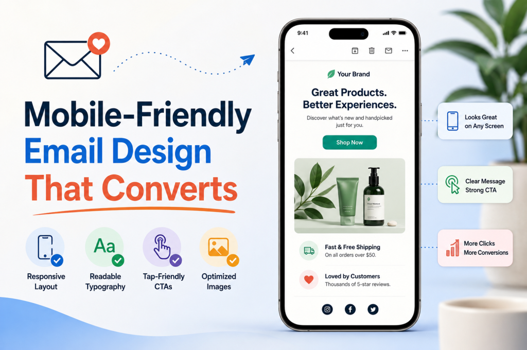
A marketing email has only a few seconds to earn attention on a mobile screen. If the subject line gets the open but the email arrives with tiny text, oversized images, awkward columns or a CTA button that requires surgical precision to tap, that attention disappears just as quickly.
Effective mobile-friendly email design is therefore about much more than shrinking a desktop email until it fits on a phone. It means designing the entire experience around smaller screens, touch interaction, fast scanning and a clear route from inbox to conversion.
The quick version
For mobile-optimized emails that are easy to read and built to convert:
- Design for the smallest screen first rather than treating mobile as an afterthought.
- Favour a clean, single-column layout with an obvious content hierarchy.
- Keep subject lines, preheader text and email copy concise.
- Use readable typography and enough white space to make scanning effortless.
- Make CTA buttons large, prominent and easy to tap.
- Optimise and compress email images to protect loading speed.
- Ensure the destination page works just as well on mobile as the email itself.
- Test email rendering across different devices, screen sizes and email clients.
- Measure clicks and conversions rather than judging success on open rate alone.
The principle is simple: every extra pinch, zoom, scroll, tap or moment of confusion creates another opportunity for the reader to leave.
That matters because the real job of a marketing email isn’t simply to look good. It is to move somebody smoothly from subject line → message → CTA → landing page → conversion.
Why Mobile-First Email Design Matters
Think about the circumstances in which somebody might actually read your email.
They could be standing in a queue. Sitting on a train. Checking their inbox between meetings. Holding a coffee in one hand and their phone in the other.
They’re probably not giving your beautifully crafted campaign their undivided attention.
That changes the rules.
Traditional email design could afford to assume a relatively generous screen and deliberate interaction with a mouse. Mobile email design has to account for narrow displays, fingers instead of cursors and readers who may be scanning rather than reading every word.
This is why a mobile-first mindset is so useful. Instead of designing a large email and asking “How do we make this fit on a phone?”, start with:
“What does the reader actually need to see, understand and do on this screen?”
The difference sounds small. In practice, it influences almost everything: email width, typography, image size, spacing, CTA placement and the amount of copy you can reasonably expect someone to digest.
It’s the same principle that should underpin good website design. Responsive design isn’t simply a technical box to tick. The experience needs to remain intuitive when the available space changes.
Mobile-Friendly and Responsive Aren’t Quite the Same Thing
The terms mobile-friendly email design and responsive email design are sometimes treated as interchangeable, but there is a useful distinction.
A mobile-friendly email is designed to be usable on a smaller screen. A responsive email goes further by allowing elements of the email layout to adapt according to the screen or device displaying it.
That could mean:
- Columns stacking vertically.
- Images resizing within their containers.
- Typography adapting for better legibility.
- Spacing changing at smaller screen sizes.
- CTA buttons becoming easier to tap.
- Certain elements being repositioned or simplified.
A well-built responsive email template therefore gives you flexibility without sacrificing consistency.
The goal isn’t to produce dramatically different emails for every possible device. It’s to create a resilient email layout that still makes sense whether somebody opens it on a large desktop display or a compact smartphone.
Start With One Column and One Clear Story
Complexity becomes expensive when screen space is scarce.
A multi-column desktop layout might appear sophisticated on a monitor, yet collapse into visual clutter when squeezed onto a mobile device. Readers can be left wondering where one section finishes and another begins.
A single-column layout avoids much of that friction.
It naturally guides the eye down the screen:
- Hook — why should I care?
- Value — what’s in this for me?
- Evidence — why should I believe you?
- Action — what should I do next?
This doesn’t mean every email needs to look minimalist or identical. Strong branding, product imagery, illustrations and different content sections can all work brilliantly on mobile.
What matters is the hierarchy.
Give Every Element a Job
One useful test is to look at each element in your mobile email template and ask:
If I removed this, would the reader understand the message or reach the desired action any less effectively?
If the answer is no, the element may simply be taking up valuable screen space.
A clean email layout isn’t empty for the sake of being fashionable. It uses space deliberately.
For example, white space around a CTA makes the action easier to identify. Space between paragraphs improves email readability. Clear separation between content sections helps readers understand the hierarchy without needing borders, boxes and decorative elements everywhere.
The same thinking applies beyond email. Whether traffic originates from organic search, paid advertising or an email campaign, removing unnecessary friction is fundamental to conversion. A well-structured PPC strategy can bring qualified visitors to a page, but confusing design can still lose them once they arrive.
Write for the Thumb and the Scanning Eye
Mobile readers don’t necessarily consume an email from beginning to end.
They scan.
A headline gets noticed. A bold phrase catches the eye. An image provides context. A CTA offers the next step.
Your email copy should accommodate that behaviour rather than fight it.
That means short paragraphs, descriptive headings and concise sentences where possible. Large walls of text make readers work harder to find the point, particularly on narrow screens where an innocent-looking desktop paragraph can suddenly become half a dozen lines long.
Consider the difference:
Desktop-first thinking:
Explain everything, then reveal the action.
Mobile-first thinking:
Establish value quickly, provide enough information to create confidence, then make the next action obvious.
Neither means writing simplistic copy. It means establishing a stronger content hierarchy.
Put the Important Information Early
The upper portion of an email has disproportionate value.
Readers should be able to understand the purpose of the message without an extended scroll through branding, introductory filler or enormous hero imagery.
Try to answer three questions quickly:
- What is this?
- Why should I care?
- What can I do next?
That structure also creates a natural relationship between email marketing and SEO. Both disciplines benefit from clear intent, useful content and an obvious hierarchy rather than padding a page or message simply to make it longer.
The aim is not brevity at any cost. It’s clarity without waste.
Make Typography Work on Small Screens
A beautifully written email isn’t useful if reading it feels like an eye test.
Typography is one of the easiest areas to underestimate when designing on a large monitor. Text that looks perfectly comfortable inside an email builder may feel cramped once viewed on an actual phone.
Good mobile typography depends on more than font size alone.
Consider:
- Font size: body copy should remain comfortably readable without zooming.
- Line height: cramped lines make paragraphs feel denser.
- Line length: narrower measures can make copy easier to follow.
- Contrast: text needs sufficient distinction from its background.
- Hierarchy: headings, subheadings and body text should be immediately distinguishable.
- Font choice: decorative typography can quickly become difficult to read at smaller sizes.
There is also a practical compatibility issue. Email clients don’t behave identically, so elaborate typography choices can introduce unpredictable email rendering.
Use brand fonts thoughtfully, provide sensible fallbacks and always test what recipients actually see.
White Space Is Functional
White space is often described as a visual design choice. On mobile, it’s also an interaction tool.
Enough spacing can prevent two links from becoming difficult to tap independently. It can separate a CTA from surrounding copy. It can make a dense email feel substantially easier to scan.
Compare:
Headline → paragraph → image → paragraph → CTA → footer
with:
Headline
Short supporting message
Image
Clear value proposition
CTA
The second structure gives the eye places to stop.
That breathing room is part of the mobile user experience, not wasted real estate.
Your CTA Has to Survive the Thumb Test
Eventually, the reader reaches the moment that matters.
Shop now. Learn more. Get a quote. Book a consultation. Download the guide.
Whatever the objective, your call-to-action should not require hunting.
Desktop users have the precision of a mouse pointer. Mobile users have a fingertip. That makes touch-friendly design an essential part of conversion optimisation.
A strong mobile CTA should be:
- Large enough to tap comfortably.
- Visually distinct from surrounding elements.
- Separated from competing links.
- Written with specific, action-oriented CTA copy.
- Positioned at a logical decision point.
- Supported by a clear value proposition.
In other words, don’t make readers solve a puzzle before they’re allowed to convert.
And don’t assume that making a button enormous automatically solves the problem. CTA placement matters just as much. A prominent button appearing before the reader understands the offer can feel premature; burying it beneath unnecessary content can mean it is never seen.
The strongest mobile CTA design matches the reader’s decision-making journey: establish relevance, create desire or confidence, then make the desired action effortless.
That is where responsive design begins turning into conversion design.
The Conversion Starts Before the Email Is Opened
Responsive design matters once somebody is inside your email. But before any of that matters, you have to earn the open.
On mobile, the inbox itself is compressed. Your subject line, sender name and preheader text are competing for a small amount of visible space alongside dozens of other messages.
That makes the inbox part of your mobile design.
A subject line shouldn’t try to explain the entire campaign. It needs to create enough relevance, curiosity or value to justify the tap.
Compare:
Our Latest Products and Special Offers Are Available Now
with:
Something new just landed
The first explains more. The second may create a stronger reason to investigate.
There is no universally perfect formula, of course. Audience, offer, brand voice and context all influence performance. That’s precisely why subject line testing can be more useful than following arbitrary character-count rules.
Don’t Waste Your Preheader Text
The preheader is one of the most valuable pieces of inbox real estate — and one of the most frequently neglected.
Think of it as the supporting line to your subject.
If the subject creates interest, the email preheader can provide context.
For example:
Subject: Your weekend plans just changed
Preheader: See what’s waiting inside.
Or:
Subject: Still thinking about it?
Preheader: Here’s another look before it’s gone.
Subject and preheader should work together rather than repeat one another.
Poorly configured campaigns can instead expose whatever text happens to appear first in the email, creating awkward previews filled with navigation labels, image descriptions or instructions such as “view this email in your browser.”
That’s hardly irresistible.
Good preview text optimization treats those first few visible words as part of the campaign itself.
Images Should Support the Message, Not Hold It Hostage
Images can transform an email.
They communicate products instantly, establish atmosphere and help readers understand an offer without reading several paragraphs of explanation.
But there is a catch.
An email that depends entirely on imagery is fragile.
Some recipients may have images disabled. Connections can be slow. Email clients can behave unexpectedly. Oversized assets can increase email load time, while text embedded directly into graphics may become difficult to read on smaller displays.
The goal isn’t fewer images for the sake of it. It’s smarter image optimization.
Build Responsive Images Into the Design
Images need to behave predictably as the available screen width changes.
A hero graphic designed for a large desktop email shouldn’t force a mobile user to scroll horizontally or view an awkwardly cropped version of the original.
Responsive images should scale within their containers while maintaining sensible proportions.
Before adding an image, ask:
- Does this image contribute useful information?
- Will the important detail remain visible on a smaller screen?
- Is text baked into the image unnecessarily?
- Has the file been compressed appropriately?
- What happens if the image doesn’t load at all?
That last question is particularly important.
Alt Text Is More Than a Backup
Useful alt text gives context when imagery isn’t displayed and supports people using screen readers.
Instead of:
image1.jpg
or:
banner
describe the function or meaningful content of the image.
If the image is purely decorative, it shouldn’t create unnecessary noise for assistive technology. If it communicates something essential, that information shouldn’t disappear simply because the recipient can’t see the image.
This is where image accessibility and conversion design intersect.
A message cannot persuade somebody if important information is inaccessible to them.
Compress Without Destroying Quality
High-resolution imagery may look impressive, but unnecessarily heavy files can make an email feel sluggish — particularly when the recipient isn’t sitting on a fast Wi-Fi connection.
Effective image compression reduces file size while retaining enough visual quality for the intended display.
Think in terms of appropriate quality, not maximum quality.
For each asset, consider:
- Its displayed dimensions.
- The level of detail actually required.
- The most appropriate image format.
- Compression level.
- Whether a smaller mobile-specific treatment would work better.
- Whether the asset is essential in the first place.
A fast-loading email feels effortless.
A slow one creates friction before the reader has even reached the offer.
Accessibility Makes Better Emails for Everyone
Accessibility is sometimes treated as a specialist requirement added at the end of the design process.
It shouldn’t be.
Many email accessibility practices simply make messages easier for everybody to use.
Readable typography helps someone with impaired vision, but it also helps the commuter glancing at their phone in bright sunlight.
Strong color contrast can improve accessibility while also making a CTA easier to identify.
Logical heading structure supports assistive technology while making the email more scannable for everyone else.
Generous tap targets help people with motor impairments while also helping anyone trying to use a phone one-handed.
Accessibility and email usability are deeply connected.
Build for More Than One Kind of Reader
An accessible email should consider:
- Clear heading hierarchy.
- Logical reading order.
- Descriptive link text.
- Meaningful alt text.
- Sufficient color contrast.
- Legible typography.
- Buttons that remain understandable without relying solely on color.
- Comfortable touch targets.
- Content that makes sense when images are unavailable.
- Sensible treatment for screen readers.
This doesn’t mean stripping personality from your emails.
Accessible design can still be bold, distinctive and unmistakably branded.
The constraint is simply that visual creativity shouldn’t make the message harder to understand or interact with.
Good accessibility removes barriers. Good conversion design removes friction. Often, they are solving the same problem.
Design for Fingers, Not Mouse Pointers
A text link can be easy to click with a cursor and surprisingly frustrating to tap with a thumb.
This is why tappable elements deserve deliberate attention.
Buttons need enough height and width to create comfortable touch targets, while links placed close together need enough separation to reduce accidental taps.
Think about somebody holding a phone naturally rather than carefully operating it with two hands.
Would your CTA still be easy to reach?
Could they accidentally hit the link beneath it?
Would they know immediately that the element is interactive?
These questions make touch-friendly email design practical rather than theoretical.
A thumb-friendly CTA should look like an action, behave like an action and clearly explain what happens next.
“Click here” wastes that opportunity.
“View the collection”, “Get your quote”, “Download the guide” or “See the details” communicates far more.
The button itself becomes part of the message.
Don’t Forget Dark Mode
Your email isn’t always going to be viewed against the background you designed.
Dark mode can alter backgrounds, text colors, logos, icons and other visual elements depending on the device and email client.
An email that appears polished in a standard preview can suddenly reveal invisible logos, low-contrast text or strange blocks around transparent imagery when dark mode is enabled.
That’s why dark mode email design deserves consideration during production rather than after a problem appears.
Pay particular attention to:
- Transparent logos.
- Icons with dark details.
- Background and foreground contrast.
- Text placed inside images.
- Borders that may disappear.
- Brand colors that behave differently against darker backgrounds.
Perfect visual consistency across every email client may not always be realistic.
Usability is the priority.
Your email should remain recognisable, readable and actionable even when the recipient’s settings alter its appearance.
The Email Isn’t the Conversion — It’s the Bridge
This is where mobile email optimisation is often misunderstood.
Imagine you’ve done everything right.
The subject line earns the open.
The responsive email design looks excellent.
The email copy makes a persuasive case.
The reader taps your perfectly positioned CTA button.
And then…
…they arrive on a landing page designed almost entirely for desktop.
Tiny navigation. Slow-loading images. An intrusive pop-up. A form with fifteen fields. Buttons hiding below oversized banners.
Your email did its job.
The journey didn’t.
Think Beyond the Inbox
If conversion is the objective, the complete journey looks more like this:
Inbox → Open → Message → CTA → Mobile landing page → Action → Conversion
Every stage influences the next.
This is why the post-click experience belongs in a conversation about mobile email design.
The visual and messaging relationship between the email and destination page should feel continuous. If an email promotes a particular offer, clicking the CTA shouldn’t send somebody to a generic homepage and leave them searching for it.
Maintain:
- The same core message.
- Recognisable imagery or branding.
- Consistent offer details.
- A clear primary action.
- Mobile-friendly navigation.
- Fast page loading.
- Minimal unnecessary friction.
This landing page consistency reassures the visitor that they’ve arrived in the right place.
Reduce the Distance Between Interest and Action
Every unnecessary step increases the possibility of abandonment.
Suppose an email promotes a particular service. The CTA could lead directly to a relevant page where the user can understand the offer and take the next step.
Or it could lead to the homepage, forcing the visitor to open a menu, find the right category, locate the service and rediscover the information that originally persuaded them to click.
One journey maintains momentum.
The other spends it.
That’s the essence of friction reduction.
Mobile email conversion optimization isn’t only about improving the button people tap. It’s about reducing the effort required after they tap it.
One Email, Many Email Clients
Designing an email is unusual because you don’t have complete control over where your work will be displayed.
Recipients might open it through Gmail, Apple Mail, Outlook or another email provider. They might use a browser, smartphone app, tablet or desktop application.
Those environments don’t always interpret email code identically.
A perfectly rendered design in one client may develop spacing problems in another. Fonts can fall back. Images can resize unexpectedly. Dark mode can alter colors. Layouts can behave differently.
This makes email client compatibility a fundamental part of responsive email production.
Previewing Isn’t Testing
An email builder’s preview is useful.
It isn’t enough.
Proper email testing means examining what happens in real-world conditions and across the devices and clients that matter to your audience.
Before sending an important campaign, check:
- Subject line and preheader.
- Desktop and mobile layouts.
- Image loading and scaling.
- Alt text.
- Button appearance.
- Every link and CTA.
- Personalization and merge tags.
- Dark-mode behaviour.
- Reading order.
- Email rendering in important clients.
- The destination page after each click.
Send yourself a test email too.
Actually open it on a phone.
Scroll through it.
Tap the buttons.
Try to experience the campaign as a recipient rather than its creator.
You’ll often notice things that weren’t obvious inside the editor.
Responsive Design Should Adapt, Not Merely Shrink
A common mistake in mobile email optimization is assuming that responsiveness means making everything smaller.
Sometimes the opposite is required.
Text may need to become larger.
Buttons may need more padding.
Columns may need to stack.
Spacing may need to increase.
Navigation may need to disappear altogether.
The purpose of a responsive layout is to preserve usability as conditions change — not to create a miniature replica of the desktop version.
This is why a mobile-first approach can simplify decision-making.
Start with the constraints.
Decide what information genuinely deserves the limited space available.
Then enhance the experience as the screen becomes larger.
The result is usually cleaner because you’re designing around priorities rather than trying to preserve every desktop element at all costs.
Personalization Has to Earn Its Place
Personalization can make email campaigns more relevant, but inserting a first name into the opening line isn’t automatically meaningful.
Effective email personalization changes the experience based on something useful: interests, behaviour, previous interactions, customer stage or context.
That might mean showing different content to different audience segments, adjusting an offer based on previous engagement or sending people towards the most relevant next step.
This is where dynamic content can become particularly powerful.
But personalization also creates another layer of testing.
Merge tags fail.
Data can be incomplete.
Fallback values can look awkward.
Dynamic modules can introduce unexpected layout changes.
So personalization should never come at the expense of clarity or reliability.
A simple, relevant message will usually outperform an elaborate “personalized” experience that feels forced or breaks on the recipient’s screen.
Measure What Happens After the Open
Open rate is tempting because it’s immediate.
You send an email. People open it. The number goes up.
Success?
Not necessarily.
If the objective was a sale, enquiry, booking or download, the open was only an intermediate step.
A campaign can achieve an impressive open rate and still produce disappointing business results.
That’s why meaningful analysis needs to look further down the funnel.
Consider:
- Click-through rate — did the email generate interaction?
- Unique clicks — how many recipients actually engaged?
- CTA performance — which actions attracted attention?
- Landing-page behaviour — what happened after the click?
- Conversion rate — how many recipients completed the desired action?
- Revenue or lead value — what did those conversions actually produce?
The most useful metric depends on the campaign objective.
For a newsletter, meaningful engagement might be the priority.
For an ecommerce promotion, purchase conversion may matter more.
For a service business, the important result could be an enquiry or booked consultation.
This is the difference between measuring email engagement and understanding commercial performance.
A good-looking email is nice.
A good-looking email that reliably moves the right people towards action is much more valuable.
Test Decisions, Not Just Designs
Once an email looks good on mobile, the next temptation is to declare it finished.
Don’t.
A polished design tells you that the email works. It doesn’t tell you whether it works as well as it could.
That’s where A/B testing becomes useful.
Instead of relying on preference — I think this headline sounds better, I prefer the blue button, this hero image feels stronger — testing lets actual recipient behaviour inform future decisions.
The key is to test with purpose.
Changing five things at once might produce a different result, but it won’t necessarily tell you why the result changed.
Start With High-Impact Variables
Some elements have a much greater opportunity to influence performance than others.
Good candidates for testing include:
- Subject line.
- Preheader text.
- Email headline.
- Value proposition.
- CTA copy.
- CTA placement.
- Primary CTA prominence.
- Hero imagery.
- Amount of email copy.
- Personalization.
- Offer presentation.
- Landing-page destination.
A subject line test, for example, can help determine which message earns attention in the inbox.
A CTA test can explore what happens once that attention has been earned.
Those are two very different questions.
If version A generates more opens but version B generates more conversions, which one wins?
The answer depends on the objective.
That’s why every experiment should begin with a clear hypothesis and a meaningful success metric.
Don’t test because you can. Test because there is something worth learning.
Small Changes Can Reveal Big Behavioural Differences
Consider two CTA buttons:
Learn More
and:
See How It Works
The difference looks tiny.
But the second tells the reader more about what will happen after the tap.
Or compare:
Get Started
with:
Get My Free Quote
Again, the design may be identical. The expectation isn’t.
Good CTA testing explores the relationship between wording, context and intent rather than endlessly experimenting with cosmetic changes.
The same applies to CTA placement.
A button near the beginning of an email may work brilliantly when the audience already understands the offer. A more considered purchase may require supporting information before the reader is ready to act.
Test behaviour, not assumptions.
Track the Journey From Email to Conversion
Clicks tell you that somebody left the email.
They don’t automatically tell you what happened next.
If the campaign exists to generate revenue, enquiries, registrations or another meaningful outcome, conversion tracking needs to extend beyond the inbox.
That means understanding the journey from the email campaign through to the destination page and eventual action.
At a basic level, you want to be able to answer:
- Which campaign generated the visit?
- Which link or CTA was used?
- What did the visitor do after arriving?
- Did they complete the intended conversion?
- What was that conversion worth?
This is where appropriate UTM tracking and analytics become valuable.
Consistent campaign parameters can help distinguish traffic generated by different emails, links and campaign variations. That becomes particularly useful when multiple CTA buttons point towards the same destination.
Without sensible tracking, an email can generate activity without giving you enough information to learn from it.
Don’t Let Measurement Damage the Experience
Tracking should help you understand the customer journey, not make that journey worse.
Long, messy URLs shouldn’t appear visibly in the email when descriptive anchor text or a clear CTA button would make more sense.
Likewise, analytics shouldn’t distract from the fundamental question:
Did the email help the recipient take a useful next step?
Data is most valuable when it improves future decisions.
If a campaign receives plenty of opens but few clicks, investigate the message and offer.
If clicks are healthy but conversions are poor, examine the landing page and post-click experience.
If a CTA near the bottom consistently attracts little interaction, consider whether readers are reaching it at all.
Look for the point where momentum disappears.
That’s where your next optimization opportunity probably lives.
Don’t Ignore Email Deliverability
There is one performance problem even the best responsive template can’t overcome:
The email never reaches the inbox.
Email deliverability sits slightly outside visual design, but it has an obvious relationship with campaign performance. You cannot generate clicks or conversions from messages recipients never see.
Healthy email marketing therefore requires more than attractive templates.
List quality, sending practices, authentication, relevance and recipient engagement can all influence overall results.
It is also worth resisting design decisions that make legitimate emails feel suspicious or low quality.
An email overloaded with aggressive messaging, excessive links, unclear sender information or poor formatting may undermine trust before the recipient has considered the offer.
Design for humans first.
Trust Is a Conversion Element
Mobile users make rapid judgements.
Does the sender look familiar?
Does the email feel consistent with the brand?
Is the offer clear?
Does the CTA destination make sense?
Can I understand why I’ve received this message?
Those questions influence whether somebody feels comfortable tapping a button.
Brand consistency, clear language and transparent expectations aren’t decorative details. They’re part of the conversion experience.
If your CTA says View Pricing, for example, the destination shouldn’t unexpectedly demand personal details before showing any pricing.
If it says Download the Guide, make the download straightforward.
Micro-promises matter.
Every accurate expectation builds confidence. Every misleading one spends it.
Common Mobile Email Design Mistakes
Most poor mobile experiences aren’t caused by one catastrophic design decision.
They’re usually the accumulation of small annoyances.
Tiny text.
Crowded links.
Huge images.
Too many competing CTAs.
An unclear opening.
A slow landing page.
Individually, each issue might seem tolerable. Together, they create friction.
Here are some of the most common problems worth eliminating.
1. Designing Desktop First and Squeezing It Down
This is perhaps the fundamental mistake.
A complicated desktop email gets built first. Mobile is considered afterwards, when the team tries to preserve every section within a fraction of the original width.
The result can technically be responsive while still feeling awkward.
A genuine mobile-first email design process reverses that logic.
Start with essential content and actions. Build the smallest useful experience. Then enhance it for larger screens.
2. Trying to Say Everything
Your email does not need to contain the entire website.
Nor does every campaign need five offers, six articles, three products, four buttons and an autobiography from the founder.
More choice isn’t always more persuasive.
When conversion matters, establish a clear primary objective and build the email layout around it.
Secondary information can still exist, but it shouldn’t compete equally with the action you most want readers to take.
3. Making Buttons Difficult to Tap
A CTA can be visually attractive and still fail the thumb test.
Watch for:
- Buttons that are too small.
- Multiple links positioned too close together.
- CTAs surrounded by clutter.
- Low color contrast.
- Vague CTA copy.
- Buttons that don’t look interactive.
- Important actions hidden at the end of long emails.
Thumb-friendly buttons aren’t simply an accessibility consideration. They’re basic mobile usability.
4. Using Images for Essential Text
Putting headlines, offer details or important instructions exclusively inside images creates several problems.
The text may scale poorly.
It may be difficult for screen readers to interpret.
It can disappear when images aren’t displayed.
It may also become uncomfortable to read on smaller devices.
Where possible, important copy should exist as actual text.
Let images strengthen the communication rather than carry the entire message.
5. Forgetting the Preheader
You carefully write a subject line and then allow the inbox to pull in:
“Having trouble viewing this email?”
That’s a missed opportunity.
The preheader text should complement the subject line and help earn the open.
Treat it as copy, not technical debris.
6. Assuming One Preview Represents Every Inbox
It doesn’t.
Differences between email clients, operating systems, apps and device settings can alter the finished result.
Cross-client email testing is particularly important when campaigns use more complex HTML, custom typography, unusual layouts or dark-mode treatments.
A template that worked last year shouldn’t automatically escape testing either.
Software changes.
Templates change.
Content changes.
Test the actual campaign you’re sending.
7. Sending Every CTA to the Homepage
The homepage is rarely the best answer to every click.
If somebody taps a button about a specific service, product, offer or piece of content, send them somewhere relevant.
A focused mobile landing page reduces the work required after the click and protects the momentum created by the email.
Remember:
Email → CTA → destination → action
Each transition should feel obvious.
8. Judging Success by Opens Alone
Opens can provide useful context, but they’re not the whole story.
A campaign designed to generate enquiries should ultimately be evaluated against enquiries.
A sales campaign should connect performance with sales.
A content email may care more about readership and meaningful clicks.
Match the metric to the objective.
Otherwise, it’s easy to optimize for activity rather than outcomes.
A Practical Mobile Email Checklist Before You Hit Send
The final few minutes before sending a campaign are often when mistakes become expensive.
Use this checklist as a last line of defence.
Inbox
- Is the sender name immediately recognisable?
- Is the subject line clear and compelling?
- Does the preheader add something rather than repeat the subject?
- Does the inbox preview make sense on mobile?
Layout and Copy
- Is the email easy to understand from the opening screen?
- Is there a clear content hierarchy?
- Does the layout work comfortably in a single column where appropriate?
- Are paragraphs concise and scannable?
- Is typography comfortably readable without zooming?
- Is there enough white space between important elements?
Images and Performance
- Have large email images been appropriately compressed?
- Do responsive images resize correctly?
- Is important information available without relying exclusively on images?
- Does meaningful imagery have useful alt text?
- Does the email load comfortably on a mobile connection?
Accessibility and Mobile UX
- Is text sufficiently legible?
- Is color contrast appropriate?
- Are links descriptive?
- Are touch targets comfortably separated?
- Can CTA buttons be easily tapped with a thumb?
- Does the reading order make sense?
- Have important accessibility considerations been checked?
CTA and Conversion
- Is there an obvious primary CTA?
- Does the CTA copy explain the next step?
- Is the CTA positioned where the reader is likely to be ready for it?
- Do competing links distract from the primary action?
- Does every CTA lead to the correct destination?
- Is the destination mobile-friendly?
- Is the offer consistent between the email and landing page?
Testing
- Have you sent a real test email?
- Have you opened it on an actual smartphone?
- Have important email clients been checked?
- Have light and dark-mode behaviours been considered?
- Have all links been tapped and verified?
- Are personalization fields and merge tags working?
- Is conversion tracking configured correctly?
That might look like a long list.
In practice, much of it becomes routine.
And that’s exactly what you want.
The fundamentals of email design best practices shouldn’t require reinvention for every campaign. Build them into your templates, processes and quality assurance so your attention can move towards the parts that genuinely need creative thought.
Build a Mobile Email System, Not a One-Off Template
The strongest approach to email marketing isn’t to create a completely new design every time somebody needs to send a campaign.
Build a system.
Create reusable components that have already been designed and tested for different screen sizes and common email clients.
For example:
- Header modules.
- Text sections.
- Hero sections.
- Image-and-copy blocks.
- Product or service cards.
- Testimonials.
- Primary CTA blocks.
- Secondary CTA treatments.
- Footer content.
Once these components have been tested for email rendering, accessibility and mobile usability, campaigns become faster to produce and more consistent.
That doesn’t mean every email should look the same.
Think of it as having reliable building blocks.
Your team can rearrange them, change imagery, adapt messaging and alter the campaign structure without rebuilding fundamental responsive behaviour every time.
Establish Rules for the Things That Matter
A simple internal email design system could define standards for:
| Element | Mobile-first rule |
|---|---|
| Layout | Prioritise a clear, narrow content flow |
| Body copy | Readable without pinch-to-zoom |
| Paragraphs | Short and easily scannable |
| Images | Responsive and appropriately compressed |
| Primary CTA | Prominent, descriptive and touch-friendly |
| Links | Clearly distinguishable and comfortably spaced |
| Preheader | Written deliberately for every campaign |
| Accessibility | Considered during design, not afterwards |
| Landing pages | Relevant, fast and mobile-friendly |
| Testing | Completed before every major send |
These standards remove unnecessary decisions.
Instead of debating basic usability campaign after campaign, you can concentrate on the offer, creative concept, segmentation and message.
Optimize the Whole Conversion Funnel
There is a danger in becoming too obsessed with individual metrics.
Higher open rates sound good.
Higher click-through rates sound good.
Higher landing-page engagement sounds good.
But none of those numbers exists independently.
Imagine campaign A receives fewer clicks than campaign B, but the people who click campaign A convert at twice the rate.
Which campaign performed better?
You need the commercial context to know.
This is why email CRO should consider the complete conversion funnel rather than treating each metric as an isolated score.
Look at the relationships:
Delivered → Opened → Clicked → Landed → Converted
Where does the biggest drop occur?
If delivery is poor, investigate deliverability.
If opens are weak, examine the sender, subject line, relevance and timing.
If people open but don’t click, examine the offer, copy, layout and CTA.
If they click but don’t convert, investigate the destination page, message consistency, usability and conversion process.
Optimization becomes much more useful when you’re diagnosing a journey rather than chasing percentages.
Mobile-Friendly Email Design That Converts: The Final Principle
The best mobile emails rarely feel complicated.
That’s the point.
The reader doesn’t notice the responsive HTML email behaving correctly.
They don’t congratulate you on your image compression.
They don’t admire the carefully calculated touch target surrounding the CTA button.
They simply understand the message.
They can read it.
They can navigate it.
They know what to do next.
And when they decide to act, nothing gets in their way.
That apparent simplicity usually comes from a considerable amount of thought behind the scenes: responsive email design, content hierarchy, accessibility, image optimization, testing, landing-page consistency and conversion tracking all working together.
So don’t approach mobile email optimization as an exercise in making desktop emails smaller.
Design around the actual circumstances of the reader.
Start with the smallest screen.
Prioritise what matters.
Write for scanning.
Make actions easy to tap.
Keep images lightweight.
Test across real devices and email clients.
Continue optimizing after the click.
And measure success against the outcome the campaign was actually created to produce.
Because the ultimate test of a mobile email isn’t whether it looks beautiful in the editor.
It’s whether the person holding the phone can move from attention to understanding to action without friction.
Get that journey right, and mobile-friendly design stops being merely a formatting requirement.
It becomes part of what makes the email convert.
Frequently Asked Questions About Mobile-Friendly Email Design
1. What is the ideal width for a mobile-friendly email?
There isn’t one email width that will be perfect for every device, which is why responsive email design is more important than designing around a single screen size.
For desktop email, a content container around 600px wide has traditionally been common. On mobile devices, however, the email should adapt to the available viewport rather than force the recipient to view a fixed-width desktop layout.
A responsive HTML email can use fluid widths, appropriately sized containers and media queries where supported so that content scales or rearranges on smaller screens. The practical goal is simple: recipients shouldn’t need to pinch, zoom or scroll horizontally to understand the message.
2. How long should a mobile marketing email be?
There is no universal word count or pixel length that guarantees better conversions.
The right length depends on the complexity of the offer, the reader’s familiarity with it and how much information they reasonably need before taking action.
A promotional offer might require only a headline, a few lines of concise email copy, an image and a prominent CTA. A more considered service or proposition may require supporting benefits, proof and additional explanation.
Instead of asking “How short can we make this email?”, ask:
“What does the reader need to know before they’re comfortable taking the next step?”
Then remove anything that doesn’t contribute to that decision.
3. Should mobile emails include a navigation menu?
Usually, less navigation is better when an email has a specific conversion objective.
Replicating an entire website navigation bar can introduce numerous small links and competing choices at the exact moment you’re trying to guide the reader towards one primary action. Those links can also be frustrating to use on smaller screens if the touch targets are too close together.
For conversion-focused campaigns, consider simplifying the navigation dramatically or removing it altogether when it doesn’t serve the email’s objective.
The email isn’t your website. It doesn’t need to provide access to everything.
4. How many CTA buttons should a mobile email have?
There is no fixed maximum, but there should usually be an obvious primary CTA.
Longer emails can repeat the same call-to-action at sensible points so readers don’t have to scroll backwards after deciding to act. That’s different from presenting several unrelated actions with equal visual prominence.
For example, repeating “Get a Quote” near the middle and end of a longer email can reinforce one conversion goal.
Presenting “Get a Quote”, “Read Our Blog”, “Follow Us”, “View Services”, “Download This Guide” and “Contact Us” with equal emphasis creates competing decisions.
The number of buttons matters less than the clarity of the CTA hierarchy.
5. Should mobile emails use animated GIFs or video?
They can, but only when the creative element improves communication rather than existing purely for novelty.
Animated GIFs can demonstrate a feature, reveal several products or attract attention to an important message. However, large animations can increase file size and affect email load speed, while support and behaviour can vary between email clients.
Embedded video presents additional compatibility challenges, so a thumbnail or static image linking to a mobile-friendly video page can sometimes provide a more reliable experience.
Always provide a sensible fallback and make sure the message still works if the animation or video doesn’t behave as expected.
6. Do mobile-friendly emails improve conversion rates?
They can, but responsive design alone doesn’t guarantee a higher email conversion rate.
Mobile-friendly design removes usability barriers: unreadable text, awkward layouts, difficult-to-tap buttons, oversized images and other sources of friction. That gives recipients a better opportunity to understand and act on the offer.
Conversion still depends on factors including audience quality, relevance, timing, proposition, price, trust, email copy and the post-click experience.
Think of mobile optimization as removing reasons not to convert. The offer and marketing still need to provide the reasons to convert.
7. Is plain-text email better than designed HTML email on mobile?
Neither format automatically wins.
Plain-text-style emails can feel personal, load quickly and remove visual distractions. Designed HTML emails can communicate products visually, establish stronger branding and create a clearer content hierarchy.
The better choice depends on what you’re trying to achieve.
A personal outreach campaign may benefit from a stripped-back approach. A product launch may rely much more heavily on imagery and visual presentation.
There is also plenty of room between the extremes. A lightweight responsive HTML email can look simple while still providing structured typography, accessible links, tracking and touch-friendly CTA buttons.
Choose the format that best serves the message rather than assuming more design — or less design — automatically means more conversions.
8. How can I stop my marketing emails being clipped in Gmail?
Email clipping can occur when an HTML email becomes too large, causing Gmail to truncate the message and display a prompt to view the rest.
This is another reason to favour lightweight email design.
Avoid unnecessarily bloated HTML, redundant styling, excessive modules and overly complicated templates. Repeatedly editing or forwarding test emails can also make testing misleading because additional content may become attached to the message.
Remember that HTML email size is different from the file sizes of remotely hosted images. Optimizing both is useful, but they solve different performance problems.
If Gmail clipping regularly affects your campaigns, inspect the actual HTML being sent rather than simply reducing the dimensions of your images.
9. How often should mobile email templates be updated?
A responsive email template shouldn’t be considered permanently finished.
You don’t need to redesign it every few weeks, but it should be reviewed periodically and whenever there are meaningful changes to your branding, email platform, content requirements or audience behaviour.
Pay attention to changes in:
- The devices and email clients your subscribers use.
- Email rendering behaviour.
- Dark-mode compatibility.
- Accessibility expectations.
- Brand design.
- CTA performance.
- Engagement and conversion data.
- The types of campaigns you’re sending.
Your own analytics should help determine when changes are justified.
If a template is reliable, accessible and performing well, don’t redesign it merely for the sake of novelty. If evidence shows recipients are encountering friction, that’s a reason to improve it.
10. What’s the biggest factor in creating mobile-friendly emails that convert?
Clarity.
A recipient should quickly understand what the email is about, why it matters and what they’re expected to do next.
Responsive layouts, optimized images, readable typography, accessible design, personalization, thumb-friendly CTA buttons and cross-client testing all contribute to that experience. But none can rescue a message that leaves the reader confused.
Before sending any campaign, view it on a phone and ask:
- Do I immediately understand the message?
- Is there a compelling reason for me to care?
- Is the next action obvious?
- Can I take that action comfortably?
- Does the experience remain straightforward after I tap?
If the answer to all five is yes, you’ve addressed much of what mobile-friendly email design that converts is ultimately trying to achieve.