
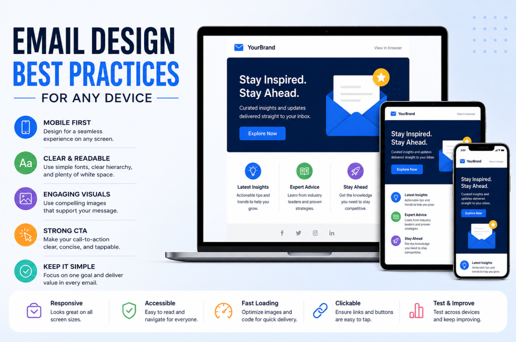
In brief: A great marketing email shouldn’t merely fit on a phone. It should remain clear, attractive, fast and easy to act on whether somebody opens it on a smartphone, tablet, laptop or desktop. That means building around responsive layouts, sensible content widths, readable typography, flexible images, obvious calls to action and robust HTML rather than designing one desktop email and hoping it shrinks gracefully. Start with the smallest screen, establish a strong visual hierarchy, keep layouts simple, and allow the design to adapt rather than forcing every device to display an identical composition.
The principle to remember: Don’t design an email for a particular screen. Design a hierarchy of information that can adapt to the screen it’s given.
Email has a peculiar job.
A website can usually count on a modern browser. An email has to walk into Gmail, Outlook, Apple Mail and countless combinations of apps, operating systems, screen sizes and settings—and somehow emerge looking like itself.
That is why good email design is less about creating a beautiful rectangle and more about creating a flexible system.
The best responsive emails don’t draw attention to their responsiveness. On a 27-inch monitor, they feel comfortably proportioned. Open the same message on a phone and the text remains readable, images behave themselves, columns stack logically and the CTA button is waiting exactly where a thumb expects to find it.
Nothing feels squeezed. Nothing needs pinching and zooming. Nothing important disappears off the side of the screen.
Getting there begins long before you start worrying about CSS.
Why Designing for “Any Device” Is Harder Than It Sounds
There was a time when an email designer could concentrate heavily on desktop dimensions. That approach no longer makes much sense.
Your recipient might read an email on a phone while waiting for a train, reopen it on a work laptop and return to it later on a tablet. Each screen changes the space available to the design, but the user’s objective doesn’t necessarily change with it.
They still need to understand:
- who the message is from;
- why it matters;
- what the main offer or information is;
- what they should do next; and
- how to take that action without fighting the interface.
This is where cross-device email design becomes important. The aim isn’t to make an email look pixel-for-pixel identical everywhere. In fact, pursuing perfect visual uniformity can work against usability.
The objective is email rendering consistency where it matters: branding, meaning, hierarchy, readability and functionality.
Think of it in much the same way you would approach good website design. A page viewed on a desktop has room to breathe horizontally. A smartphone doesn’t. Responsive design acknowledges that difference and reorganises the experience instead of simply miniaturising it.
Email needs the same discipline—with the added complication that email clients don’t all interpret HTML and CSS in the same way.
Responsive Email Design Starts With Hierarchy, Not Code
It is tempting to begin with technical questions.
What breakpoint should we use? Do we need CSS media queries? What should the max-width be? How will Outlook handle the layout?
Those questions matter. We’ll get to them.
But first ask a more important one:
If somebody gives this email three seconds of attention, what must they notice?
That answer should determine the design.
A useful content hierarchy might look something like this:
- Brand recognition — the recipient immediately understands who is speaking.
- Primary message — a headline communicates the reason for the email.
- Supporting context — concise email copy provides enough information to make a decision.
- Visual evidence — imagery supports rather than overwhelms the message.
- Primary action — a prominent CTA makes the next step unmistakable.
- Secondary information — useful detail appears without competing with the main objective.
This hierarchy is especially important for mobile-first email design because a small screen exposes weak prioritisation very quickly.
A sprawling desktop composition can disguise an overloaded message. A smartphone can’t.
If your recipient has to scroll through a giant banner, three introductory paragraphs, several competing offers and a row of tiny links before discovering what the email actually wants them to do, responsive CSS isn’t going to rescue the experience.
Responsive design can reorganise content. It cannot decide which content deserved to be there in the first place.
That distinction matters commercially, too. Whether an email is supporting organic traffic, nurturing a lead generated through SEO or following up with somebody who arrived through a paid campaign, the email user experience should make the next action easier—not introduce another obstacle between interest and conversion.
Mobile-First Doesn’t Mean Mobile-Only
One of the easiest mistakes is treating mobile-friendly email design as shorthand for “make everything big and stack it into one column.”
Sometimes that’s exactly the right answer.
Sometimes it isn’t.
Mobile-first means beginning with the most constrained environment and making deliberate decisions about what deserves space. You can then progressively enhance the experience as more screen real estate becomes available.
That is different from ignoring desktop email design.
A message that looks excellent at 375 pixels wide but strangely sparse on a large monitor hasn’t solved the entire problem. Equally, an elaborate multi-column email layout that looks beautiful at 1,440 pixels but becomes microscopic on a phone hasn’t solved it either.
The sweet spot is an adaptive visual system.
Think in behaviours, not screenshots
Instead of specifying only how an email should look, define how each component should behave.
For example:
| Component | Wider screen | Smaller screen |
|---|---|---|
| Main container | Centred with controlled width | Uses available screen width |
| Two-column section | Content sits side by side | Columns stack vertically |
| Hero image | Scales within container | Scales fluidly to screen |
| Navigation | Full set of links where appropriate | Reduced or simplified |
| Body copy | Comfortable line length | Readable without zooming |
| CTA buttons | Clear and prominent | Large, touch-friendly buttons |
| Spacing | Generous | Reduced carefully, not eliminated |
This way of thinking is more durable because there is no single “mobile” size.
Phones differ. Tablets differ. Desktop windows are resized. Users change text settings. Some people use portrait orientation; others landscape. Screen-size optimization therefore needs to account for a range of conditions rather than one fashionable handset.
That is why device-agnostic email design is a more useful long-term ambition than designing around a list of specific devices.
Choose an Email Layout That Can Bend Without Breaking
Complexity is expensive in email.
Every extra column, overlap, unusual alignment or decorative flourish introduces another opportunity for an email client to interpret the design differently.
This doesn’t mean every campaign should be visually dull. It means the underlying email layout should have a clear structure.
For many campaigns, a single-column layout remains remarkably effective:
Logo
↓
Hero / Headline
↓
Supporting Copy
↓
Primary CTA
↓
Supporting Content
↓
Secondary CTA
↓
Footer
There’s a reason this pattern survives.
It creates a natural reading order. It adapts readily to smaller screens. It gives images predictable boundaries. It makes email accessibility easier to manage. And it reduces the gymnastics required to transform a desktop composition into a usable mobile email layout.
A single column isn’t mandatory, though.
A multi-column email layout can work particularly well for product comparisons, related articles, features or paired image-and-copy modules. The crucial question is what happens when horizontal space disappears.
Plan column stacking before designing the columns
Suppose you create a two-column section:
Desktop:
[ IMAGE ] [ COPY + CTA ]On a narrow screen, it might become:
[ IMAGE ]
[ COPY ]
[ CTA ]
Straightforward.
Now imagine three alternating sections:
[ IMAGE ] [ COPY  ]
[ COPY  ] [ IMAGE ]
[ IMAGE ] [ COPY  ]
Without thinking about column stacking and reading order during development, the mobile version can easily become:
[ IMAGE ]
[ COPY  ]
[ COPY  ]
[ IMAGE ]
[ IMAGE ]
[ COPY  ]
The carefully alternating desktop composition suddenly creates an awkward sequence on mobile.
Responsive email design therefore begins at the wireframe stage. Decide what stacks, what moves, what disappears and—most importantly—what order makes sense when every module is presented vertically.
This is where module stacking becomes more than a technical behaviour. It becomes part of the storytelling.
How Wide Should an Email Be?
There is no magical email template width that guarantees perfect rendering everywhere, but restraint is useful.
A desktop email doesn’t need to stretch from one edge of a large monitor to the other. Extremely long lines become tiring to read, visual hierarchy weakens and imagery can become unnecessarily large.
This is why traditional HTML email design often works with a constrained central container, with 600px email width frequently used as a familiar reference point.
Treat that as a convention, not a law.
What matters is the relationship between:
- the maximum content width;
- available viewport width;
- internal padding;
- image dimensions;
- line length; and
- the behaviour of the container below its maximum width.
A robust responsive email layout might have a controlled maximum width on larger screens but become fluid as the viewport narrows.
Conceptually:
.email-container {
    width: 100%;
    max-width: 600px;
}
Real-world responsive HTML email is more complicated because email client compatibility often requires table-based structures, inline styles and fallbacks. Still, the principle is useful: set a sensible ceiling without forcing a fixed width when the screen is smaller than the email.
This combination of controlled and fluid sizing is central to fluid email layout and hybrid email design.
Give Small Screens Space to Work
Reducing an email’s width doesn’t automatically make it mobile friendly.
Spacing has to adapt as well.
Consider a desktop card with 40 pixels of padding on either side. On a 600-pixel-wide container, that’s comfortable. Transfer the same proportions carelessly to a narrow screen and valuable room disappears.
The opposite extreme is just as problematic. Removing most padding to “save space” can leave text, images and CTA buttons crowded against one another.
Good email spacing creates separation without waste.
Use white space to indicate relationships:
- keep a headline relatively close to the copy it introduces;
- create more separation before a new content section;
- leave enough room around CTA buttons to make them distinct;
- prevent text from touching the edge of the viewport;
- give images enough breathing room to feel intentional.
White space is functional. It tells the eye which elements belong together and which don’t.
On mobile, where users often scan rather than read linearly, that visual organisation becomes particularly valuable.
Typography Has to Survive the Smallest Screen
Beautiful typography that requires zooming isn’t beautiful typography.
For mobile typography, readability should outrank novelty. That means selecting typefaces carefully, establishing obvious differences between headings and body copy, maintaining adequate line spacing and using a readable font size from the outset.
There is also the reality of email client support.
Custom fonts can enhance brand consistency, but they aren’t universally supported. A thoughtful email therefore specifies sensible web-safe fonts or fallback typefaces so that the message remains coherent when the preferred font doesn’t load.
The goal isn’t simply “large text.”
You need contrast between levels:
Headline
Immediately communicates the core proposition.
Supporting heading
Introduces a distinct idea without competing with the headline.
Body copy explains what the recipient needs to know in short, readable sections.
CTA copy tells them precisely what happens next.
Strong typography creates visual hierarchy before the recipient has consciously read a word.
And on mobile, that hierarchy is invaluable.
Make the copy scannable, too
Email design and email copy aren’t separate disciplines.
Dense copy makes a spacious design feel cramped. Concise copy can make even a relatively information-rich email feel manageable.
Aim for:
- short paragraphs;
- meaningful headings;
- direct sentences;
- useful lists where information genuinely belongs in a list;
- emphasis on important phrases rather than entire paragraphs; and
- one clear purpose for each content block.
This becomes particularly important when email is part of a wider acquisition journey. A person arriving through PPC may already have seen an advert, visited a landing page and completed an action before receiving your email. Repeating everything they’ve already encountered wastes attention. The email should move the journey forward.
Good scannable email content respects that attention.
Responsive Images Need to Be Flexible and Lightweight
Images are often among the heaviest elements in an email, and they’re also among the easiest to get wrong.
A desktop-width graphic inserted at fixed dimensions can force horizontal scrolling or become awkwardly cropped on a small display. The better approach is to build responsive email images that scale within their available container.
At a conceptual level, that usually means allowing an image to shrink with the layout while preventing it from expanding beyond its natural or intended size.
But dimensions are only half the issue.
A 2,000-pixel-wide image might visually scale down perfectly on a phone while the recipient is still forced to download a needlessly large file.
That’s why image optimization and image compression belong in the design process rather than being treated as final housekeeping.
Before adding an image, ask:
- Does this image communicate something useful?
- What is the largest size at which it will realistically appear?
- Can its dimensions be reduced before export?
- Can its file size be compressed without an obvious quality loss?
- What happens if the image doesn’t load?
That last question is especially important.
Emails should never depend entirely on imagery to communicate their central message. Image blocking, connection problems and accessibility requirements all make text-based context essential.
Appropriate alt text can explain meaningful images when they aren’t visible and improve image accessibility for recipients using assistive technology.
Meanwhile, keeping the email image file size under control improves email load time—particularly important when somebody opens a message over a slower mobile connection.
A responsive image that takes too long to appear is technically responsive, but practically useless.
And that brings us to the next part of the problem: once the layout, hierarchy, typography and imagery can adapt, the email itself has to survive the wildly inconsistent world of email clients. Media queries, breakpoints, fluid tables, Outlook compatibility, fallback styling, CTA construction and accessibility all determine whether the design you’ve planned is the design your recipient actually receives.
Build for Email Clients, Not Just Browsers
A responsive layout can be perfectly logical on paper and still fail once it reaches an inbox.
That is because email clients are not browsers in the conventional sense. Gmail, Outlook, Apple Mail and other platforms can interpret HTML and CSS differently, sometimes dramatically so. Features that feel routine in modern web development may be partially supported, stripped out or rendered inconsistently in email.
This is why email client compatibility has to be considered during development rather than treated as a final quality check.
An email that looks immaculate in one environment but breaks elsewhere is not truly responsive.
The practical goal is graceful degradation.
In other words, use modern responsive techniques where support exists, while ensuring that recipients using less capable email clients still receive something readable, usable and recognisably on-brand.
The best email doesn’t have to look identical everywhere. It does have to work everywhere that matters.
That distinction makes cross-client compatibility considerably easier to manage.
Instead of asking:
“How do we force every client to display exactly the same design?”
ask:
“What is the minimum acceptable experience, and how can supported clients improve on it?”
That mindset leads naturally towards more resilient HTML email design.
Why Tables Still Matter in HTML Email
Modern web designers spend much of their time moving away from table-based layouts.
Email is different.
Tables remain one of the most dependable ways to create structural layouts across a broad range of email clients, particularly older versions of Outlook that rely on Microsoft Word’s rendering engine.
It can feel archaic.
It is also practical.
A simple email structure might rely on nested tables to control:
- overall email content width;
- columns;
- alignment;
- spacing;
- background colours;
- image placement; and
- CTA positioning.
This doesn’t mean every email should become a maze of unnecessary markup. The aim should still be simplicity.
A strong responsive HTML email usually has a relatively predictable underlying structure. Each additional nested layout creates more places for rendering differences to appear.
Keep structural HTML boring
“Boring” is useful in email.
Reliable beats clever.
Your foundational layout should be easy to reason about, easy to test and easy to repair when something behaves strangely in a particular client.
That might mean using:
- a full-width outer table;
- a centred inner container;
- table cells for reliable spacing;
- inline styling for critical presentation;
- percentage widths where fluid behaviour is required;
- explicit widths where older clients require them; and
- fallback techniques for clients that ignore modern CSS.
Once that foundation is stable, design details can become more expressive.
Trying to reverse that order often produces fragile emails that look impressive in one preview and collapse somewhere else.
Media Queries: Powerful, but Don’t Depend on Them for Everything
CSS media queries are one of the key tools behind responsive email design.
They allow styling rules to change according to conditions such as viewport width.
For example, a wider layout might display two columns, while a media query changes them into a single-column layout below a particular breakpoint.
Conceptually:
@media screen and (max-width: 600px) {
    .column {
        display: block;
        width: 100% !important;
    }
}
This can be used to modify:
- font sizes;
- padding;
- margins;
- column widths;
- image behaviour;
- alignment;
- visibility;
- CTA dimensions; and
- other device-specific styling.
The point at which those styles change is commonly referred to as a breakpoint.
But there is an important caveat.
Not every email client handles media queries in the same way.
That means the base email should remain usable even if the responsive rules are ignored.
This is where hybrid email design and spongy email design approaches become useful.
Rather than relying entirely on CSS media queries, hybrid techniques combine fluid widths, max-width CSS, table structures and conditional code so the email can adapt more naturally even when a client has limited responsive CSS support.
Fluid, Responsive and Hybrid Email Design Are Not Quite the Same Thing
These terms are often used interchangeably, but they describe slightly different approaches.
Fluid email design
A fluid email layout uses relative sizing—often percentage-based widths—so components shrink and expand with the available space.
A table might use:
<table width="100%">while an image might conceptually behave like:
img {
    max-width: 100%;
    height: auto;
}
The advantage is flexibility.
The disadvantage is that purely fluid designs can become excessively wide on large displays unless they are constrained.
Responsive email design
A responsive approach introduces specific styling changes at defined screen sizes.
That might mean:
- stacking columns;
- increasing body text;
- changing alignment;
- hiding non-essential elements;
- adjusting spacing; or
- turning small links into touch-friendly buttons.
This provides more control than fluid resizing alone.
Hybrid email design
A hybrid approach combines the two.
The layout can shrink fluidly while also using maximum widths and conditional techniques to accommodate clients that don’t fully support media queries.
The ideal method depends on the email, audience and complexity.
For a straightforward marketing message, a simple fluid layout may be enough.
For a more sophisticated campaign with multiple columns, product modules or structured content blocks, hybrid techniques can provide better resilience.
The important lesson is not to choose an approach because it sounds technically advanced.
Choose the simplest system that preserves the intended user experience.
The Viewport Matters More Than It Looks
One tiny line of code can have an outsized impact on mobile email usability: the viewport meta tag.
Without correct viewport configuration, some mobile environments may scale the email in ways that make text, imagery and buttons appear smaller than intended.
A typical implementation resembles:
<meta name="viewport" content="width=device-width, initial-scale=1.0">The idea is simple: tell the device to use its actual screen width as the basis for rendering.
It isn’t a complete responsive strategy by itself.
It is part of the foundation.
Good mobile email design depends on many small decisions working together: viewport behaviour, width constraints, responsive tables, image sizing, typography, spacing and CTA design.
There is rarely one magical fix.
Outlook Compatibility Deserves Special Attention
If you’ve built emails for any length of time, Outlook is probably familiar territory.
Some versions of Outlook use Microsoft Word’s rendering engine rather than a browser-style engine. That creates unusual limitations around CSS support and layout behaviour.
This is where techniques such as MSO conditional comments and ghost tables become useful.
MSO conditional comments allow developers to target Microsoft-specific rendering behaviour.
Conceptually:
<!--[if mso]>
<table role="presentation" width="600">
<tr>
<td>
<![endif]-->

    Email content here

<!--[if mso]>
</td>
</tr>
</table>
<![endif]-->
Other email clients ignore those instructions.
Outlook interprets them.
That makes it possible to provide a fixed structural fallback for Outlook while letting more flexible clients use the responsive layout.
These techniques can look strange to anybody accustomed to clean web HTML, but their purpose is straightforward: preserve layout stability where CSS support is limited.
Don’t overengineer for one client
Outlook compatibility matters.
It doesn’t mean every campaign should become an enormous collection of workarounds.
Use fallbacks where they solve genuine problems, then test them.
If a cosmetic difference doesn’t harm readability, usability or branding, it may not need fixing.
Pixel-perfect uniformity can consume huge amounts of development time without improving the recipient’s experience.
Prioritise:
- readable content;
- functioning links;
- usable buttons;
- logical reading order;
- recognisable branding;
- intact layout;
- cosmetic consistency.
That order is usually much healthier than chasing identical shadows, line heights or rounded corners across every email client.
CTA Buttons Need to Work for Fingers, Not Cursors
A CTA that is easy to click with a mouse can be infuriating on a phone.
Tiny text links surrounded by other links create a poor touch experience. So do buttons whose clickable area only covers the text rather than the whole visual button.
Good mobile CTA design gives the user a generous target.
That means thinking about:
- button height;
- horizontal padding;
- spacing from nearby elements;
- contrast;
- label clarity; and
- the size of the clickable area itself.
A call to action should not require precision.
It should feel effortless.
Use meaningful button copy
“Click here” tells the recipient almost nothing.
A clearer button might say:
- View the collection
- Get a quote
- Read the guide
- See available options
- Download the report
- Book a consultation
Specific copy improves both usability and accessibility.
It also makes the CTA easier to understand while scanning.
Make important buttons resilient
Image-based buttons can create problems if images are blocked.
Whenever possible, primary CTAs should be built using HTML and CSS so their label remains visible even if other visual assets fail to load.
Some email developers refer to these as bulletproof buttons.
Different implementation techniques exist, particularly where Outlook support is needed, but the objective remains the same:
the action should survive imperfect rendering conditions.
A stylish button that disappears is not useful.
Accessibility Is Part of Responsive Design
A message cannot really be described as device-friendly if it ignores the people using those devices.
Email accessibility should be considered alongside responsiveness, not bolted on afterwards.
Recipients may use:
- screen readers;
- enlarged text;
- zoom;
- keyboard navigation;
- high-contrast settings;
- image blocking;
- dark mode;
- or other assistive technologies.
Those behaviours affect design.
Accessible email design usually begins with surprisingly basic decisions.
Use a logical reading order
A screen reader encounters content according to the structure of the HTML, not according to your visual intentions.
This makes reading order especially important in responsive layouts.
If a multi-column section rearranges visually but the HTML sequence becomes confusing, assistive technology may present information in the wrong order.
That is another reason to plan column stacking before development begins.
Use semantic structure where possible
Email HTML has limitations, but semantic HTML email still benefits from meaningful hierarchy.
Headings should act like headings.
Paragraphs should act like paragraphs.
Links should describe their destination.
Images should have appropriate alternative text.
Decorative imagery can often use empty alt attributes so it doesn’t create unnecessary noise for screen readers.
The principle is simple:
structure should communicate meaning even when styling is removed.
Colour Contrast Can’t Be an Afterthought
A beautifully restrained colour palette can become unreadable surprisingly quickly.
Pale grey body copy on white may look elegant on a large calibrated monitor. On a phone outdoors in bright daylight, it can become nearly invisible.
Good colour contrast helps users distinguish:
- text from backgrounds;
- links from surrounding copy;
- buttons from the content around them;
- headings from body text; and
- important states from decorative elements.
Accessible typography is not just about font size.
Weight, colour, line height and surrounding space all contribute to readability.
This is where aesthetic restraint helps. You don’t need seven shades of grey to create visual hierarchy.
Often, size, weight and spacing can do that more reliably.
Don’t Let Dark Mode Surprise You
Dark mode has introduced another variable into email rendering.
Some clients invert colours aggressively.
Others partially adjust them.
Some leave large parts of the message unchanged.
The result can be unexpected combinations:
- dark logos disappearing against dark backgrounds;
- buttons losing contrast;
- icons becoming difficult to see;
- white backgrounds switching while embedded image backgrounds remain white;
- transparent assets behaving differently than expected.
This makes dark mode email testing increasingly important.
There is no universal dark mode implementation because email clients handle it differently.
That means designers should create components that remain resilient when colours change.
Useful practices include:
- using transparent imagery carefully;
- avoiding logos that rely on a single background colour;
- keeping sufficient contrast;
- testing light and dark variants;
- avoiding critical text embedded inside imagery; and
- checking buttons and links independently.
A dark-mode-safe email doesn’t necessarily need to look identical to its light version.
It needs to remain legible and coherent.
Accessibility and Mobile Usability Often Solve the Same Problems
One of the useful things about accessibility is that it frequently improves the experience for everyone.
Consider the overlap.
A large CTA helps somebody with reduced motor precision.
It also helps someone trying to tap a button on a moving bus.
Readable body text helps a recipient with impaired vision.
It also helps somebody checking email outdoors.
Clear link copy benefits screen-reader users.
It also makes scanning easier for everybody.
Strong colour contrast supports accessibility.
It also makes a message easier to read on a low-quality display.
This is why accessibility should not be framed as a niche enhancement.
It is part of good email user experience.
Image Accessibility Goes Beyond Alt Text
Alt text matters, but image accessibility is broader than writing a description.
The first question should be whether the image contains essential information.
Imagine a promotional graphic containing:
50% OFF — TODAY ONLY
If that message exists only inside the image and the image fails to load, the recipient may never see the offer.
Better:
Headline: 50% Off Today
Supporting image
CTA: Shop the Offer
Now the image enhances the email without carrying the entire burden of communication.
Use alt text to describe meaningful images, but keep essential information in live text wherever possible.
That approach also improves adaptability.
Live text can reflow.
It can scale.
It can be read by assistive technology.
Text baked into an image cannot.
Subject Lines Are Part of Mobile Email Design Too
Responsive design usually makes people think about the email body.
But the first mobile experience often happens before the message is opened.
The inbox itself is part of the interface.
A recipient may see:
- sender name;
- subject line;
- preview text;
- time or date; and
- perhaps only a very narrow portion of each.
This means subject line optimization should consider smaller screens.
Long subject lines are not inherently bad, but the important information should appear early enough that truncation doesn’t remove the point.
Compare:
A few things we thought you might like to know about our upcoming seasonal promotion
with:
Seasonal offer: save 20% this weekend
The second isn’t better simply because it is shorter.
It communicates its value earlier.
That matters on mobile.
Treat Preheader Text as Valuable Space
The preheader text, sometimes called preview text, is the short snippet many inboxes display beside or beneath the subject line.
Don’t waste it.
Repeating the subject line contributes very little.
Leaving it unmanaged can be worse, because the inbox may pull random text from the beginning of the email—navigation labels, image descriptions or other unhelpful fragments.
Instead, let the preheader extend the subject.
For example:
Subject: New arrivals are here
Preview: See what’s changed before the weekend.
Or:
Subject: Your campaign report is ready
Preview: Review traffic, conversions and the strongest-performing channels.
Think of subject and preview text as a two-part message.
Together they should create enough context and curiosity to earn the open without resorting to vague clickbait.
Keep Email Weight Under Control
Visual design affects performance.
Large imagery, excessive markup, unnecessarily complicated modules and bloated code all add weight.
That influences email load time, especially on slower connections.
It can also contribute to other issues.
One of the better-known examples is Gmail clipping.
When an email’s HTML becomes sufficiently large, Gmail may truncate the message and display a link inviting the recipient to view the rest.
That is undesirable for several reasons.
Important content may be hidden.
Tracking can behave differently.
The footer may disappear.
The recipient has to perform an extra action to continue reading.
Good email performance optimization therefore includes the HTML itself, not just images.
Look for:
- repeated inline styling that can be simplified;
- unnecessary nested tables;
- duplicated hidden content;
- bloated template modules;
- excessive tracking code;
- unused CSS;
- overlong comments; and
- redundant markup.
The lighter the underlying message, the less work an email client has to do.
Don’t Confuse Image Dimensions With File Size
These are related, but they are not the same thing.
A 600-pixel-wide image may still have an unnecessarily large file size if it has been exported poorly.
Likewise, a physically large image may compress efficiently depending on its content and format.
Good email image optimization therefore requires two separate questions:
Are the dimensions appropriate?
and:
Is the file weight appropriate?
Resize images for realistic display conditions.
Then compress them.
Avoid uploading enormous photography and relying on HTML to shrink it visually. The recipient may still download the full asset.
This matters especially for mobile-optimized emails, where users may be on weaker connections or have limited data availability.
Fast-loading emails feel better.
They also reduce the chance that somebody loses patience before the primary message appears.
Design for Image Blocking
Although many modern clients display images automatically, you should never assume every recipient will see them immediately.
Corporate security settings, user preferences and client behaviour can all affect image loading.
A resilient message still makes sense without them.
Try this test:
If every image vanished, would the recipient still understand what the email is about and what they can do next?
If the answer is no, the design depends too heavily on imagery.
Headlines, supporting copy and CTA labels should carry the essential message.
Images should enrich that experience.
They should not be the only experience.
Personalisation and Dynamic Content Need Responsive Rules Too
Dynamic content can make emails much more relevant, but it adds another layer of complexity.
Different recipients may receive:
- different products;
- different text lengths;
- different offers;
- different imagery;
- different recommendations; or
- entirely different modules.
That variation can break a layout that was only tested with ideal placeholder content.
Imagine designing a beautifully balanced card around the product name:
Desk Lamp
Then dynamic content replaces it with:
Handcrafted Adjustable Brass Reading Lamp With Articulated Arm
The layout suddenly behaves differently.
This is why responsive testing should include awkward content.
Test:
- long headings;
- short headings;
- missing images;
- long CTA labels;
- longer names;
- multiple lines of pricing;
- unusually short descriptions; and
- empty optional fields.
A robust design needs to tolerate variation.
Test the Email, Not Just the Template
An email template may be proven.
The individual campaign can still break it.
A new image might have unexpected dimensions.
A headline may be three lines longer than usual.
A new content module may introduce excessive nesting.
A tracking parameter might produce an unwieldy URL.
A dark logo might disappear in dark mode.
That is why email testing should happen at campaign level.
Not occasionally.
Every time.
A sensible email testing process
Before sending, check:
- Desktop rendering
Confirm layout, alignment, spacing and overall visual hierarchy. - Mobile rendering
Check responsive behaviour, font sizes, stacking order and touch targets. - Major email clients
Review relevant Gmail, Outlook and Apple Mail environments. - Images disabled
Confirm the message remains understandable. - Dark mode
Look for disappearing logos, low contrast and awkward background changes. - Links and CTAs
Click every important destination. - Subject and preview text
Check how the message appears before opening. - Accessibility basics
Review alt text, hierarchy, link meaning and colour contrast. - Content variations
Test dynamic modules where applicable. - Final proof
Read the actual delivered email rather than relying solely on the editor preview.
This is where responsive email testing, mobile email testing and cross-client email testing come together.
Preview Tools Are Useful, but Send Real Emails Too
An email preview tool can save enormous amounts of time.
It can show how a campaign is likely to appear across numerous clients and device combinations without manually maintaining every environment.
But previews should not completely replace live sends.
Send the email to real inboxes.
Open it on a physical phone.
Tap the buttons.
Rotate the screen.
Increase text size.
Check the email on Wi-Fi and mobile data if performance is important.
There are details you notice while actually interacting with an email that are easy to miss in a static screenshot.
Maybe the CTA looks large but still feels awkward to tap.
Maybe the copy is technically readable but exhausting.
Maybe the hero image consumes almost the entire first screen.
Maybe there is so much padding that the recipient scrolls repeatedly before reaching the point.
An inbox preview tells you what something looks like.
Real interaction tells you what it feels like.
Test Against Your Audience, Not Every Device Ever Made
Perfect universal compatibility is an unrealistic target.
There are too many clients, devices, operating systems, settings and versions.
Instead, use data.
If a meaningful portion of your audience uses Outlook, Outlook email testing deserves serious attention.
If Apple Mail dominates, prioritise that environment.
If mobile opens are especially high, invest heavily in small-screen optimization.
The right compatibility matrix is based on actual audience behaviour.
That doesn’t mean ignoring everyone else.
It means allocating testing effort intelligently.
Create tiers of support
A practical model is:
Tier 1 — Critical environments
Your most commonly used clients and devices. These should receive the fullest intended experience.
Tier 2 — Important environments
Widely used clients that may receive small cosmetic compromises but must remain fully usable.
Tier 3 — Legacy or uncommon environments
The email should remain readable and functional even if advanced styling is unavailable.
This is another example of graceful degradation.
It helps teams avoid spending hours fixing a tiny visual discrepancy in a rarely used client while overlooking a serious usability issue affecting a large percentage of recipients.
Mobile Optimization Doesn’t End When the Button Is Clicked
There is a final trap in mobile-friendly email design.
The email can be beautifully responsive.
The CTA can be perfect.
The landing page can still ruin everything.
Imagine a recipient reads a well-designed mobile email, taps a large button and arrives at a desktop-only page with tiny navigation and a form extending beyond the viewport.
The journey has broken at the moment of conversion.
Responsive email design therefore has to be considered within the wider user journey.
Email and destination should feel continuous.
That means checking:
- whether the landing page is responsive;
- whether the same offer is clearly represented;
- whether forms are mobile friendly;
- whether page load speed is acceptable;
- whether the CTA destination matches its label;
- whether authentication or checkout introduces friction; and
- whether tracking parameters behave correctly.
Email engagement does not end with a click.
The click is usually where the next experience begins.
Design for the Recipient’s Context
Device size matters.
Context matters just as much.
Someone reading an email on a desktop may be seated, focused and ready to examine detail.
Someone opening it on a phone may be:
- walking;
- commuting;
- standing in a queue;
- switching between apps;
- using one hand;
- outdoors;
- on a slower connection; or
- distracted.
This is why mobile email usability tends to reward clarity.
The design should make the primary message apparent quickly.
The action should be obvious.
The recipient should not have to decode an elaborate layout before understanding what matters.
That doesn’t mean every email has to be short.
Long-form emails can work very well when the subject warrants depth.
But length and complexity are different things.
A long email can still have:
- clear headings;
- strong hierarchy;
- short paragraphs;
- useful visual breaks;
- predictable navigation;
- obvious CTAs; and
- a logical progression from one section to the next.
Good design makes information easier to process.
It does not merely make it look attractive.
Responsive Email Design Is Really Constraint Management
At this point, a pattern should be emerging.
Strong email design is not based on finding one perfect width, one perfect font size or one perfect breakpoint.
It is about managing competing constraints.
You are balancing:
- visual ambition against client support;
- imagery against load time;
- desktop composition against small-screen readability;
- brand typography against font fallbacks;
- rich content against email size;
- personalisation against layout predictability;
- modern CSS against older rendering engines; and
- consistency against graceful degradation.
There is no single value that solves all of those tensions.
That is why thoughtful adaptive email design often performs better than rigid rules.
Create a strong default.
Allow the design to flex.
Use progressive enhancement where useful.
Provide fallbacks where necessary.
Test where your audience actually reads.
And never lose sight of the message itself.
Because an email can survive every client, pass every rendering test and use technically flawless responsive code—and still fail if the recipient cannot quickly understand why it matters.
Turn Good Principles Into a Repeatable Email Design System
The most useful email design best practices are the ones a team can repeat without reinventing the entire campaign every time.
A reliable email system should reduce decisions, not create more of them.
You should know your default content width. You should know how headings scale. You should know how much spacing a content block receives, how buttons behave on mobile, what happens to columns below a breakpoint and which fallbacks are required for older email clients.
That doesn’t make every email look the same.
It creates a stable framework within which the design can change safely.
Think of it as a set of guardrails:
- flexible enough for creative campaigns;
- predictable enough for reliable email rendering;
- simple enough for marketers and designers to use consistently;
- accessible enough to serve a broad audience; and
- robust enough to survive different devices and email clients.
Once those fundamentals are established, responsive email design becomes less about firefighting and more about making deliberate creative choices.
Start With a Sensible Content Width
For desktop and mobile email alike, the central container should be wide enough to present content comfortably without forcing the reader’s eye across excessively long lines.
A traditional 600px email width remains a useful starting point because it works well across many clients and screen sizes, but it should not be treated as a rigid commandment.
The more important principle is this:
Use a controlled maximum width on larger screens and allow the layout to shrink naturally on smaller screens.
That creates a design that feels deliberate on desktop while still supporting smaller viewport widths.
A typical email might use:
.email-shell {
    width: 100%;
    max-width: 600px;
    margin: 0 auto;
}
In production HTML email design, you may still need table attributes, inline styling and Outlook-specific fallbacks. The CSS illustrates the intention rather than the entire implementation.
Don’t stretch content simply because space exists
A 1,500-pixel desktop window does not mean your email should be 1,500 pixels wide.
Large email content widths can create:
- tiring line lengths;
- weak visual hierarchy;
- oversized images;
- scattered CTAs; and
- a design that feels more like a web page than an email.
Constraining the content gives the recipient a clearer visual path.
The outer background can still fill the available viewport while the important material remains comfortably centred.
Establish a Spacing Scale
Inconsistent spacing is one of the fastest ways to make an email feel improvised.
Rather than choosing arbitrary padding values for every block, create a small spacing system.
For example:
| Spacing role | Example use |
|---|---|
| Small | Between closely related text elements |
| Medium | Around buttons or individual content blocks |
| Large | Between major email sections |
| Extra large | Hero areas or substantial visual breaks |
The exact numbers matter less than the consistency.
If one section uses 12px between a heading and paragraph, another uses 31px and the next uses 18px without a reason, the design gradually loses rhythm.
A clear spacing scale also makes mobile and desktop styling easier to control.
Desktop might use more generous separation.
Mobile can reduce certain values while still retaining visual structure.
That is much better than collapsing all padding simply to squeeze more content above the fold.
Create a Typography System Before Writing the Campaign
Email typography should not be decided paragraph by paragraph.
Define a small hierarchy.
A practical system might contain:
- Primary headline — strong, distinctive and immediately readable.
- Secondary heading — separates important sections without competing with the headline.
- Body copy — comfortable to read across multiple paragraphs.
- Supporting text — useful for captions or supplementary information.
- CTA text — concise and visually prominent.
Each level should have defined rules for:
- font family;
- fallback fonts;
- font size;
- weight;
- line height;
- colour; and
- spacing.
This helps preserve brand consistency without sacrificing accessible typography.
Avoid shrinking text to save the layout
If copy does not fit comfortably, the problem is usually not the font size.
The problem may be:
- too much copy;
- an overly complicated layout;
- insufficient width;
- excessive decoration; or
- poor hierarchy.
Reducing body copy until it technically fits is one of the least useful solutions.
A readable font size should remain readable.
Edit the design around the content rather than forcing the reader to compensate.
Build CTA Rules, Not One-Off Buttons
CTA buttons are among the most important interactive elements in email, so they deserve their own design system.
Define consistent rules for:
- minimum height;
- horizontal padding;
- text size;
- border radius;
- colour contrast;
- spacing around the button;
- alignment;
- clickable area; and
- fallback behaviour.
Primary and secondary CTAs can look different, but that difference should be intentional.
A primary action should be unmistakable.
A secondary action should remain visible without fighting for equal attention.
One section, one obvious action
A common mistake is surrounding recipients with choices.
Shop now. Learn more. View details. Read reviews. Follow us. Contact us. See offers.
Technically, every link may be useful.
Collectively, they can weaken the message.
For important sections, decide what you most want the recipient to do and emphasise that action.
Secondary links can still exist, but they should not visually compete with the main CTA.
This is particularly important for mobile CTA design because smaller screens magnify clutter.
Think About Tap Targets, Not Just Visual Buttons
A button can look large while still having a tiny clickable area.
This happens when padding is applied to a container but only the text itself is linked.
Where possible, make the entire visual button interactive.
Touch targets also need space around them.
Two tightly packed buttons may be easy enough to distinguish with a mouse but awkward with a thumb.
Good touch-friendly buttons leave enough separation to reduce accidental taps.
The same applies to text links.
If several links sit next to one another in a narrow footer, add enough spacing or stack them vertically on smaller screens.
Design Images Around Purpose
Before placing an image in an email, decide what job it performs.
A useful image might:
- demonstrate a product;
- provide visual context;
- support a promotion;
- reinforce branding;
- explain a process; or
- break up a long section of text.
If an image does none of those things, it may be decoration without value.
That matters because every image has a cost.
It adds to email size.
It introduces another asset that can fail to load.
It can create responsive sizing issues.
It may require additional alt text or accessibility consideration.
It can also distract from the primary action.
Export images for the size they actually need
Do not place a huge source file into an email simply because the HTML can scale it down.
For a 600px-wide content area, an oversized image exported at several thousand pixels may create unnecessary bandwidth without any visible benefit.
Use appropriate dimensions.
Compress sensibly.
Then test the result on a high-resolution display to ensure it still appears sharp enough.
Image compression should reduce unnecessary weight, not destroy quality.
Plan for Retina and High-Density Displays
High-density screens can make low-resolution imagery look soft.
One common approach is to export an image at roughly twice its intended display dimensions while controlling its visual width in the email.
For example, an image intended to display at 300 pixels wide might be exported at 600 pixels.
That can improve sharpness on high-density screens.
But there is a trade-off.
Higher-resolution files are often heavier.
So the right approach is not simply “make everything twice as large.”
Balance:
- visual sharpness;
- image compression;
- realistic display dimensions;
- connection speed; and
- overall email weight.
Performance and presentation should support one another.
Keep Important Information Out of Images
This principle deserves repeating because it solves several problems at once.
Avoid putting essential copy inside image files whenever possible.
Live HTML text improves:
- accessibility;
- responsive behaviour;
- dark mode resilience;
- readability;
- editing;
- search within an email;
- translation workflows; and
- image-blocking resilience.
A promotional banner that contains every important word inside a JPEG may look polished, but it is fragile.
A better structure is often:
Headline in HTML
Supporting image
Offer details in HTML
CTA button
Now the email continues to communicate even if the image fails.
Use Background Images Carefully
Background images can add visual richness, but support varies between email clients.
Outlook in particular may require additional techniques such as VML if you want reliable background imagery.
That creates another question:
Is the background image essential?
If the email becomes unreadable without it, the design is too dependent on that asset.
Text should retain sufficient colour contrast against a fallback background.
Buttons should remain visible.
Content hierarchy should remain intact.
Decorative effects can degrade.
Critical communication should not.
Create Fallback Styles Intentionally
Fallback styles should be designed, not discovered accidentally.
For each advanced element, ask what happens when support is absent.
Examples include:
- custom fonts falling back to a web-safe font;
- border radius disappearing in older clients;
- a background image being replaced by a solid colour;
- columns staying side by side instead of stacking;
- dark mode changing background colours;
- a CSS property being ignored entirely.
If the fallback still looks coherent and functions properly, the design is resilient.
That is graceful degradation in practice.
Do Not Hide Essential Content on Mobile
Responsive styling sometimes uses display: none; to simplify small-screen layouts.
Used carefully, that can be useful.
Used carelessly, it can remove information the recipient needs.
Good candidates for hiding may include:
- decorative elements;
- duplicated navigation;
- secondary visual flourishes; or
- redundant supporting imagery.
Poor candidates include:
- primary offers;
- required terms;
- essential product information;
- the only CTA;
- accessibility instructions; or
- important legal content.
Mobile-first email design should prioritise content, not erase it arbitrarily.
Let Content Stack in a Logical Sequence
Column stacking deserves its own quality check.
When a multi-column module becomes a single-column layout, the resulting sequence should still tell a coherent story.
Consider this desktop structure:
[ IMAGE ] [ HEADING + TEXT ]
[ TEXT  ] [ IMAGE          ]
Visually, the alternating pattern looks attractive.
But the source order might cause mobile content to stack unpredictably.
A safer mobile sequence is usually:
[ IMAGE ]
[ HEADING + TEXT ]

[ IMAGE ]
[ TEXT ]
The exact order depends on the content.
The important point is that the mobile reading order should be intentional.
Test it with images turned off as well.
That can reveal strange structural relationships that are hidden by the visual design.
Don’t Overuse Breakpoints
It can be tempting to create separate breakpoints for every screen size imaginable.
That usually creates complexity without much benefit.
Most marketing emails do not need a vast responsive CSS system.
A strong base layout plus one well-considered small-screen breakpoint may be sufficient.
Additional breakpoints should solve specific problems.
For example:
- a three-column product section needs an intermediate tablet treatment;
- extremely narrow devices need reduced padding;
- a particular navigation module needs different behaviour.
Do not add breakpoints because websites often have several.
Email and web development have different constraints.
Simple CSS is usually easier to maintain and more reliable across clients.
Design for Tablets Without Treating Them as Oversized Phones
Tablet email design often sits awkwardly between desktop and mobile.
A tablet in portrait orientation may resemble a large phone.
Rotate it, and the available width changes dramatically.
This is another reason to avoid device-specific assumptions.
Instead of designing “for iPhone,” “for tablet” and “for desktop,” define behaviours based on available space.
Ask:
- Does this column arrangement still make sense?
- Is the line length comfortable?
- Are images too dominant?
- Is there enough padding?
- Do CTAs still feel proportionate?
Screen-size optimization works best when the design responds to constraints rather than hardware names.
Make the Email Work at 320 Pixels
Modern phones are often wider than this, but testing at a narrow viewport remains useful.
It exposes weaknesses.
At a tight width, inspect:
- headline wrapping;
- button width;
- long words;
- URLs;
- image scaling;
- padding;
- navigation links;
- footer content;
- legal copy; and
- column stacking.
If the email remains usable at a narrow size, it is likely to behave well across a broad range of mobile environments.
That does not mean everything must look luxurious at 320 pixels.
It means nothing essential should break.
Check What Happens When Text Becomes Longer
Designers often test with neat placeholder copy.
Real content is rarely so cooperative.
A heading that fits on one line may become three.
A CTA that reads “Shop” may become “View All Available Packages.”
Personalisation may insert a long first name.
Dynamic content may introduce lengthy product titles.
Localisation can make text substantially longer.
So test the template with deliberately awkward copy.
Try:
Short:Save today
Long:Discover everything included in your personalised account package
If the longer version breaks the component, the component is too fragile.
Test Zoom and Text Scaling
Users do not always view your email at the default text size.
Some enlarge fonts through device accessibility settings.
Others zoom.
A design with narrowly constrained containers can break when text expands.
Check whether:
- headings overlap;
- buttons grow sensibly;
- content is clipped;
- fixed-height blocks fail;
- navigation wraps;
- columns become awkward; or
- line spacing remains comfortable.
Avoid fixed heights around text wherever possible.
Content should be allowed to grow.
That single decision prevents many accessibility and responsive issues.
Use Descriptive Link Text
Accessibility is not only visual.
A screen-reader user may navigate through links independently of surrounding text.
Ten links named “Read more” provide little context.
More descriptive alternatives might be:
- Read the email accessibility guide
- View campaign performance
- Explore responsive templates
- See pricing options
This improves descriptive link text and makes the email easier to navigate.
It also benefits sighted readers scanning quickly.
Clear language wins repeatedly in email.
Keep Decorative Tables Out of the Accessibility Tree Where Appropriate
Because table-based layouts are common in HTML email, assistive technologies can sometimes interpret layout tables as data tables.
Where supported and appropriate, presentation tables can use attributes such as:
<table role="presentation">This signals that the table exists for layout rather than tabular data.
Not every email client or assistive technology behaves identically, but using semantic intent where possible helps reduce unnecessary navigation noise.
Accessibility in HTML email involves working within imperfect technical constraints.
The aim is improvement, not theoretical purity.
Colour Should Never Carry Meaning Alone
Imagine a status message that says:
- green = approved;
- red = rejected.
A recipient with colour-vision deficiency may not be able to distinguish the difference.
Add text, icons or labels as well.
The same principle applies to:
- selected offers;
- warnings;
- pricing changes;
- progress indicators;
- category distinctions; and
- interactive states.
Colour can reinforce meaning.
It should not be the only source of meaning.
Check Dark Mode at Component Level
Dark mode testing works better when you inspect individual components rather than merely glancing at the entire email.
Check:
- logo;
- hero area;
- body background;
- cards;
- text links;
- buttons;
- icons;
- borders;
- dividers;
- footer;
- social icons; and
- legal copy.
A message may appear acceptable overall while one critical CTA becomes nearly invisible.
Transparent PNGs deserve particular attention.
A dark logo designed for a white background may disappear when the background becomes dark.
Sometimes adding a subtle outline, background treatment or alternate asset can help.
Be Careful With All-Image Emails
An all-image email can appear visually controlled in design software.
It is also one of the least flexible approaches.
Problems include:
- poor accessibility;
- weak responsiveness;
- large file sizes;
- image blocking;
- limited dark mode control;
- reduced text selection;
- awkward scaling;
- difficult updating; and
- less reliable rendering.
That doesn’t mean image-heavy campaigns are forbidden.
It means essential information should still be represented in HTML wherever practical.
A beautifully designed email should still function when its visual assets encounter imperfect conditions.
Maintain Brand Consistency Without Sacrificing Usability
Email should feel unmistakably connected to the brand.
That can come through:
- logo usage;
- typography;
- tone of voice;
- imagery;
- colour;
- button styling;
- iconography; and
- spacing.
But brand consistency should not become an excuse for inaccessible decisions.
If a brand typeface is difficult to read at body size, use it selectively.
If a brand colour has insufficient contrast against white, adjust the application.
If a highly decorative layout becomes unusable on mobile, simplify the mobile version.
Strong branding survives adaptation.
It does not depend on rigid replication.
Match the Email to Its Purpose
Not every email should use the same density or structure.
A newsletter may need several sections.
A promotional email may benefit from one focused offer.
A transactional email should prioritise clarity and essential information.
A lead-nurture email may require more explanation.
A product announcement may depend heavily on imagery.
A re-engagement message may work best with very little content.
Email design best practices are principles, not templates that force every message into the same mould.
Start with intent.
Then choose the structure.
Promotional email
Prioritise:
- offer;
- urgency where genuine;
- product imagery;
- CTA visibility;
- concise supporting copy.
Newsletter
Prioritise:
- scannable sections;
- clear headings;
- consistent modules;
- manageable content hierarchy;
- multiple but clearly separated links.
Transactional email
Prioritise:
- immediate confirmation;
- essential details;
- accessibility;
- reliable rendering;
- minimal distraction.
Educational or nurture email
Prioritise:
- readability;
- content hierarchy;
- logical progression;
- useful links;
- one clear next step.
The best responsive email template is the one suited to the message it needs to carry.
Watch Email Size Before Gmail Does
Email size can creep upward quietly.
A few extra modules.
More tracking.
Repeated styles.
Several hidden mobile and desktop variants.
A large footer.
More conditional code.
Eventually, the HTML becomes unnecessarily heavy.
Regularly inspect the final email HTML rather than assuming your email builder has optimised everything automatically.
Remove what does not serve the message.
Lightweight email design supports:
- faster processing;
- reduced Gmail clipping risk;
- easier maintenance;
- simpler debugging; and
- cleaner rendering.
Performance is part of design quality.
Reduce Duplication in Responsive Code
One common technique is to create separate desktop and mobile versions of the same content and hide one depending on screen size.
Sometimes this is necessary.
But excessive duplication creates problems.
You increase:
- HTML size;
- accessibility complexity;
- chances of both versions appearing;
- maintenance effort;
- dynamic content errors; and
- Gmail clipping risk.
Whenever possible, adapt one content block rather than duplicating it.
Use duplicate versions only when the desktop and mobile experiences genuinely require substantially different structures.
Test Links With Tracking Applied
A CTA may work perfectly before campaign tracking is added.
Then UTM parameters, redirect systems or platform tracking can alter the final URL.
Always test the delivered email after tracking has been applied.
Check:
- that the destination loads;
- that query parameters are preserved;
- that anchors still work;
- that redirects do not create errors;
- that links use HTTPS;
- that deep links behave correctly where relevant; and
- that mobile users land on a responsive destination.
Email testing should reflect the actual message recipients receive, not merely the clean design-stage version.
Don’t Ignore the Footer
The footer is often the least glamorous part of the email and one of the most neglected on mobile.
Yet it may contain:
- contact details;
- subscription preferences;
- unsubscribe links;
- company information;
- legal text;
- privacy information;
- social links; and
- other required content.
Tiny grey footer text is still tiny grey text.
Accessibility rules do not stop at the final divider.
Ensure footer typography remains readable.
Give links enough spacing.
Avoid extremely dense horizontal navigation on small screens.
If several items need to fit, stacking them may create a much better mobile email layout.
Use a Pre-Send Checklist
A good checklist prevents small mistakes from surviving simply because everybody assumed somebody else had checked them.
Before every campaign, review the message systematically.
Content
- The primary purpose is immediately clear.
- The headline communicates the main message.
- Body copy is concise and scannable.
- Important information is not trapped inside images.
- Subject line and preview text work together.
- Dynamic content has been checked with realistic variations.
Layout
- The email has a controlled maximum content width.
- The mobile layout works at narrow viewport sizes.
- Columns stack in a logical order.
- Padding remains comfortable on desktop and mobile.
- No element creates horizontal scrolling.
- The design remains coherent if responsive CSS is unavailable.
Typography
- Body copy uses a readable font size.
- Line height is comfortable.
- Heading hierarchy is obvious.
- Web-safe fallback fonts are defined where needed.
- Enlarged text does not break the layout.
Images
- Images are exported at suitable dimensions.
- Image compression has been applied.
- Responsive image sizing works correctly.
- Meaningful images include appropriate alt text.
- Decorative imagery does not create unnecessary screen-reader noise.
- The email still makes sense with images blocked.
CTAs
- The primary CTA is obvious.
- Button copy explains the action.
- Touch targets are large enough.
- Buttons have sufficient surrounding space.
- The entire visual button is clickable where possible.
- Important CTA buttons remain usable in Outlook.
Accessibility
- Colour contrast is sufficient.
- Reading order is logical.
- Link text is descriptive.
- Colour is not the only way important meaning is communicated.
- Dark mode has been checked.
- Layout tables use appropriate presentation semantics where practical.
Compatibility
- Gmail compatibility has been checked.
- Outlook compatibility has been checked.
- Apple Mail testing has been completed where relevant.
- Responsive email testing includes real mobile devices.
- Fallback styles remain usable.
- No critical content depends on unsupported CSS.
Performance
- HTML is not unnecessarily bloated.
- Email image file sizes are reasonable.
- Large assets have been compressed.
- Duplicate mobile/desktop markup has been minimised.
- Gmail clipping risk has been considered.
- Email load time feels acceptable on a mobile connection.
Final QA
- Every important link has been clicked.
- Tracking URLs reach the correct destination.
- The landing page works well on mobile.
- The actual delivered email has been proofread.
- Subject, sender name and preview text have been checked in the inbox.
- Test sends contain no placeholder copy or forgotten draft content.
A checklist should evolve.
If a campaign reveals a new recurring problem, add it.
Over time, the checklist becomes a record of everything your team has learned about producing reliable emails.
Measure More Than Opens
Good design should eventually influence behaviour.
Depending on the campaign, useful measurements may include:
- click-through rate;
- conversion rate;
- CTA performance;
- mobile versus desktop engagement;
- unsubscribe rate;
- downstream landing-page behaviour;
- revenue per recipient;
- lead progression; and
- engagement by email client or device type.
An email that looks beautiful but produces poor engagement should be investigated.
Equally, a visually simple campaign with a strong click-through rate may be doing its job extremely well.
Design exists to support communication and action.
The metrics should reflect that.
Compare Mobile and Desktop Behaviour
Overall campaign performance can hide important differences.
Suppose the email generates a healthy click-through rate overall.
But when segmented:
- desktop recipients convert strongly;
- mobile recipients click less often;
- mobile visitors abandon the landing page more frequently.
That might indicate:
- weak mobile CTA placement;
- excessive scrolling;
- slow image loading;
- a mobile landing-page problem;
- small touch targets;
- unreadable content;
- or poor email rendering on a commonly used mobile client.
Device-level data can turn “the campaign underperformed” into a much more actionable diagnosis.
Use Testing to Improve the Design System
A/B testing should not only chase subject-line lifts.
You can also test design decisions.
For example:
- one CTA versus several;
- shorter versus longer copy;
- image-led versus text-led hero sections;
- centred versus left-aligned text;
- shorter versus longer mobile layouts;
- button wording;
- content ordering;
- product-module density; or
- different visual hierarchy.
The purpose is not to declare one universal winner.
Audience, offer and context all matter.
The goal is to learn which patterns consistently support your own recipients.
Then feed those lessons back into the template system.
Don’t Mistake More Design for Better Design
Email builders make it easy to add another module.
Another image.
Another divider.
Another button.
Another product row.
Another colour.
The harder skill is knowing when to stop.
Every additional element competes for attention.
Ask of each section:
Does this make the recipient more likely to understand or act?
If not, it may be unnecessary.
This is particularly important on small screens, where the physical cost of additional content is immediately visible as more scrolling.
A concise mobile email can feel confident.
An overloaded one can feel indecisive.
Create a Strong First Screen
“Above the fold” is less predictable on modern devices because screen sizes vary, but the opening view still matters.
The first screen should ideally establish:
- the sender or brand;
- the main subject;
- enough context to understand the message; and
- a reason to keep reading.
For many commercial emails, showing or at least beginning the primary CTA relatively early is helpful.
That does not mean cramming everything into the top 500 pixels.
It means avoiding a giant decorative hero image that forces the actual message far below the initial viewport.
Visual impact should introduce the content, not delay it.
Think in Content Blocks
Reusable modules are one of the best ways to keep responsive email design manageable.
Instead of building entire emails as unique compositions, create tested blocks such as:
- hero;
- text section;
- image-and-copy module;
- product card;
- testimonial;
- feature list;
- CTA section;
- divider;
- article card;
- footer.
Each block should already have defined responsive behaviour.
Then campaigns become an exercise in composing proven modules rather than rebuilding structural HTML each time.
This also improves email client testing because the underlying components have already been validated.
New combinations still need testing, but the number of unknowns decreases.
Maintain a Component Library
For teams sending emails regularly, a component library can document:
- HTML implementation;
- supported variations;
- recommended copy lengths;
- image dimensions;
- responsive behaviour;
- fallback behaviour;
- accessibility requirements;
- Outlook considerations; and
- known limitations.
That saves time and creates consistency between designers, developers and marketers.
It also makes experimentation safer.
You can create a new visual treatment without sacrificing the dependable structure underneath.
Document Known Email Client Quirks
Some bugs recur.
Rather than rediscovering them every campaign, keep a record.
For example:
| Issue | Environment | Standard response |
| Background image unsupported | Certain Outlook versions | Solid background fallback |
| Rounded corners missing | Older clients | Accept square fallback |
| Column behaviour inconsistent | Specific client | Use tested table structure |
| Dark logo disappears | Dark mode | Alternate asset or protective background |
| Custom font unsupported | Several clients | Defined fallback stack |
This turns email compatibility from tribal knowledge into a repeatable process.
Know When Cosmetic Differences Are Acceptable
Cross-client email testing can become an endless pursuit of tiny inconsistencies.
At some point, teams need a definition of acceptable variation.
For example:
Must match closely:
- content;
- branding;
- hierarchy;
- dimensions that affect usability;
- CTA visibility;
- reading order.
Can vary slightly:
- border radius;
- exact font rendering;
- subtle spacing;
- shadows;
- decorative transitions;
- non-essential background effects.
The recipient is unlikely to compare the Outlook and Apple Mail versions side by side.
They will judge whether the email works in the environment they use.
Optimise for that reality.
Responsive Design Includes the Destination After the Click
The transition from email to website should feel seamless.
If the email promises one thing and the landing page presents another, confidence drops.
If the email is fast but the page loads slowly, momentum disappears.
If the email has touch-friendly buttons but the landing page has tiny form controls, mobile usability collapses at the next stage.
Cross-device email design therefore extends conceptually beyond the inbox.
The entire journey should preserve:
- message consistency;
- visual continuity;
- mobile readability;
- fast loading;
- accessible interaction;
- clear CTAs; and
- minimal friction.
The email is rarely the final destination.
It is a bridge.
Design the bridge and the landing point together.
A Practical Responsive Email Blueprint
If you need a dependable starting structure, this sequence works well for many marketing emails:
PREHEADER
↓
LOGO / BRAND
↓
PRIMARY HEADLINE
↓
SHORT SUPPORTING COPY
↓
PRIMARY CTA
↓
HERO OR SUPPORTING IMAGE
↓
KEY BENEFITS / INFORMATION
↓
SECONDARY CONTENT
↓
OPTIONAL SECONDARY CTA
↓
FOOTER
On mobile, each section should naturally follow the previous one.
On desktop, selected modules can expand into columns where useful.
The structure is deliberately uncomplicated.
Complexity should be introduced only when the content benefits from it.
A Useful Default Rule Set
If you need something practical to work from, a good baseline is:
- constrain desktop email content to a sensible maximum width;
- use fluid behaviour below that width;
- design the smallest screen early, not at the end;
- keep body copy comfortably readable;
- use clear heading hierarchy;
- maintain consistent email spacing;
- use responsive email images;
- compress assets before uploading;
- keep essential messaging in HTML text;
- build obvious touch-friendly CTA buttons;
- use media queries for purposeful enhancements;
- provide fallbacks for weaker email clients;
- test Gmail, Outlook and Apple Mail where relevant;
- check dark mode;
- consider screen readers and reading order;
- keep HTML email file size under control;
- send real test emails;
- click every link;
- check the mobile destination after the click.
These rules will not solve every campaign automatically.
They will prevent a large percentage of avoidable problems.
The Real Goal Is Not Perfect Rendering
There is an understandable obsession in email design with screenshots.
Does it look the same in Outlook?
Did Gmail add two pixels?
Is that radius identical in Apple Mail?
Those details sometimes matter.
But they are not the ultimate objective.
The goal is to make the message understandable, usable and persuasive across the environments your recipients actually use.
A technically imperfect email that remains clear and easy to act on can outperform a perfectly rendered message with weak hierarchy and confusing content.
Responsive email design is therefore not simply a coding exercise.
It is a combination of:
- communication;
- visual design;
- accessibility;
- performance;
- front-end engineering;
- testing;
- and user experience.
Each discipline supports the others.
Final Thoughts: Design for Adaptability
There will always be another screen size.
Another email client update.
Another dark mode implementation.
Another rendering quirk.
Another device.
Trying to design one fixed email that anticipates every future environment is impossible.
Designing a flexible system is not.
The strongest approach to Email Design Best Practices for Any Device is to stop thinking in terms of one perfect screenshot and start thinking in terms of behaviour.
Build a clear hierarchy.
Use a responsive email layout.
Keep typography readable.
Let fluid images adapt.
Make buttons easy to tap.
Use sensible breakpoints.
Provide fallbacks.
Respect email accessibility.
Optimise performance.
Test the clients your audience actually uses.
Then keep refining the system based on real campaign results.
The best email design for any device is not the one that looks absolutely identical everywhere.
It is the one that still feels deliberate everywhere.
Whether it opens in a crowded mobile inbox, a desktop version of Outlook, Apple Mail on a laptop or Gmail on a tablet, the recipient should be able to answer three questions almost immediately:
What is this?
Why should I care?
What should I do next?
If your email answers those questions clearly—and makes the final one easy to act on—you have solved the part of responsive design that matters most.
Frequently Asked Questions About Email Design Best Practices for Any Device
Should email designs use animations such as GIFs?
Animated GIFs can add movement and draw attention to a product, feature or call to action, but they should be used selectively. Some email clients may only display the first frame, so that opening frame should still communicate the essential message on its own. Keep animation file sizes under control as well, because large GIFs can increase email load time, particularly on mobile connections.
Is it better to use HTML text or text embedded inside images?
HTML text is generally the better choice for important messaging. Live text can resize, wrap and adapt to different screen sizes, while also supporting screen readers, dark mode and image blocking more effectively. Text embedded within an image can still be useful for decorative creative, but essential headlines, prices, offers and CTA copy should ideally remain as HTML.
How many fonts should you use in a marketing email?
For most marketing emails, one or two font families are enough. Too many typefaces can weaken visual hierarchy and make the design feel inconsistent. If you use a custom brand font, define reliable fallback fonts as well so the email remains readable in clients that do not support the original typeface.
Should email navigation menus be included on mobile?
Only when they genuinely help the recipient. Large desktop-style navigation bars can become cramped on smaller screens and distract from the primary message. A simpler mobile approach may use fewer links, stacked navigation or no navigation at all when the campaign has one clear objective. The important point is to prioritise mobile email usability over replicating a website header inside the inbox.
Are carousels, accordions and interactive email elements worth using?
Interactive email features can create engaging experiences, but support varies substantially between email clients. A carousel or accordion that works perfectly in one inbox may fail or fall back to static content elsewhere. If you use interactive components, make sure the email still communicates its message and provides a usable path forward when those features are unsupported.
How many CTA buttons should an email contain?
There is no universal maximum, but every CTA should have a clear reason to exist. A focused promotional email may only need one primary CTA, while a newsletter containing several stories may naturally require multiple links or buttons. What matters is maintaining a clear visual priority so recipients can distinguish the main action from secondary options.
Should emails include a plain-text version?
Yes. A plain-text alternative can improve accessibility, provide a fallback when HTML does not render correctly and support recipients using environments that prefer text-only email. It should contain the same essential information and working links as the HTML version rather than being treated as an afterthought.
How important is the sender name to email design?
Very important, even though it sits outside the main email body. The sender name is one of the first elements a recipient sees in the inbox and can strongly influence whether the email feels recognisable and trustworthy. It should normally be consistent with the brand or person the recipient expects to hear from and should work alongside the subject line and preview text.
Should email templates have fixed-height sections?
Usually not when those sections contain text. Fixed heights can cause clipping or overlapping when copy becomes longer, fonts render differently or users increase text size through accessibility settings. Allowing content blocks to grow naturally produces more resilient responsive emails across devices and clients.
How often should an email template be reviewed or redesigned?
A template should be reviewed whenever performance data, brand changes, new content requirements or email client behaviour suggest that the existing design is becoming less effective. A full redesign is not always necessary; often, improving spacing, typography, CTA design, accessibility or mobile rendering is enough. Regular testing is more valuable than redesigning simply because a template has been in use for a certain amount of time.